

Chandelier and Area Rug Roundup + Dining Room Mood Boards!
Now that the DIY Sharpie wall in my office is complete, and while we’re waiting for materials for the master suite to arrive so we can start rebuilding, I feel like I can finally turn my focus back to the dining room.
I’ve developed a pretty good vision of how I want it to look, but, as I’ve mentioned before, I’m very indecisive. So, I put together some mood boards of the dining room with different lighting and area rug combinations to help quell my indecisiveness. And MAN, did I get nerdy with it.
This post may contain affiliate links, meaning I receive commissions for purchases made through those links, at no cost to you.
Now that the DIY Sharpie wall in my office is complete, and while we’re waiting for materials for the master suite remodel to arrive, I feel like I can finally turn my focus back to the dining room.
I’ve developed a pretty good vision of how I want it to look, but, as I’ve mentioned before, I’m very indecisive. So, I put together some mood boards of the dining room with different lighting and area rug combinations to help quell my indecisiveness. And MAN, did I get nerdy with it.
But before I jump into the mood boards, I wanted to share with you a roundup of affordable chandeliers and rugs that I’ve considered for this room - and that you might enjoy too!
RELATED: If you want to see how this room started, visit these posts HERE and HERE.
Chandelier Roundup
All of these chandeliers are below $250 except for numbers 11 and 13, which are just a hair over $250, but they’re so beautiful so I had to include them - plus, number 11 is a steal since it’s 40% off right now!


1 / 2 / 3 / 4 / 5 / 6 / 7 / 8 / 9 / 10 / 11 / 12
I feel like I need to state that although I love all the light fixtures and rugs above, Lucius does not. He’s really not a fan of Sputnik light fixtures, so numbers 2 and 4 were an immediate no-go, and I’m still trying to win him over on Oriental rugs. That’s one of the challenges of decorating with a significant other - you have to think of their style too.
As with most projects, including this one, I tend to narrow down my favorite items using Pinterest and then show them to Lucius so he can tell me which ones he hates the least. Using that process, most of the time we can come to an agreement pretty easily! #winwin
A couple of quick notes before I share the mood boards:
The dining room set I have in these mood boards isn’t our exact set, but it is similar in style and color, so I figured it was a good placeholder.
I’m using a paint color similar to what was used in my inspiration picture, so I just used that image as the background in my mood boards.
I have specific requirements for dining room rugs - mainly that they can help hide stains because kids + food = alllll the stains. That being said, I mostly went for patterned and/or colorful rugs that would hide/camouflage some of those inevitable stains.
And lastly, I didn’t create a mood board for all the light fixtures and area rugs - that would be crazy. But I was tempted! Instead, I created them for just some of the combinations until I felt like I was getting a clearer picture of how I want the room to look.
Okay? Okay! And now for the fun part…
Dining Room Mood Boards
Option 1 - Oriental Rug/Industrial Chandelier

Pros: Although incorporating oriental rugs into our house is one of the design struggles I have with Lucius, even he agreed that he didn’t hate this one. Even though it has some geometric shapes, it’s a softer, distressed finish and I think that allows it to work with the lines in the accent wall, rather than compete against them. I also like how modern and contemporary the chandelier is and how it ties the different design elements together.
Cons: The carpet is on the dark side, which makes me nervous since the dining table and the laminate in the rest of the room are pretty dark. I’d like to lighten the space up some.
Option 2 - Oriental Rug/Farmhouse Chandelier

Pros: I think the farmhouse style can be done really beautifully, but it’s just not my jam. However, I’m really drawn to this light fixture. And of course, I love me an Oriental rug.
Cons: There’s a LOT going on with this combination. The pattern on the rug is too defined and definitely competes with the wall. Also, it’s still darker than I’d like. Additionally, I think the lines in the chandelier compete with the lines in the wall as well.
Option 3 - Abstract Rug/Geometric Chandelier

Pros: Although I’m really trying to find a way to get an Oriental rug to work in this room, this abstract rug makes me really happy. I think it’s the bright pop of gold/yellow that seems like it really brightens up the room. Plus, that light fixture is gorgeous!
Cons: I’m concerned that the rug will have too much blue in it in real life and will clash with the call color. I also have some hesitations about the light fixture being a little too geometric for the space.
Option 4 - Oriental Rug/Farmhouse Chandelier

Pros: I’ve been swooning over this rug forever, but just haven’t found a place in our home that it makes sense. I love the colors and design. And I actually think the pink/orange color in it goes nicely with the green accent wall. The chandelier I think helps pull out some of the curved lines in the rug and the color ties in nicely with the dining set.
Cons: Lucius hates both the rug and the chandelier - but sometimes I like to throw ideas out there even if I think he’ll hate them - sometimes he doesn’t! (Most the time he still does.) And honestly? This combination just doesn’t catch my eye as much as I thought it would.
Option 5 - Oriental Rug/Brass Chandelier

Pros: I’m loving the contrast that the bright rug and brass chandelier bring to this space. And I actually think the pattern of the rug and the curves of the chandelier work nicely against the straight lines in the accent wall.
Cons: I’m still trying to win Lucius over as far as incorporating brass into our house goes. I’m not quite there yet (don’t worry - I’ll wear him down), so this light fixture was definitely a no-go. Besides that, we currently have very little orange in our house decor so bringing in such a bold rug would be tricky without adding more orange throughout the house.
Option 6 - Oriental Rug/Brass Wagon Wheel Chandelier

Pros: I LOVE this light fixture. The more I look at it the more I like it. I love how the curves in the chandelier break up the straight lines in the wall and brass/oil rubbed bronze finish adds some more dimension. The rug is pretty but…
Cons: I actually don’t like the rug in this space at all. I’m not fond of the purple in the rug next to the green in the walls and I think there are way too many areas without a pattern that would definitely not hide food stains.
Option 7 - Abstract Rug/Industrial Chandelier

Pros: I had to try out another abstract rug, and I’m actually liking this one quite a bit too! It’s a lot brighter than a lot of the other rugs I’ve looked at, which would be great in our dining room since it can be pretty dark sometimes. The chandelier is also pretty great. I love the curved lines and the brass/oil rubbed bronze combination.
Cons: I worry a little that this rug has more blue than green, which could look weird against the accent wall. As for the chandelier, I’m not sure I can convince Lucius to go with it.
Final Thoughts
There are ENDLESS combinations that I could have put together, but I know eventually I have to just make a decision and run with it. We’re still working on reinstalling the trim and installing the accent wall so I have a little time, but while I continue thinking it over, I’d love to hear which option or combination you like most! Let me know if the comments! Who knows? Maybe you can sway my opinion.
Related Dining Room Renovation Posts
We bought another house...
You’re probably thinking, “But didn’t you just move into your house?” Well, yes, but this new house isn’t one we’ll be living in. We bought a flip!
You’re probably thinking, “But didn’t you just move into your house?” Well, yes, but this new house isn’t one we’ll be living in. We bought a flip!

We’ve been a part of a few flips in the past, but this is the first time we’ve taken the leap to be the primary owner. Flipping houses is something we’ve dreamed about for years, so it was only a matter of time before we pulled the trigger.
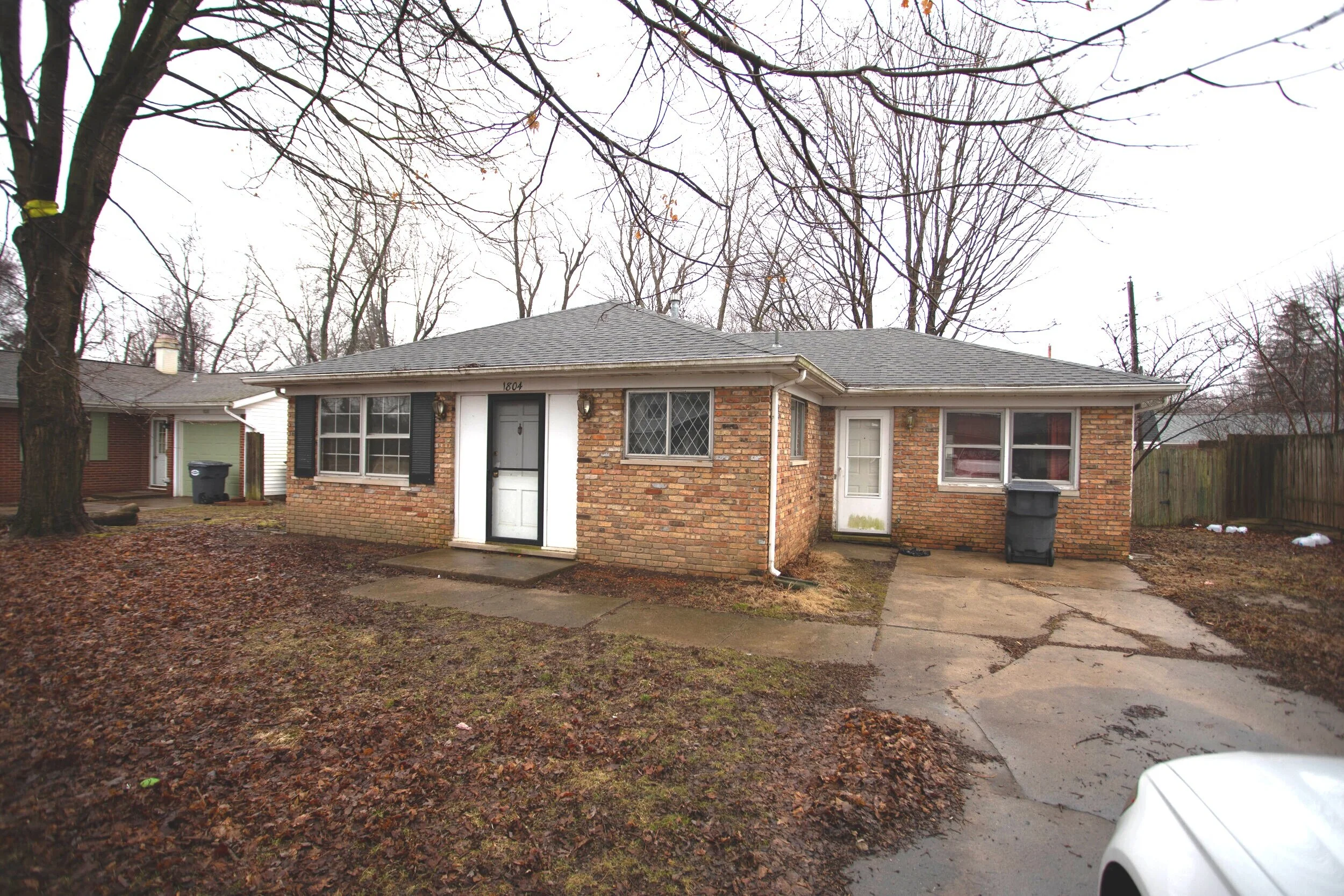
The flip house is a cute (beauty is in the eye of the beholder here) little 3-bedroom one-bath starter home in a great location. It’s not much to look at right now (and definitely something you don’t want to smell), but boy do we have plans.
Let’s start with the exterior. We closed a couple of weeks ago and obviously the weather isn’t the greatest this time of year, so everything is looking pretty sad right now. First off, the whole exterior and driveway/walkway need power washed. (I love power washing, so sign me up!) And the yard needs some basic maintenance.
Now picture this house looking something along the lines of these beauties:


I love brick, but not all brick is created equal. The brick on this house isn’t anything special, and I think the house would look amazing if it were painted white. We still have to figure out if painting the brick is in the budget, but man oh man do I hope it is because I think it would look INCREDIBLE. I also plan to paint the front door a bright color and add a fun and unique knocker. Below is some of my current inspiration.


Obviously I haven’t narrowed down the color of the door yet.
Adding a little bit of landscaping out front will also help brighten it up and increase the curb appeal. I’m thinking that some boxwood bushes would be perfect. If you aren’t sure what boxwoods are, let me tell you that they’re amazing. From someone who doesn’t have the greenest thumb, these bushes are easy to maintain and look great! I’m sure you’ve seen them before but probably didn’t even realize it. Here’s an example of what they look like:

Look familiar? I thought so…
Now, on to the interior!
At this point, we’ve already completed most of the demo, but here are a few pictures of what we started with.

Living room. Free couch! woo! (Just kidding)

Dining Room on the left/Kitchen on the Right

Kitchen

Bathroom

Bedroom

Bedroom

Bonus Room

Opposite end of the bonus room
And below is what it looks like all cleared out. You can take the virtual tour if you want to walk through the place yourself. Just use your cursor to navigate by clicking on the little circles on the floor. I’ve also taken some snapshots to help explain some of the ideas swirling around in my head - there’s a lot going on up there.
To get us started, picture the whole house in shades of a blue/green/gray color with rich medium tone laminate flooring and crisp white trim.

Living Room
In the picture above, before we demoed it there used to be a wall right where I’m standing. There was a doorway between the dining and living rooms and a coat closet a few feet in front of the front door.
In the picture below, if you look at the ceiling you can see where we knocked out the wall separating the dining room and kitchen from the living room. You can also see the giant hole in the ceiling where the coat closet used to be. To save you from scrolling, I posted one of the pictures from before we took out the wall from a similar angle below.

Living Room on the left/Kitchen on the right

This house is pretty tiny, so taking out that wall felt like a good decision to really open the space up and make it feel bigger and create some good sight lines across the living areas.

Kitchen on the left/Dining Room on the right
Now that the wall is gone, you can see from the living room into the dining room and kitchen. Open concept for the win!

Kitchen
Doing the demo work and clearing out a flip to make a blank slate is pretty exciting in itself, but unless you’re staging, the transformation of a lot of the rooms is pretty limited to paint and flooring. I know, I know. On HGTV everything is so glamorous and there’s a huge reveal with tons of special details throughout the house. That’s simply not real life. Now the kitchen is where you get to put in a little of that HGTV flair and make things more exciting.
The previous kitchen left a lot to be desired. The layout wasn’t functional, there was very little counter space, and it was pretty dark. Now that the wall is gone, we’re able to reconfigure the space to provide more storage, counter space, better flow, and let in some light! Lucius put together a little mockup of the kitchen layout to get a sense of how the space will feel once it’s put back together.

Obviously the wall on the left-hand side won’t be there and there is a doorway on the right-hand side to get to the bonus room, laundry room, and side door. We’re thinking of putting some open shelving above the sink area and adding a tile backsplash. The doors on the cabinets in the island will be facing the other direction so the side of the island that you see now will actually be flat.
I’m picturing white shaker cabinets and maybe a lighter countertop with stainless steel appliances, natural wood (or maybe white) for the open shelving, and some clean and simple subway tile for the backsplash. The picture below is a good example of what I’m imagining, though maybe a little higher end than what we are willing to put in a flip. It’s all about balance, guys!

Below is the bathroom. It’s in pretty rough shape so we’re gutting it and starting over. It’s tiny, so we plan to put a medicine cabinet back in and I’m searching for a vanity with as much storage as possible. To add a little surprise I would love to tile the floor with something fun and unexpected, but we’ll see how everything pans out.

Aside from ripping up the carpet, the bedrooms look more or less the same as the pictures above, so I haven’t included pictures. The bonus room hasn’t undergone any huge renovations yet either, though we did replace the failing french doors with a sliding glass door and already it’s getting a ton more light!

So as you can see, things are moving right along (and pretty quickly!) with the flip. I’ll be sure to keep posting as we continue to renovate and beautify this cute little house!