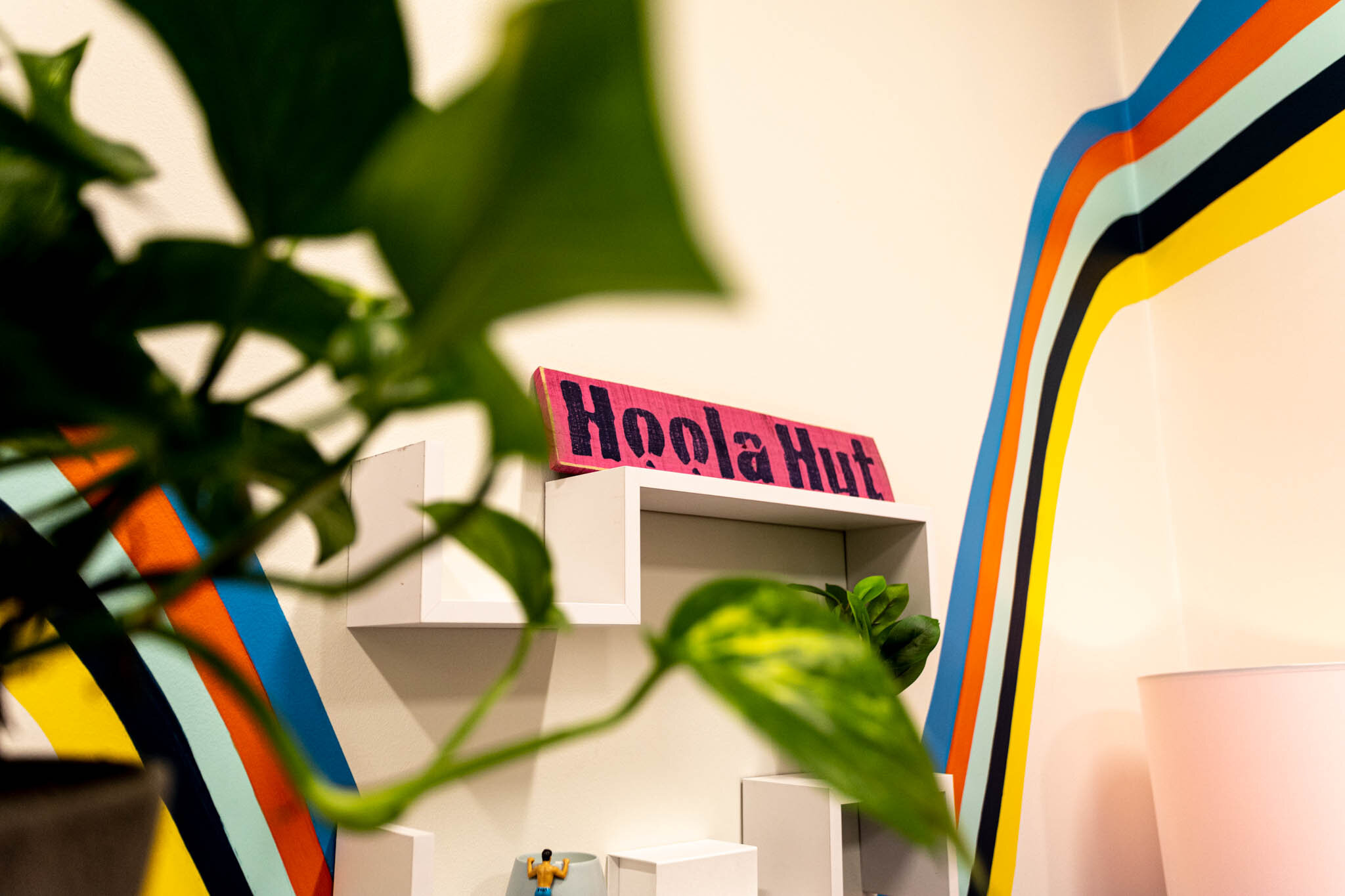
Tropical-Inspired Office Redesign
/Reviving a Dull Office Space
I have to be honest with you. While I enjoy writing tutorials and showing you all how I DIY’d something, what I really love is sharing my thought process behind the decisions I make while designing a room. And lucky for you (or me?), that’s what I’m covering in this post.
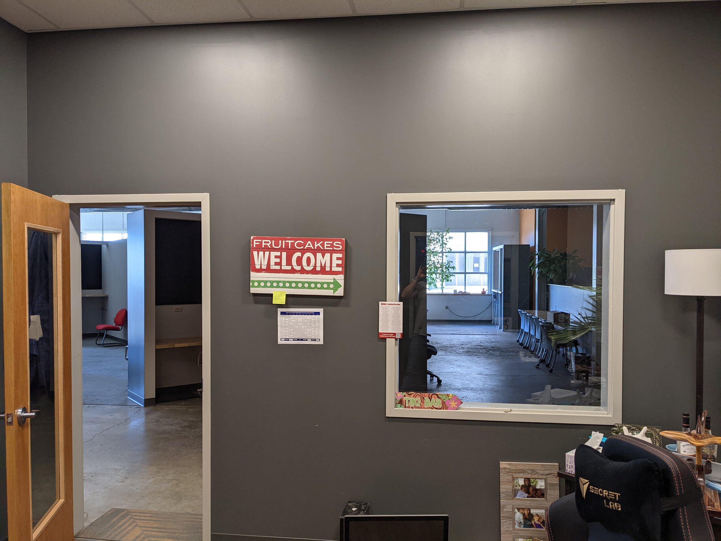
I was fortunate enough recently to be hired to redesign an office in MadJax, which is a local co-op lab where entrepreneurs can rent office spaces with the added benefit of the creativity and innovation from the other entrepreneurs who occupy the space. The building is cool and industrial and the whole vibe just makes my creative heart sing.
The icing on the cake is that my client let me have free reign of his office, which was INCREDIBLE and may never happen again so I’m relishing it.
I’m pumped up to share the final product with you today, but first, let’s take a step back to see what (and who) I was dealing with.
The Client
Meet Brad.
Okay, that’s not Brad. I got tired of waiting for him to send me a picture so this was the next best thing. That’s not even my dog.
Anywho, the REAL Brad is the founder, and owner of Hoola Managed IT, a Managed IT Services company that works with businesses to secure their networks and provide first-in-class IT helpdesk services.
While IT may sound boring (Brad probably even thinks so), I could tell immediately upon walking into his office that there was some pizazz there just waiting to escape. I like to think the room spoke to me… or maybe it was the bright orange hammock that set my wheels in motion. Who really knows?
But obviously, the space needed some help to make that giant hammock fit in.
I’m not necessarily talking about making the hammock fit in physically - somehow this behemoth actually fits in the office. But visually, there was no theme or consistency with the design. It simply looked like a giant hammock shoved in an office. But I wasn’t scared - I saw the potential.
As an Amazon Associate, I earn from qualifying purchases. This post may contain affiliate links, meaning I receive commissions for purchases made through those links, at no cost to you.
The Vision
As crazy as having a giant orange hammock in your office may seem, it wasn’t going anywhere. Not only is it a huge conversation piece - drawing people into Brad’s office where he can tell them to take a load off, serve them a Mai Tai, and talk them into buying his IT services - but it’s also convenient for those necessary post-lunch naps. Win-win.
So really, I owe a lot to this hammock for being the primary inspiration for my design.
But there were other factors at play, too.
First of all, I knew I wanted to incorporate the colors from the business logo - bright cerulean blue and, not surprisingly, orange.
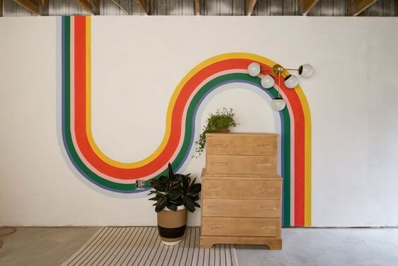
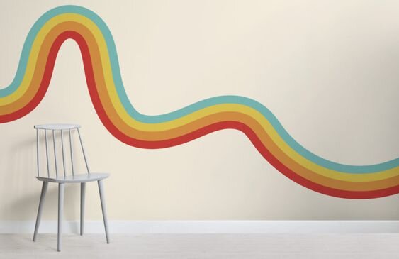
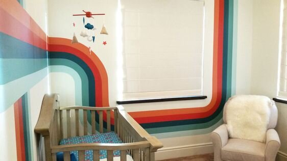
I had a hunch that I could go a little wild with this design. So I took a risk and shared the inspiration images below with Brad.
And to my delight, he was totally on board!
Choosing the Color Palette
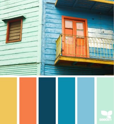
From there, I started searching for color palette ideas that included bright and energetic colors, being sure they incorporated the blue and orange tones from the logo of course. I landed on this palette as a starting point:
I love that it has the bright blue and orange I wanted to include in the design, as well as another warm color in yellow. But it also has that pastel minty green to soften the bright colors and that dark blue to ground the palette.
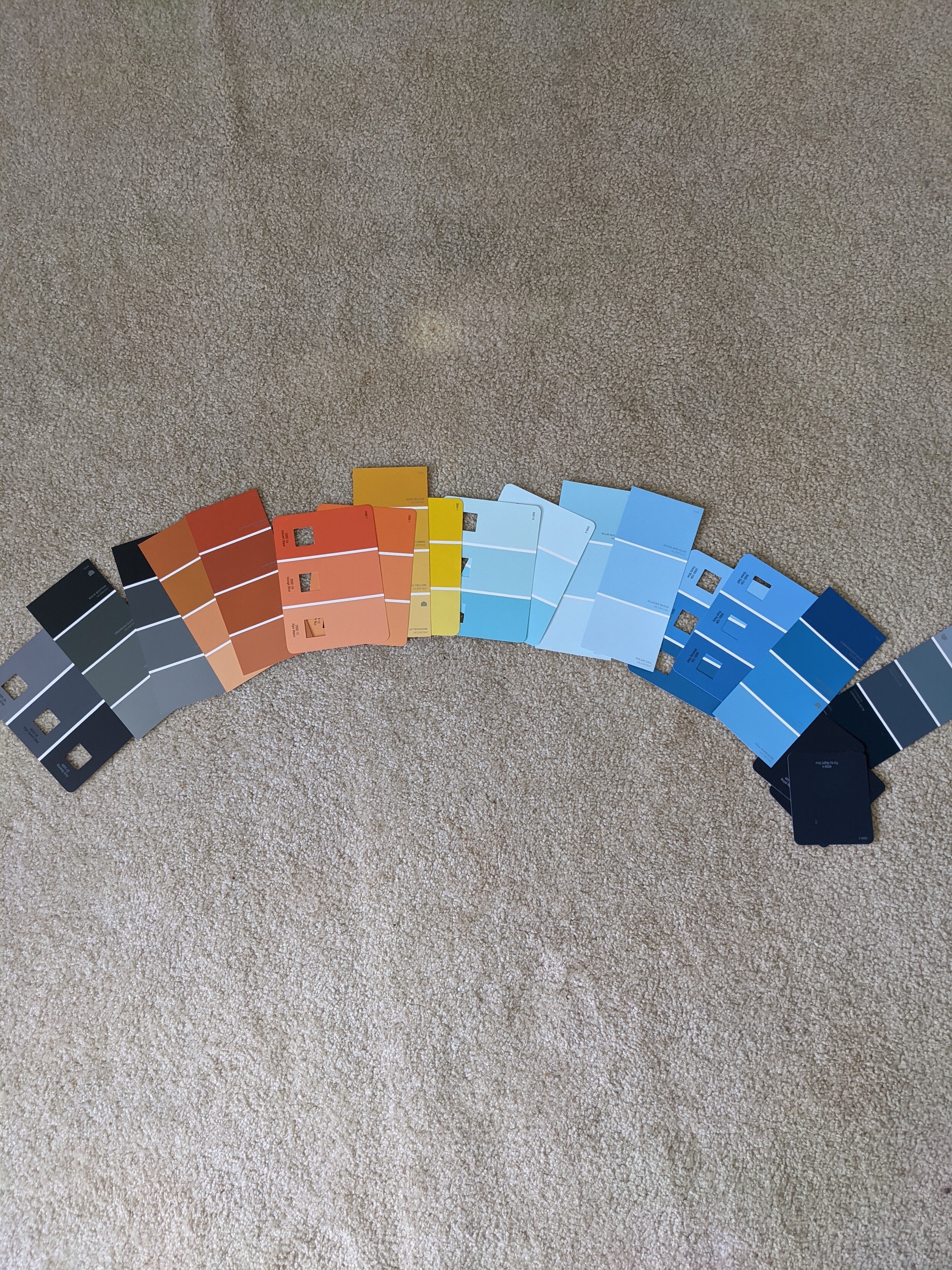
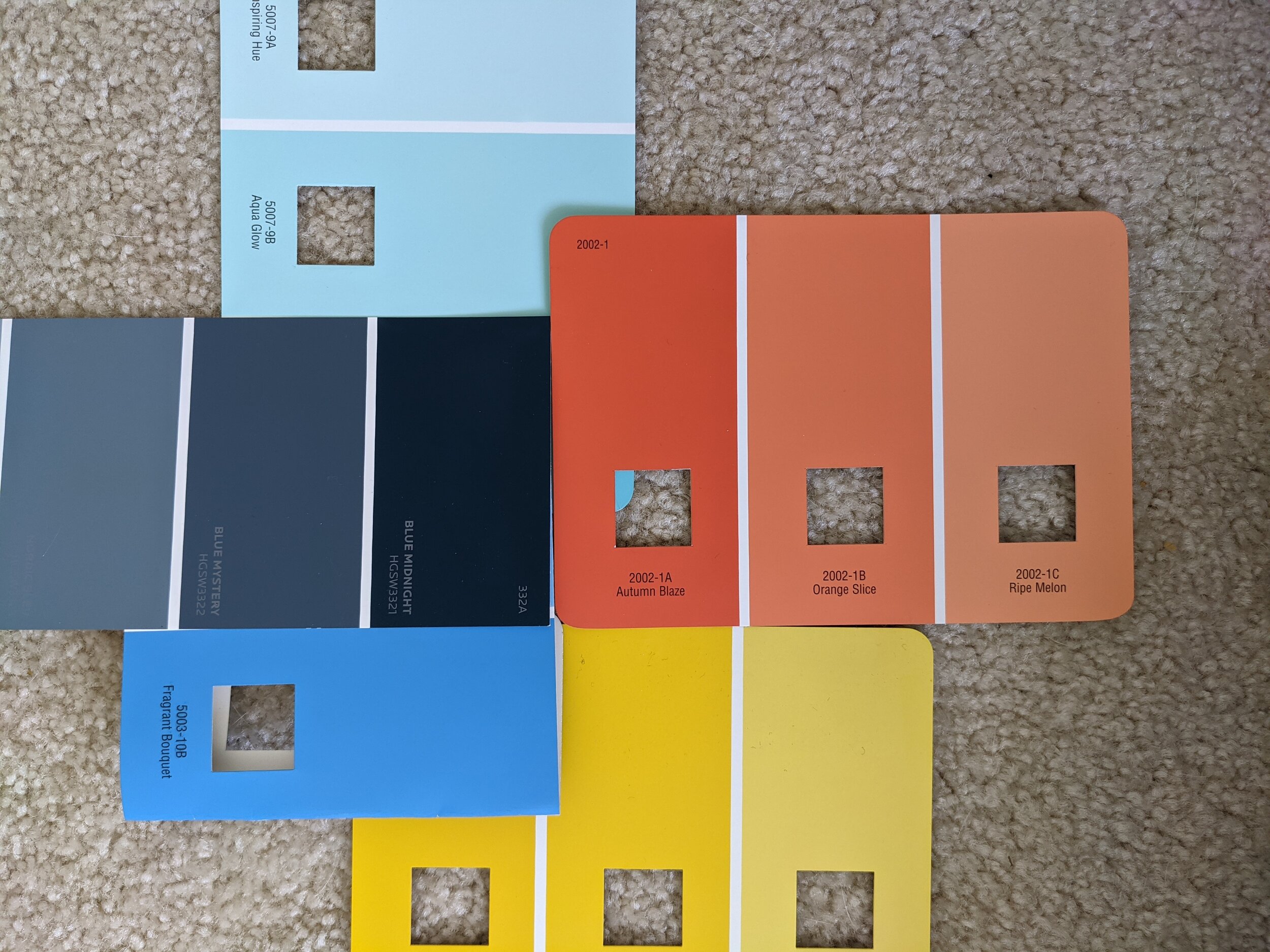
Then off I went to the store to grab paint chips and determine the exact paint colors I’d be using. I grabbed a bunch of potential samples and laid them out on the floor, then narrowed down my choices by trying different combinations grouped together.
Once I felt like I had a good idea of the colors I wanted to use, I grabbed sample pots and slapped the colors on the wall.
This helped me see how they would look in real life in the space as well as to decide in what order to paint the stripes. I also tested out white since I wanted a fresh base color to really make my design pop.
The final colors I used were Blue Midnight and Pearly White (Sherwin Williams), and Aqua Glow, Fragrant Bouquet, Autumn Blaze, and Golden Spell (Valspar).
Planning the Design
Before I got started, I had to plan the overall design. I had a general idea for the design of the stripes I was painting on the walls, but before I went nuts throwing a bunch of colors all over the place, I sketched out several different options.
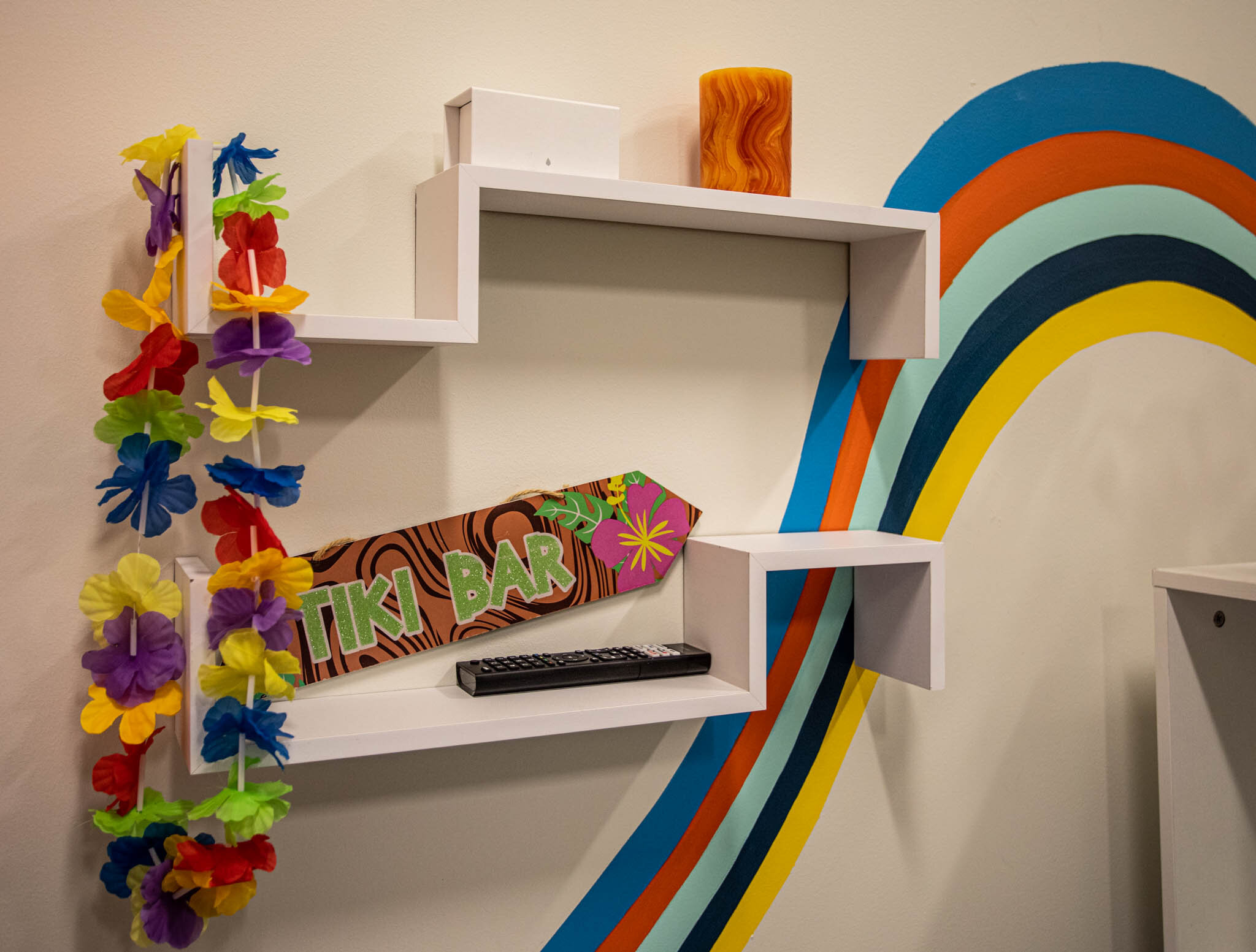
I ended up going with the design below because I like the way it flows, drawing your eye all the way from the floor up to the ceiling. Plus, the design on the wall below almost looks like a wave, kind of playing off the whole Hoola/hula/hammock/tropical thing Brad has going on.
Here’s a fun little time-lapse video of me painting the stripes on the wall above, just for kicks. In real-time the section painted in this video took at least an hour. Many true crime podcasts were listened to during the making of this office (I’m looking at you, Wine and Crime!)
Mood Board Time!
While I was sketching up different paint design options, I was also gathering resources for the actual furniture and decor. Here’s the final mood board I came up with:
Now let me break it down for you. There’s a method to my madness, people!
Brad had already purchased the desk. And while he was willing to return it, I was able to use it as a jumping-off point. It’s white, so the color obviously wasn’t an issue. And he mentioned that he bought that type of desk specifically for the additional storage it added, so I didn’t want to take that away.
So now I had an orange hammock and a white desk… obviously, I had to add some natural tones, right? Right!
The Perfect Desk Chair
I found these swanky chairs first. I was looking for something comfortable, but also unique, and I think I hit the jackpot! I love the faux wood finish on the sides, back, and arms of the chairs. And they look even better in person!
The chairs in the mood board above were just too tricky to crop out without making the desk look weird, but they weren’t part of the final design. Stay with me, folks!
More Cowbell! Storage!
Since I knew Brad already needed more storage from the discussion about his desk, I figured a bookshelf would serve him well. I found this etagere bookshelf early on in my search and couldn’t stop thinking about it. So in the design it went!
It’s the whole package for a couple of reasons:
It fits perfectly between the window and door (see the perfection below)
The etagere style doesn’t block the design on the wall behind it (see lack of design blockage below)
The style also doesn’t make the entrance into the office feel like a hallway (see open concept below)
The white frame and wood shelves tie the white desk and faux wood chairs together (again, see below)
It’s tall! The ceilings in this office are close to 12 ft so I wanted something that would bring your eye up, and this bookshelf does just that (see height below)
The Lightbulb Moment
This office doesn’t necessarily need lamps, but Brad had one in here before, so I figured, why not give the man what he wants? I found several different lamps with tropical-inspired shades that I was drawn to, but I knew I wanted to incorporate some natural woven textures elsewhere and didn’t want to go overboard. So when I found these babies I knew I had to get them.
And I know I said this about the chairs, but these, too, were even better in person!
(Maybe this post should be called, “Don’t Diss Faux Wood Because It’s Pretty Convincing”? It’s a working title…)
But seriously, the faux wood actually looks really nice, and the subtle change in wood tones near the base is a beautiful touch. Plus, these suckers are surprisingly heavy (aka: sturdy)!
Taking a Turn for the Tropical
And this is where things got even more fun. Now I was ready to start incorporating my natural textures and woven materials to really drive home the tropical theme we were going for.
I was admittedly a little hesitant at first to include woven blinds AND a woven rug, but once I saw them on the mood board I knew it was the right call. I grabbed this bamboo/seagrass area rug, making sure that it had a really flat weave so the office chairs could still roll. Then I snagged some shades for the windows in a similar tone.
Now Brad can close the shades and take his post-lunch naps in peace.
I also grabbed some bamboo boxes to add a little somethin’ somethin’ and help hide the typical office stuff that tends to accumulate.
Details, Details…
Once all the big stuff was taken care of, I was able to focus on filling in the gaps with accessories.
I hung funky shelves above the desks and added some of the silly signs that Brad already had.
Then came the plants! (Would you expect anything less?) I mean really, how tropical would this office feel without any greenery?
But the plants definitely took a little bit of thought. Since this office doesn’t get a ton of natural light, I made sure I went with some low-light-loving plants.
I plopped a pothos on top of the desk in a pot with a faux stone finish. Then I put four snake plants of two different varieties in a couple of big stone floor planters in front of one of the windows, which may or may not have made a really big mess but they were too heavy to move so I left it there (don’t look behind them, Brad).
Final Thoughts
And with the finishing touches added, this project was complete! What once was a lifeless, gray office filled with a hodgepodge of furniture is now a mood.
My goal with this office was to bring life to it, to make it energetic, and to somehow make that hammock make sense. I feel like I accomplished just that. And although hand-painting all those stripes took a whole bunch of time, I’d absolutely do it again. Someone hire me to paint a mural on their wall!


