Oops, we did it again
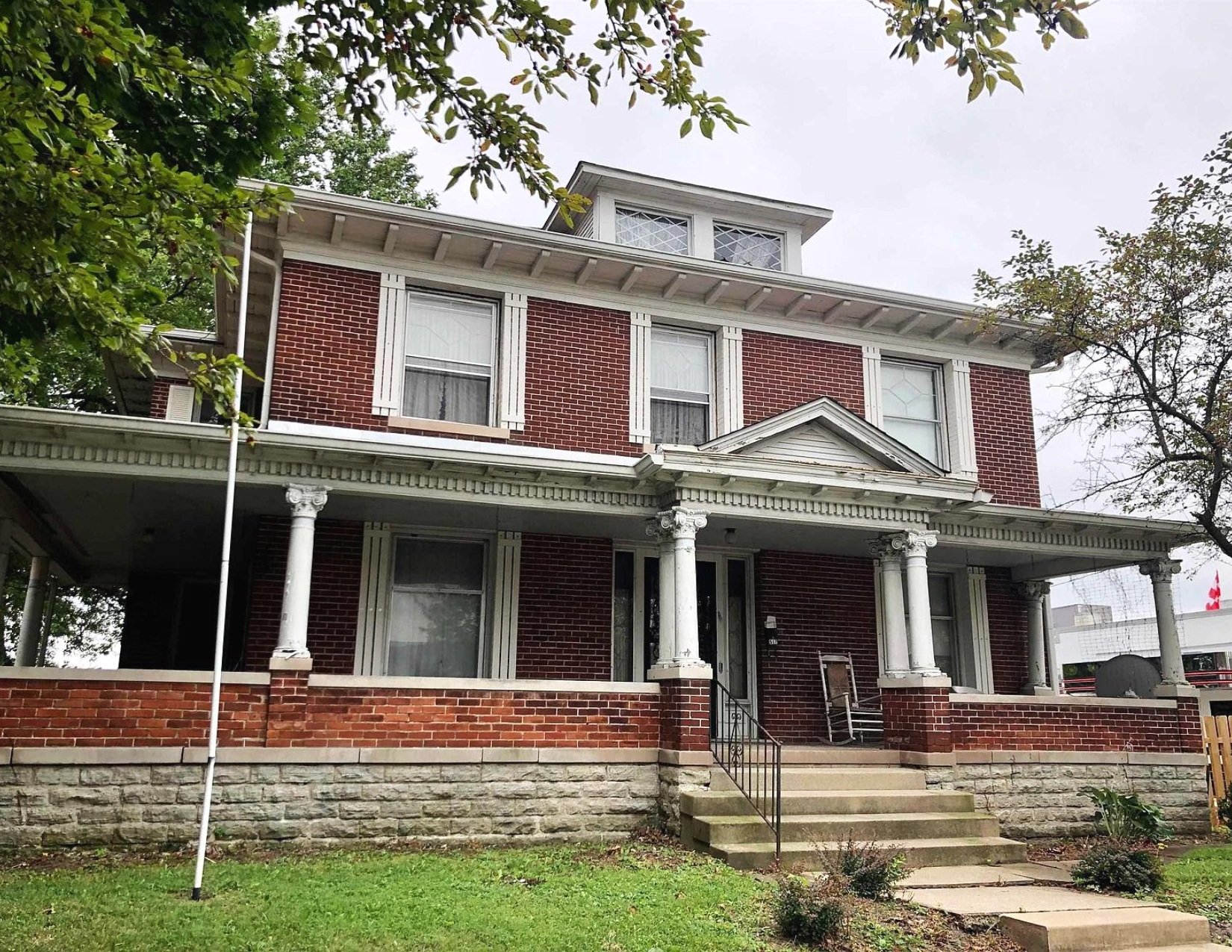
/Meet Charlie, the 1904 American Foursquare
If you’ve been following along, you’ll know that we recently purchased a dilapidated hair salon that we’re renovating into an office space. While that property is still very much a work in progress, we like to keep ourselves on our toes - so we added another one to the mix!
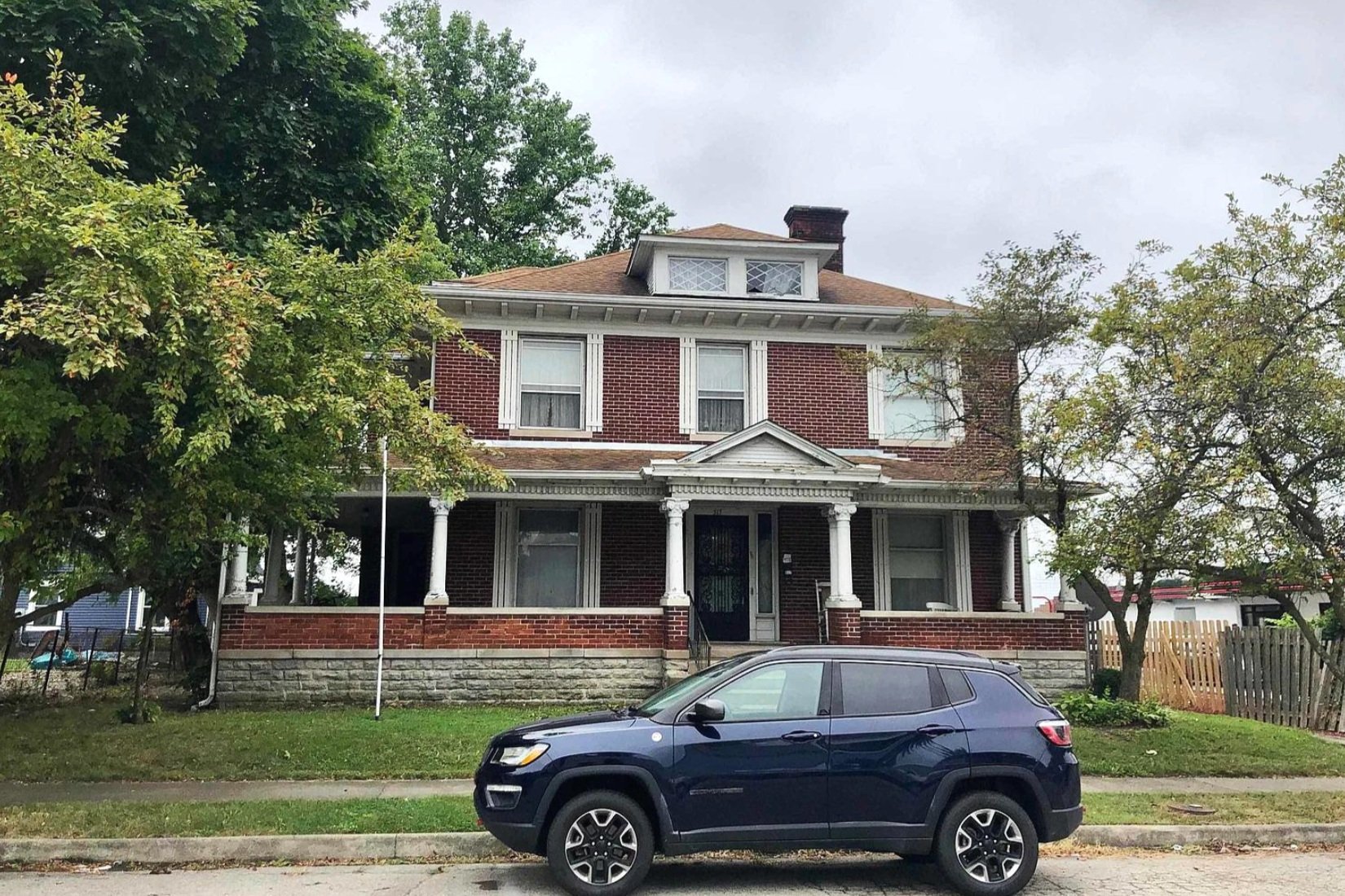
We bought this house, which we've been calling “Charlie Foursquare” as an investment property, with plans to turn it into an Airbnb. It was built in 1904 in the American Foursquare style, and MAN, is it a beauty! Boasting 10-foot ceilings and incredible original woodwork, I can’t wait to bring it back to life.
But before we jump in, here’s a little bit of background for ya…
What’s an American Foursquare?
The American Foursquare style was popularized between the 1890s and the 1930s as a reaction to the highly ornate Victorian houses that predated them. The typical layout of an American Foursquare is… well… a square with four rooms on each of the two floors.
Typically, there’s a large front porch with a centered doorway where you’ll enter into the foyer. While the downstairs layout isn’t always four distinct rooms (sometimes the living room footprint spans an entire half of the first floor), two of the rooms usually contain the dining room and kitchen. Each corner of the second floor holds a bedroom. The staircase and bathroom (sometimes the only bathroom in the home) are located in the center.
Our house follows the standard to a T. So, come on in. Let me show you around!
Forewarning - the previous owners left a ton of stuff to clean up so the house is looking a little rough. I challenge you to look past all the trash and clutter to see the potential though because there’s. so. much!
Downstairs
Foyer
Upon entering through the front door, you’re greeted with a large foyer. While I love the woodwork throughout the whole house, this room really showcases its beauty.
To the left, you see the columns leading to the living room, and to the right are pocket doors leading into a den. And then, straight ahead, you get your first look at one of the many gorgeous 6-paneled wood doors.
My only disappointment here is that the staircase is a lot less grand than many homes from this era, but obviously, that isn’t a deal-breaker.
I kind of like the wallpaper in the foyer and may end up keeping it, along with the radiators simply for aesthetics (they no longer work). The flooring, however, is cheap linoleum that I can’t wait to replace. I’m thinking tile would look amazing here and really elevate the space.
Den
As I mentioned above, this room is to the right of the foyer and repeats the amazing columns that lead to the living room. I especially love the built-ins surrounding the fireplace and their leaded glass.
You can see that this room has a little bit of repair work needed to the ceiling, and the light fixture will be replaced with something more period-appropriate. We’re fortunate that many of the original light fixtures are still with the house, but not all of them.
On top of that, we’ve already started removing the carpets throughout the whole house, and the hardwoods underneath are all salvageable. Refinishing will begin in a couple of weeks!
Living Room
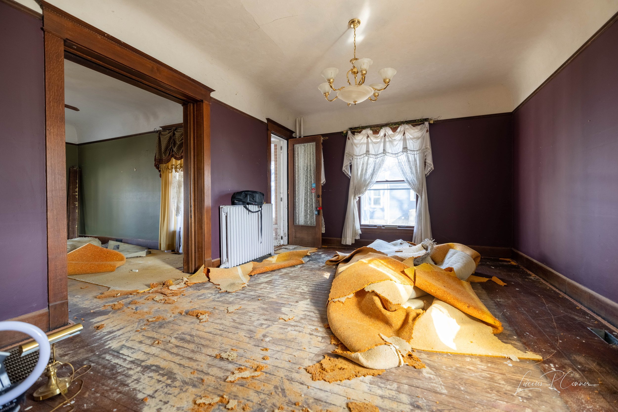
On the opposite side of the foyer is the living room, where you get your first real glimpse of the super tall ceilings (they’re just as tall in the foyer and den but it’s hard to tell in photos).
As with the den, plans for this room are paint, a new light fixture, and refinishing the floors.
Dining Room
This picture doesn’t do it justice, but this room is actually pretty large - 18x13 feet to be exact.
I can’t wait to fill this space with a large table and a beautiful area rug. (Actually, all the rooms will be getting new area rugs.) Again, paint, a new light fixture, and floor refinishing are on the list, but I would also love to add wallpaper to this room to really make a statement.
Butler’s Pantry
Between the dining room and kitchen is a passthrough with a small butler’s pantry.
While it’s not large, this pantry extends from the floor all the way to the 10-foot ceiling, so it still feels grand. To the right of the pantry is the basement - which actually has 10-foot ceilings, too!
Half Bath
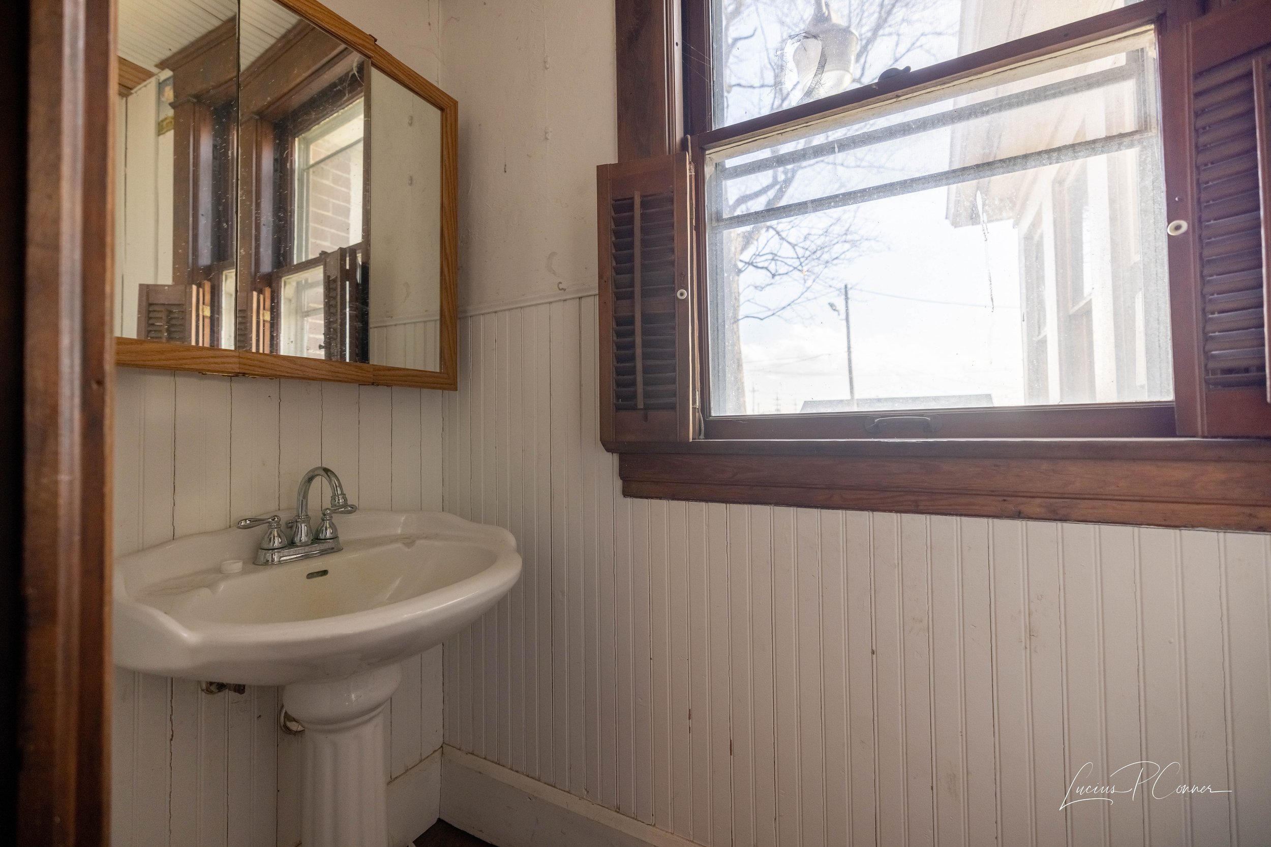
Opposite the pantry is a small half-bathroom.
This room will likely need the most work out of any throughout the house as the beadboard is in really rough shape. But hey - at least it’s tiny!
Kitchen
The kitchen is a good size but was left in a disgusting state. That being said, the cabinets are still in good shape and just need a really really thorough cleaning.
Our hit list for this room is to repair the ceiling, swap out the light fixture, paint, and peel up the linoleum. I was able to get a little bit of the flooring up pretty easily just to see what we were working with, and there’s hardwood under there. If at all possible, we’d love to restore them.
Upstairs
The second-floor houses all the bedrooms and a full bathroom.
Bedroom 1
This bedroom is by far the messiest in the house, but look past that at all the potential!
Nursery
Next to the bedroom above is a small room (less than 8x8 feet) that would have originally been used as a nursery. In fact, the door to the right connects to the room next door.
Bedroom 2
On the other side of the nursery is this bedroom that has a cool surprise. That bookcase on the left-hand side is actually secret storage! It swivels open!
Right now it holds a gun rack, but we’ll remove that and repurpose it for something more our speed.
Bedroom 3
This is the one room in the house without carpet. Unfortunately, it’s also the only one with painted trim. I may try my hand at stripping it back to the original woodwork.
Full Bathroom
Bathrooms back in the day weren’t quite the hot commodity they are now - so they weren’t typically very large. This is no exception.
Opposite the toilet is a walk-in shower which seriously makes me wonder what was there originally because there’s no way there’s enough space to hold a clawfoot tub.
Bedroom 4
This is the master bedroom, which coincidentally is the furthest away from the nursery. (They really knew what they were doing in 1900!) It’s a good size at 18x14 feet!
Final Thoughts
If you’ve been following the blog for a while, you know that we actually lived in an American Foursquare before we moved into our current home. I’ll always have a soft spot for this style of house.
Looking back at it, if we lived there now I would do so many things differently design-wise. And now I kind of have the chance!
For Charles, I’d like to make sure the design reflects the home’s history while mixing in some modern elements.
I absolutely plan on keeping the woodwork intact and reusing the original light fixtures that are still here. I can’t wait to take advantage of all the picture rails and add some wallpaper strategically throughout.
I’ve been deep in searching for inspiration and have come across some images that have really gotten my wheels turning… but you’ll have to wait a bit for me to finish clearing out all the mess so I can see the house without the clutter and really let my imagination run wild.
Keep following along here and on my Instagram to watch this house return to its former glory. I can’t wait to share it with you!


