Office Reno - Agent Office Design
/Built-in Desk Design
I’ve shared the designs for the lobby and reception area, and the conference room and kitchenette in the office building we’re renovating. Let’s keep that trend going. Today, I’m sharing the design for the agent office!
As a reminder, my husband is part-owner of a real estate brokerage. We, along with several other investors, bought this building to renovate as the office for the brokerage. So, naturally, we need places for the agents to actually do their thang. That’s what this room is for.
The Floor Plan
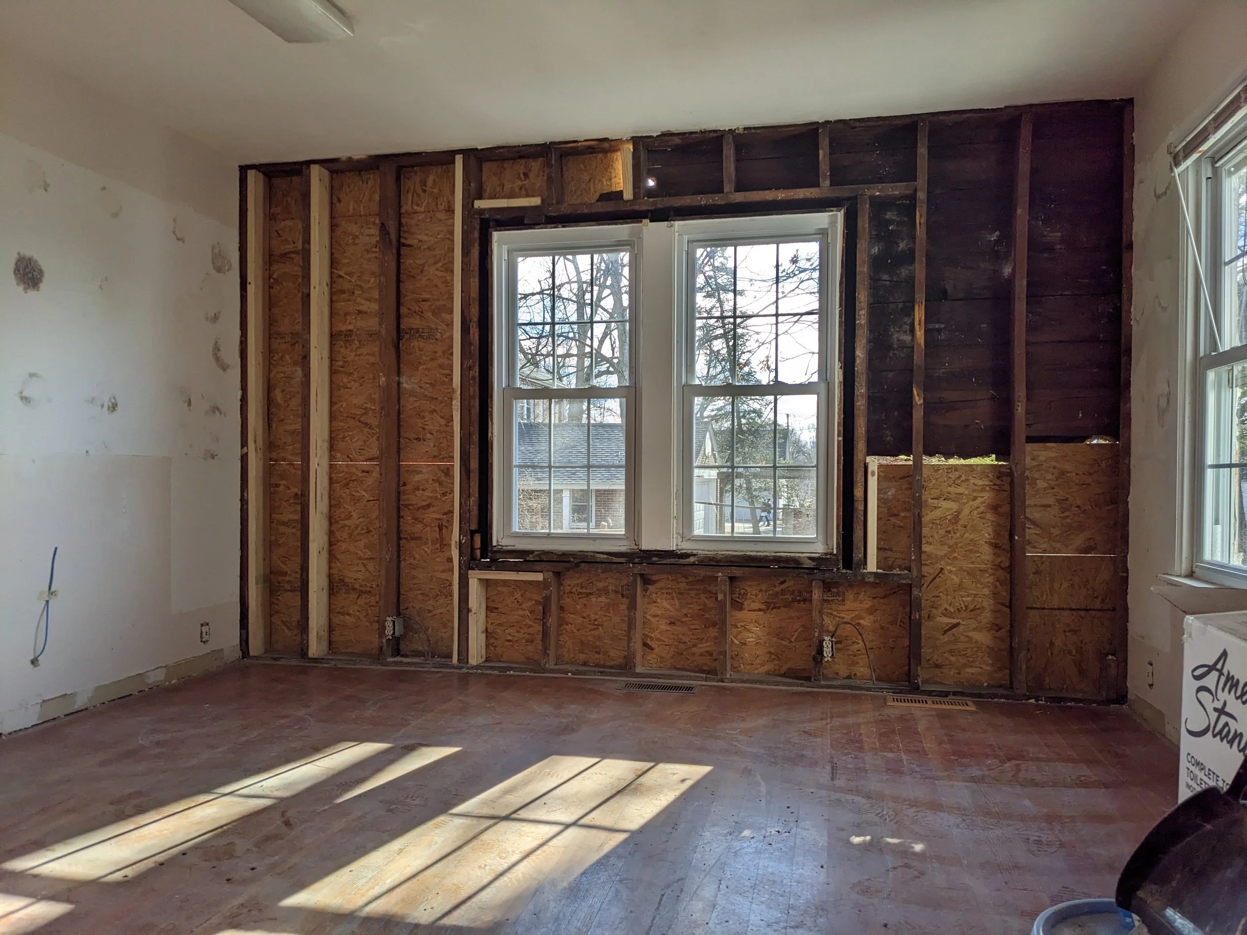
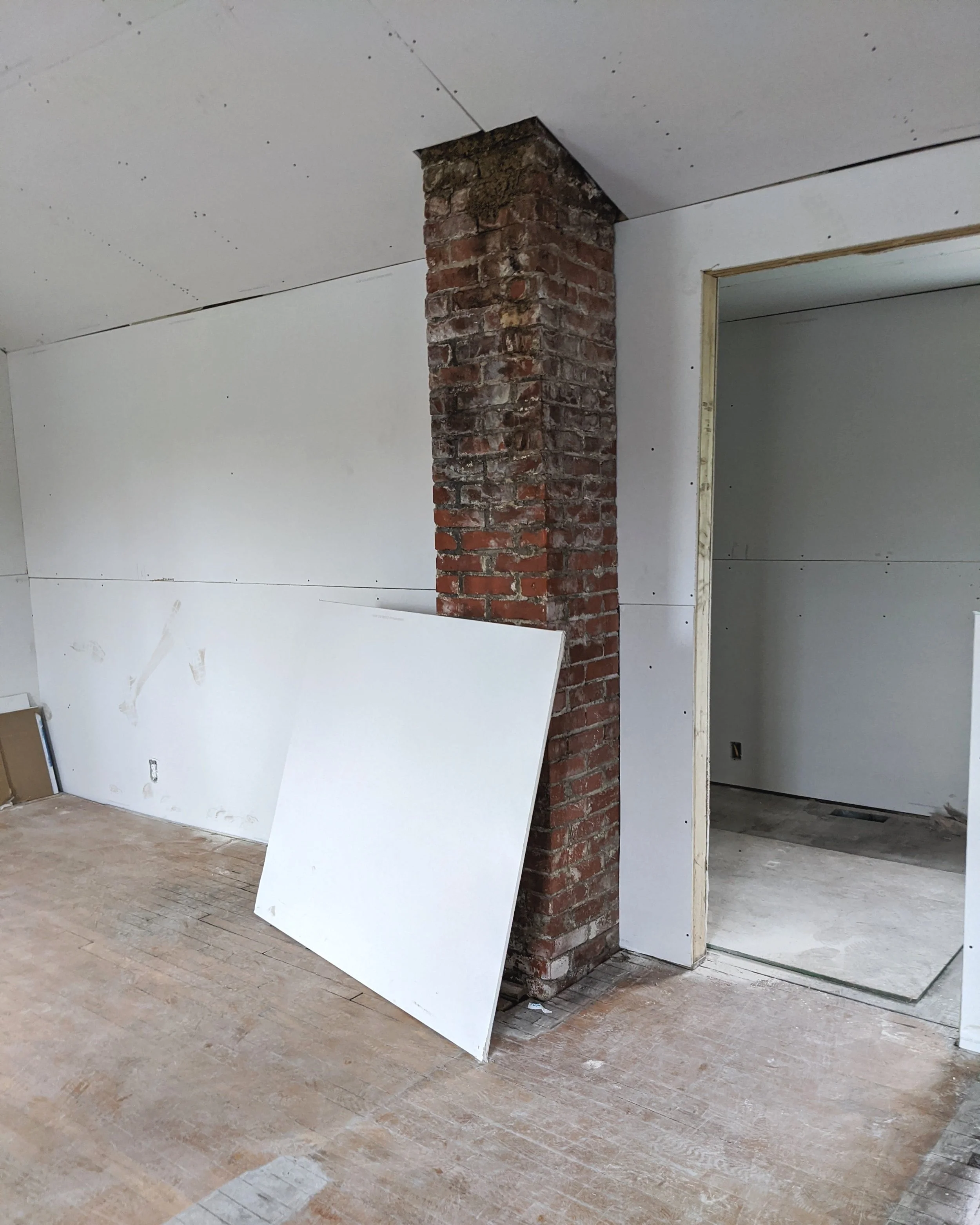
When Lucius told me I needed to figure out how to fit six workspaces into this 13x13-foot room, I probably looked at him like he had three heads. The picture below was after we started demo, but it’s the best picture I have to give you a good idea of the room size.
While it took some brainstorming and research, I finally came across a few examples of other spaces that made me realize that built-in desks around the perimeter of the room would make this possible.
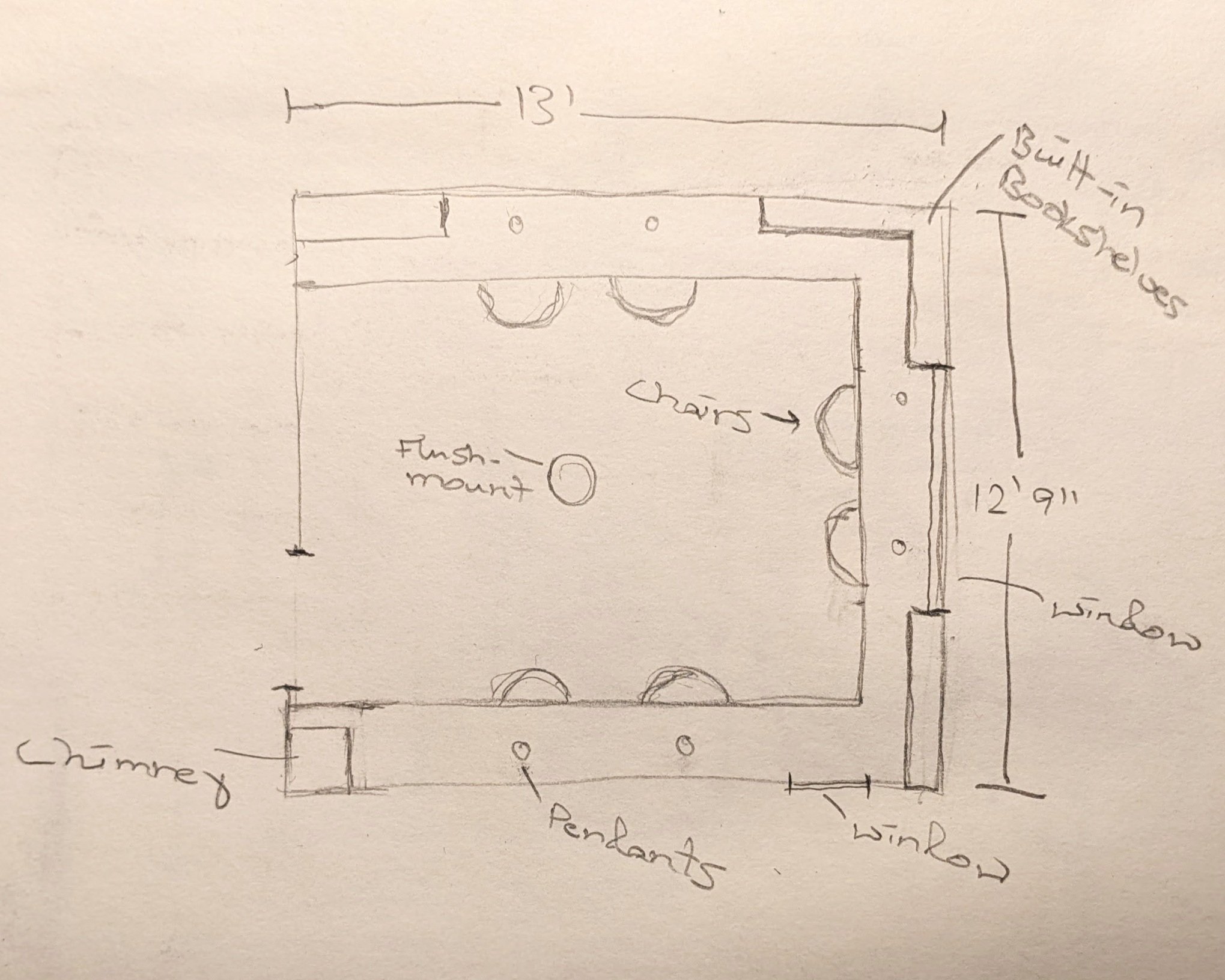
Here’s a little floor plan I threw together to help visualize my plans.
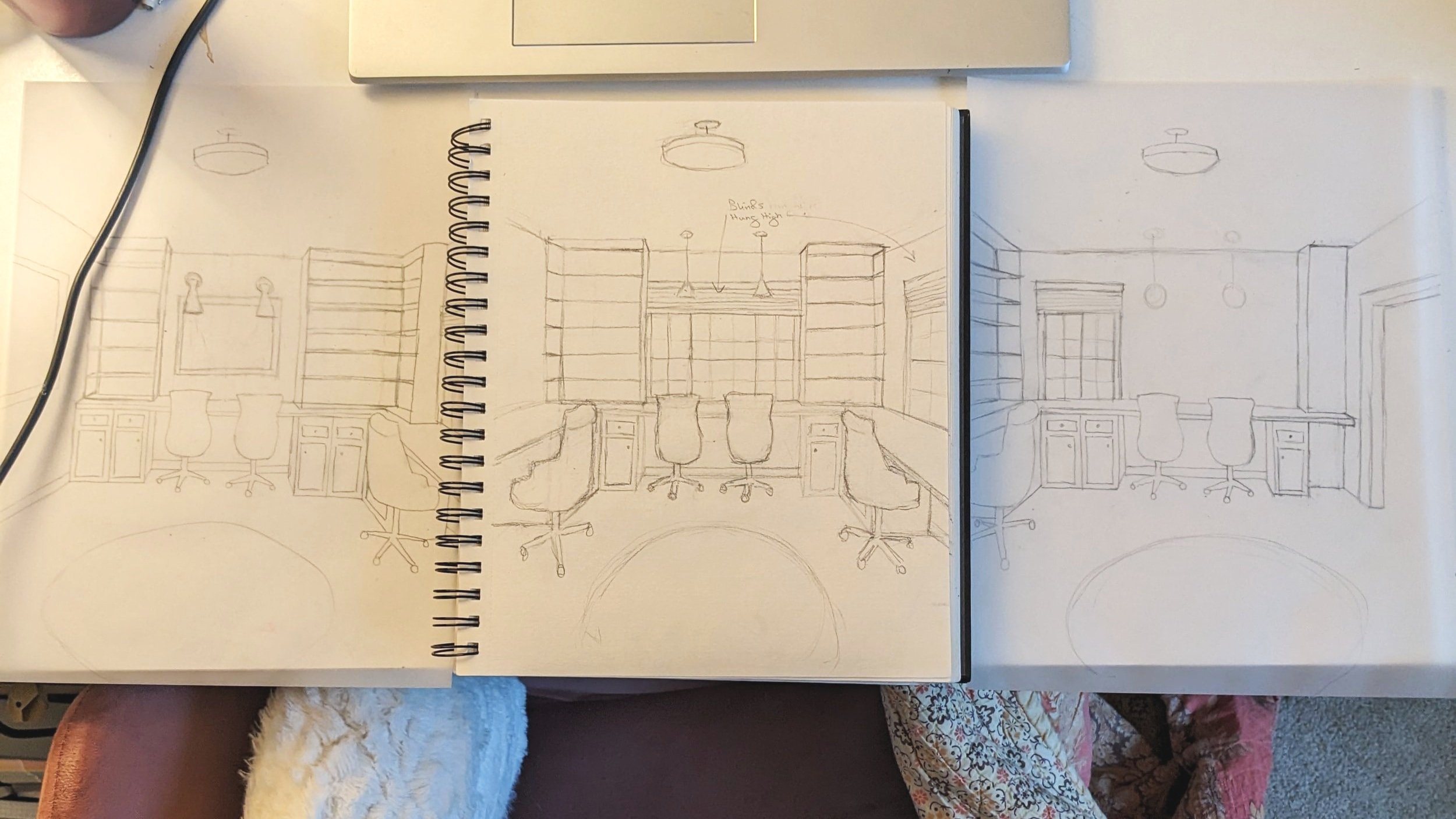
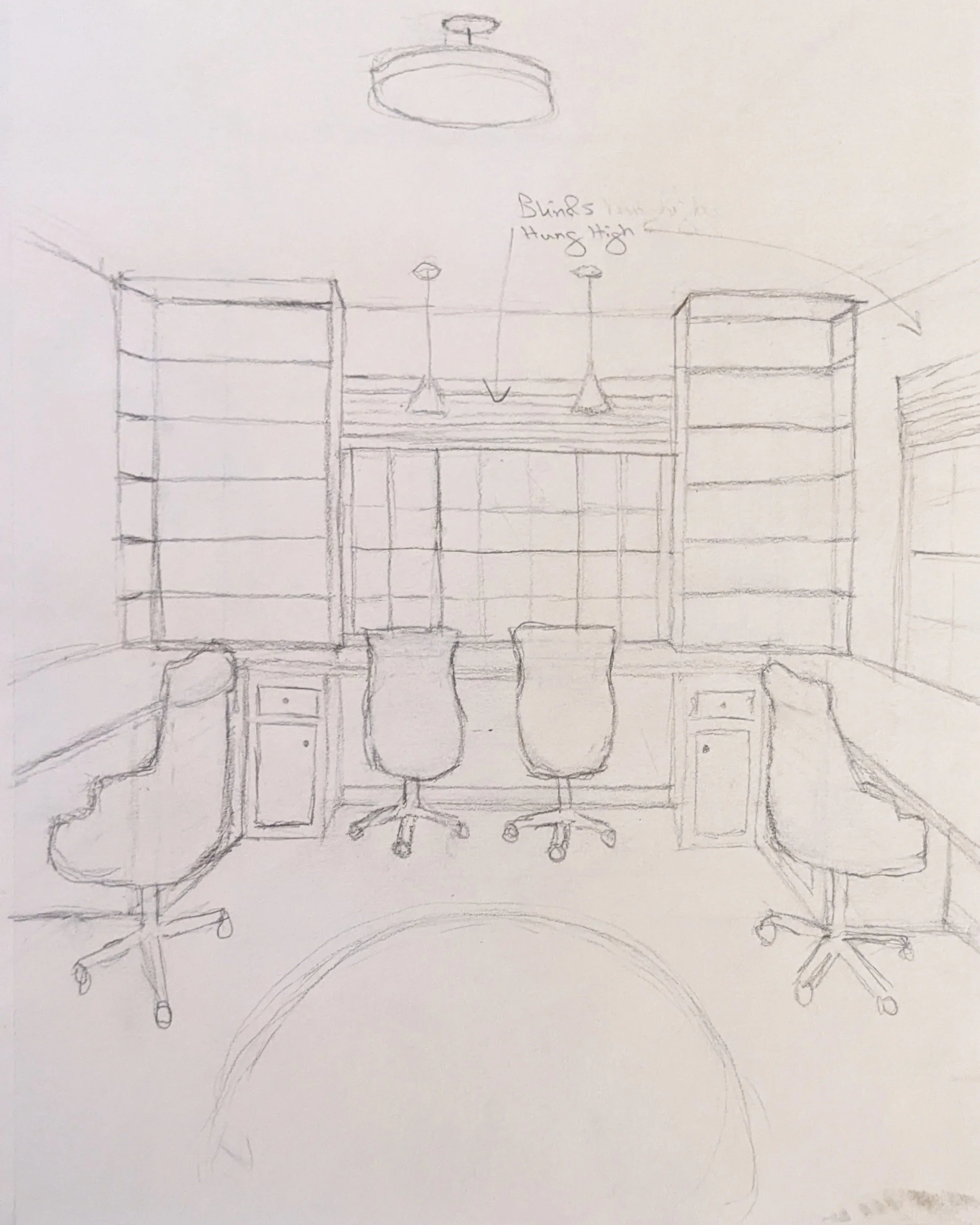
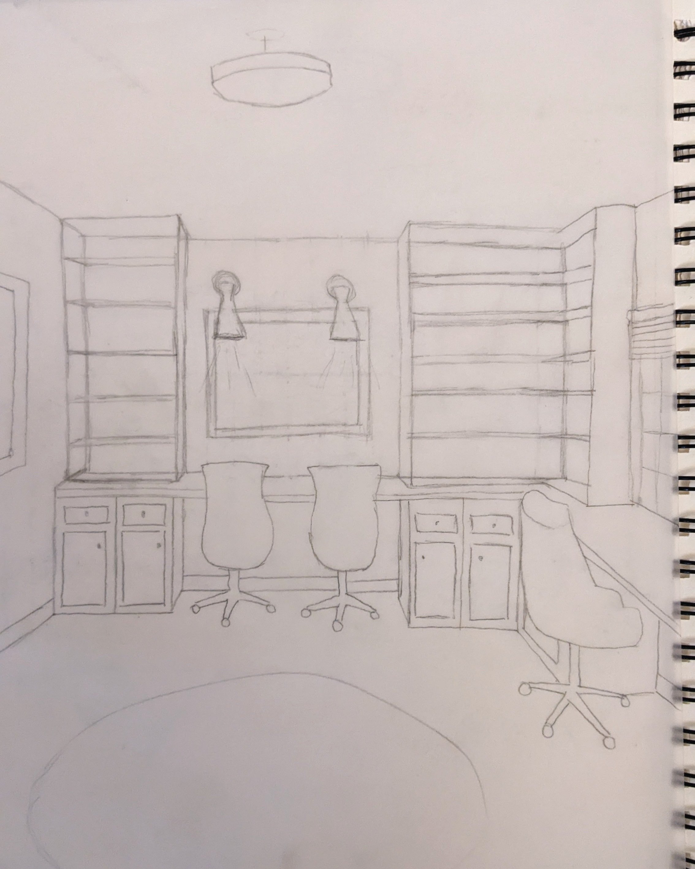
And here are the preliminary sketches of the three “desk walls” I drew to run the idea past the hubs and get his seal of approval.
As you can see, I’m imagining three out of the four walls of the room with desk space. Each opening will have enough room for two people to work, allowing for cabinetry on either end of the desk for storage.
The Design
As an Amazon Associate, I earn from qualifying purchases. This post may contain affiliate links, meaning I receive commissions for purchases made through those links at no cost to you.
Let’s break those sketches down, eh?
Walking through the door, you’ll see windows above the desk area straight ahead. Flanking either side of this desk, I’d love to add built-in bookshelves. We don’t really need them, but I think it’d look good.
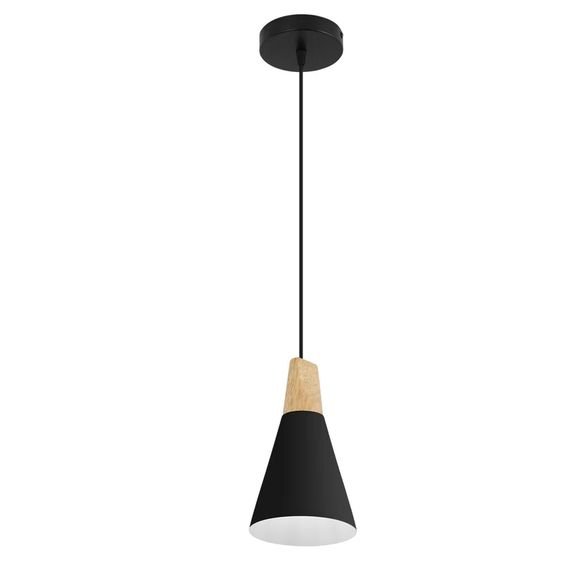
Above each desk area, there will be two pendant lights hanging down. These are the pendants I’m leaning toward, along with the flush mount that will be centered in the room:
On the left-hand wall will be another desk, with the same concept minus the windows. I think a beautiful piece of artwork or a mirror would make sense in their place. I really like the vibe of this mirror.
I’m undecided on the bookshelves in this desk area as of right now.
This sketch shows sconces above the desks. I was still playing around with light fixtures when I made these sketches, so I was trying out some different looks. Since then, we’ve officially had the room wired for pendants.
Lastly, the right-hand wall follows the same general idea, except we have another window and a chimney. We’ve exposed the brick on the chimney, and I’m so excited to leave it just like that. It adds so much character!
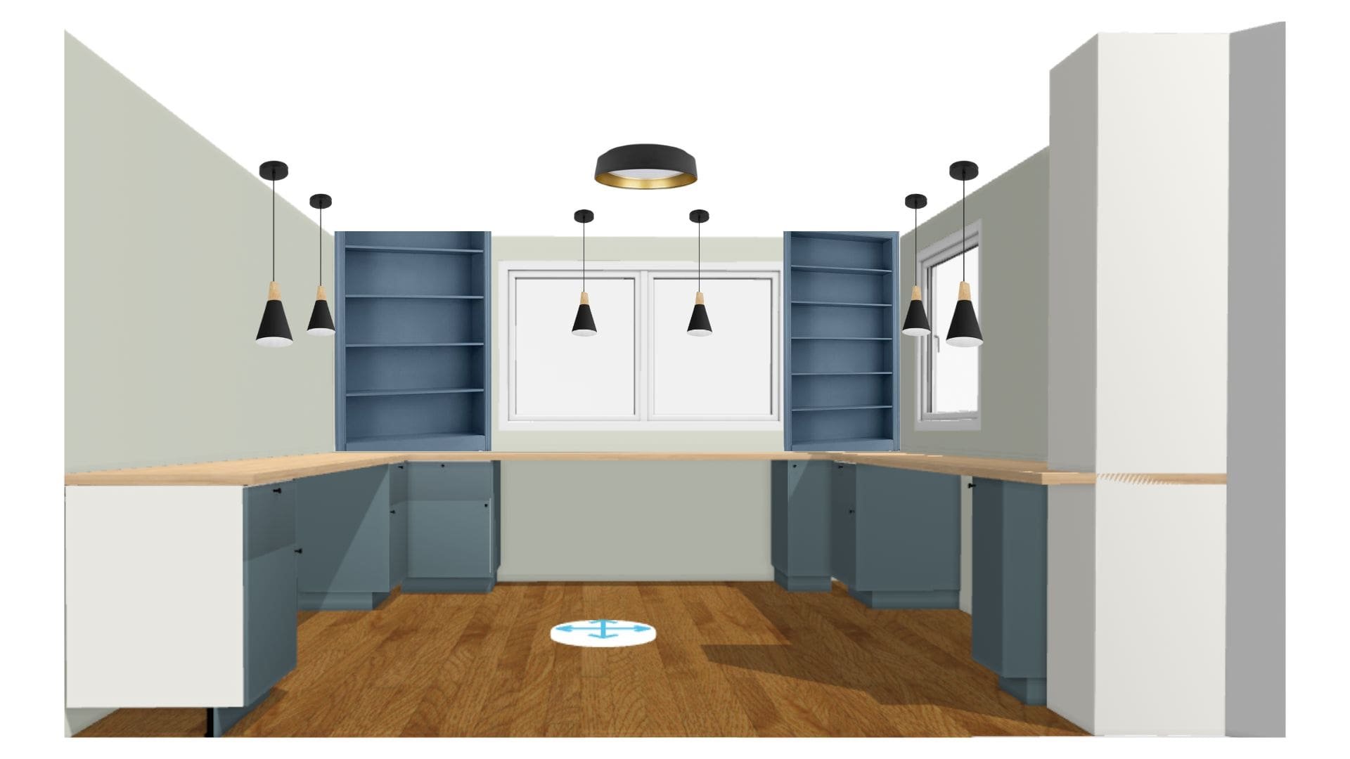
After I made sure Lucius was on board, I put my plan on graph paper to get exact measurements and headed over to the IKEA site to use their kitchen planner again since, as with the kitchenette, we’ll be using IKEA cabinetry.
This is the rendering I put together using the kitchen planner for the cabinets and added additional elements using Canva.
Because we’ll need so much counter space for this design, I think butcherblock is the route to go so the seams are a little less noticeable.
Color Scheme
I don’t know what came first here - me imagining blue cabinets and built-ins on my own or because that’s primarily what I’ve come across when looking for inspiration (classic chicken or the egg, amirite?). Either way, that’s the route I’m going!
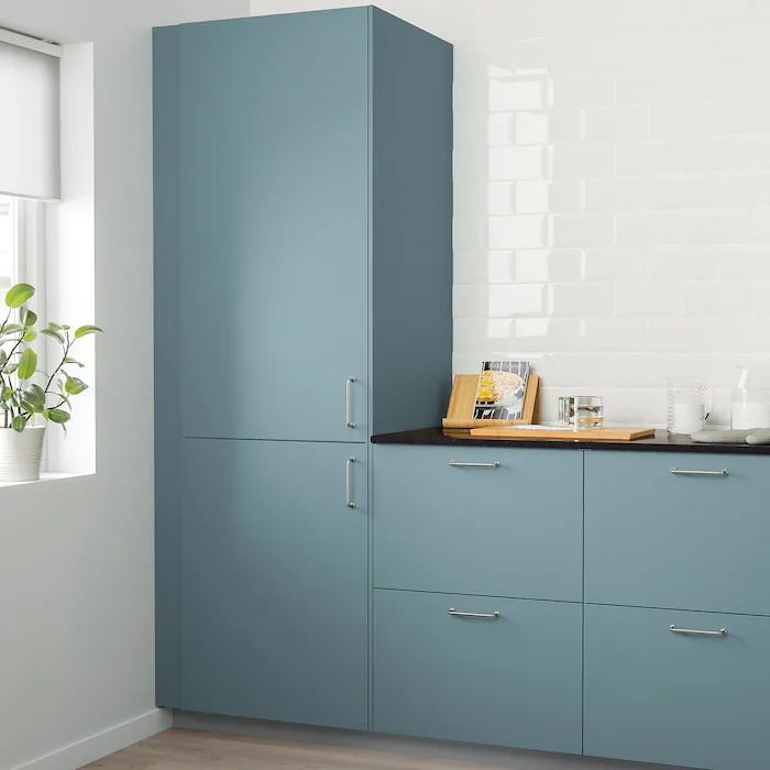
I ping-ponged back and forth a lot about whether I wanted to go with blue since I’m not 100% sure what shade of blue the “Havstorp Turquoise” IKEA cabinets are. After doing as much research as I possibly could without driving an hour to the nearest IKEA, I decided to just go for it.
I’d like to use a blue color for the walls in the lobby and reception area. My hope is that these cabinets are a nice call-back to that room.
Once the cabinets are installed, I think we’ll have to custom-build the bookshelves and color-match them to the cabinets since I can’t find the exact sizes I’m looking for.
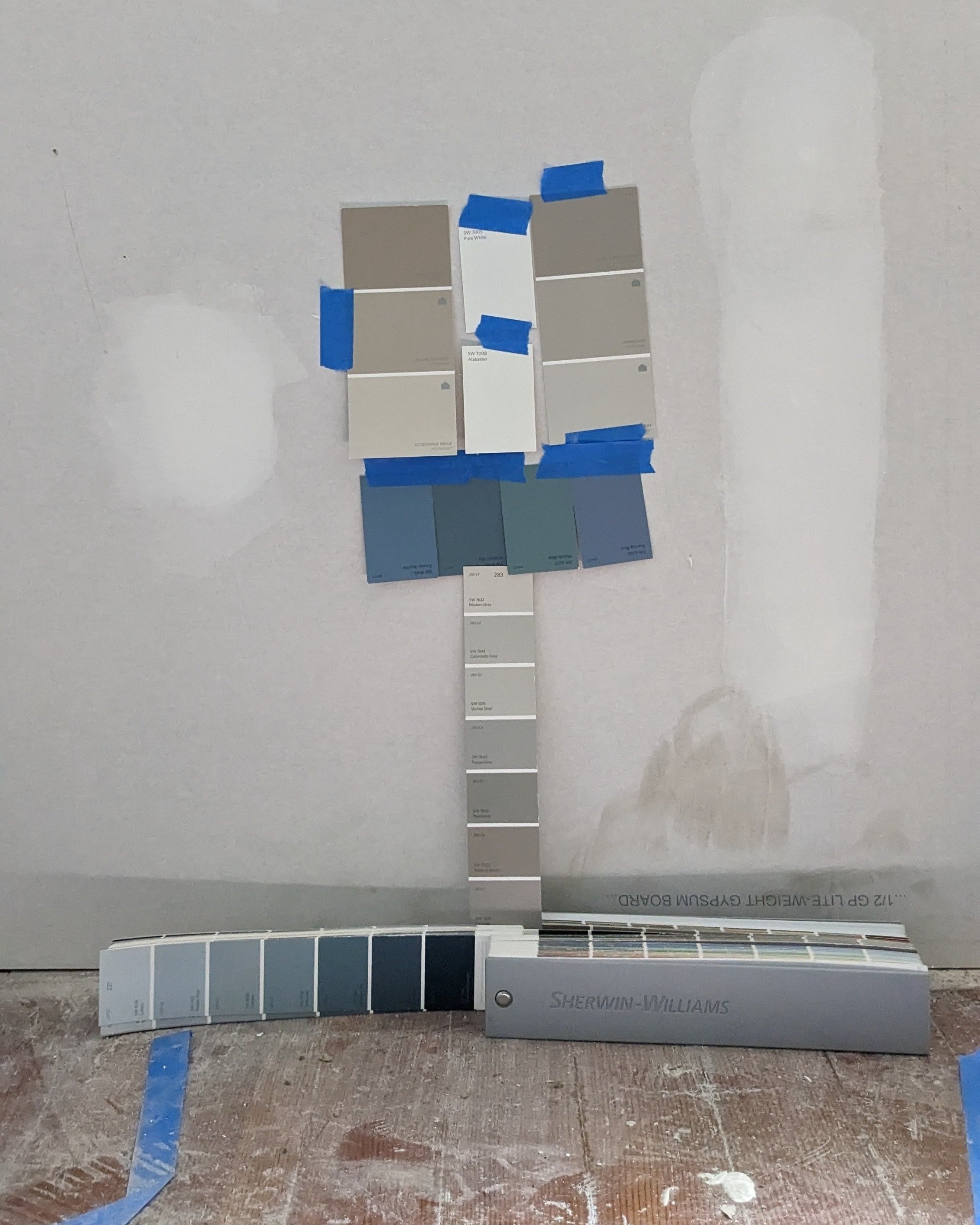
As for the walls, I’m leaning toward a light neutral that will probably be repeated throughout several rooms - Agreeable Gray by Sherwin Williams.
I’m holding off on my final decision for the color of the butcherblock countertops until the floors are refinished (they’re currently in progress!) to avoid any clashing in the wood tones. They’ll likely be either of the extremes - walnut or ash. I used the ash finish in my rendering and am really digging the look.
Final Thoughts
Once I nailed down the floor plan, my vision for this room was pretty clear. I’m so excited to see it come to life, which will be happening very soon!
Drywall will be completed this week, and the floors have already been patched and are well underway for refinishing. Follow along on Instagram and Facebook to see all the progress in real-time!
Catch up on the full office renovation with these posts:
We Bought a Hair Salon! (Office Building Reno Intro)

