House Tour! - 2022
/It’s been a good three years since we moved into this house, and A LOT has changed since I last showed you around. Although I share bits and pieces of various rooms as we’re working on them, I’d say it’s about time for a good old house tour! Complete with lots of before and after comparisons because those are just so dang fun - let’s jump in!
The Foyer
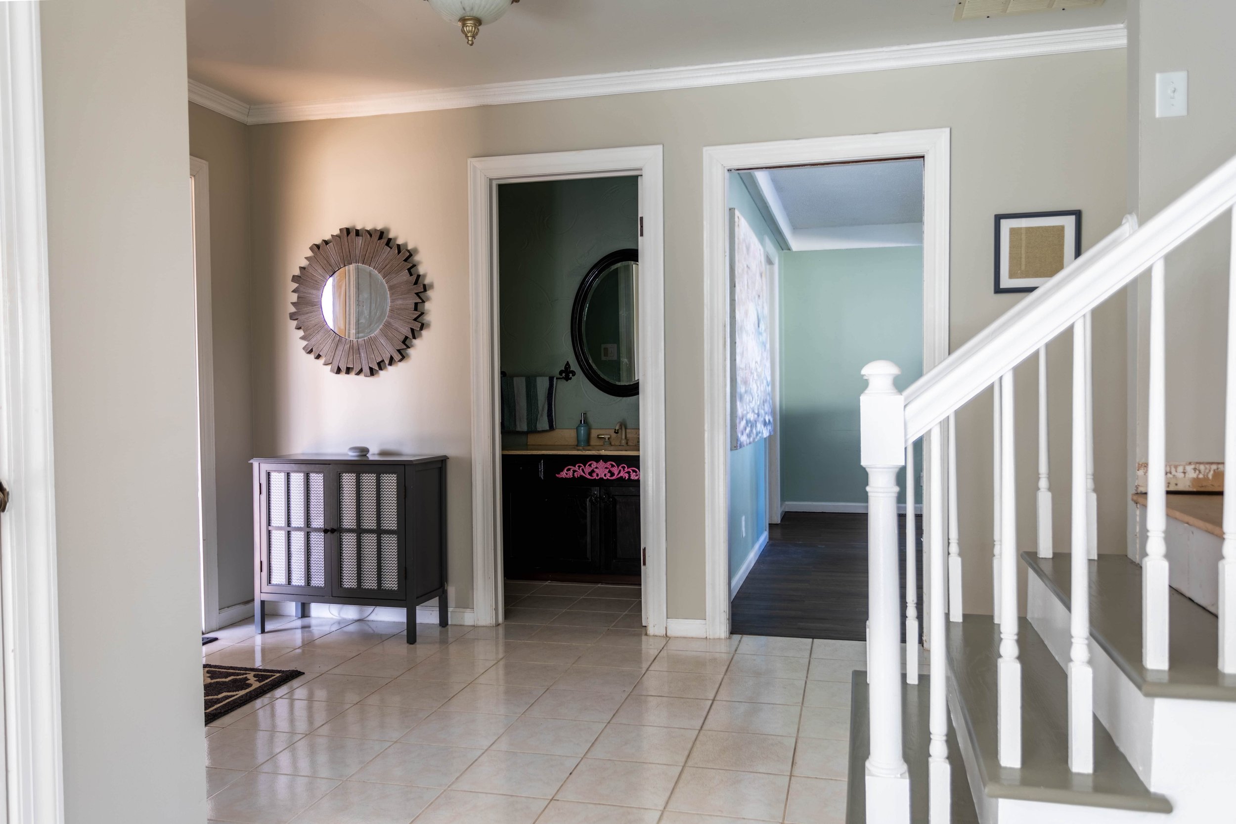
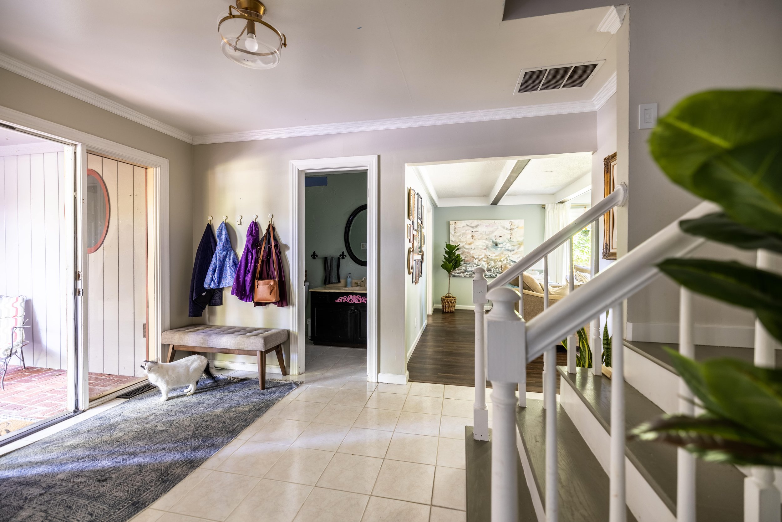
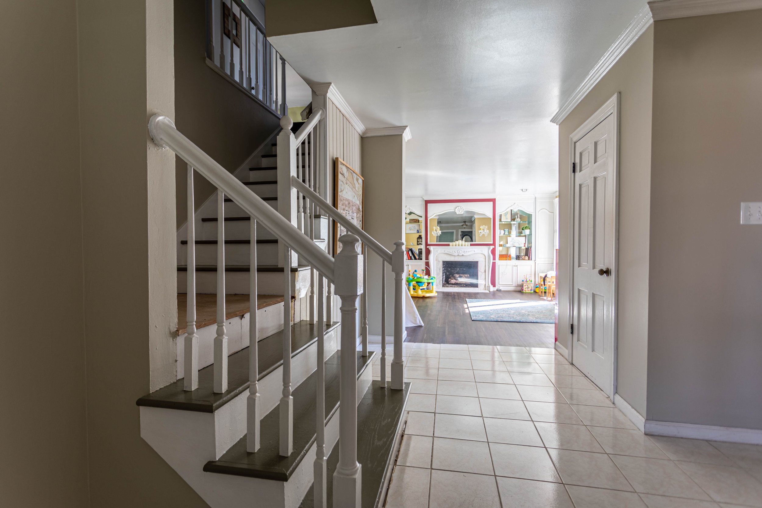
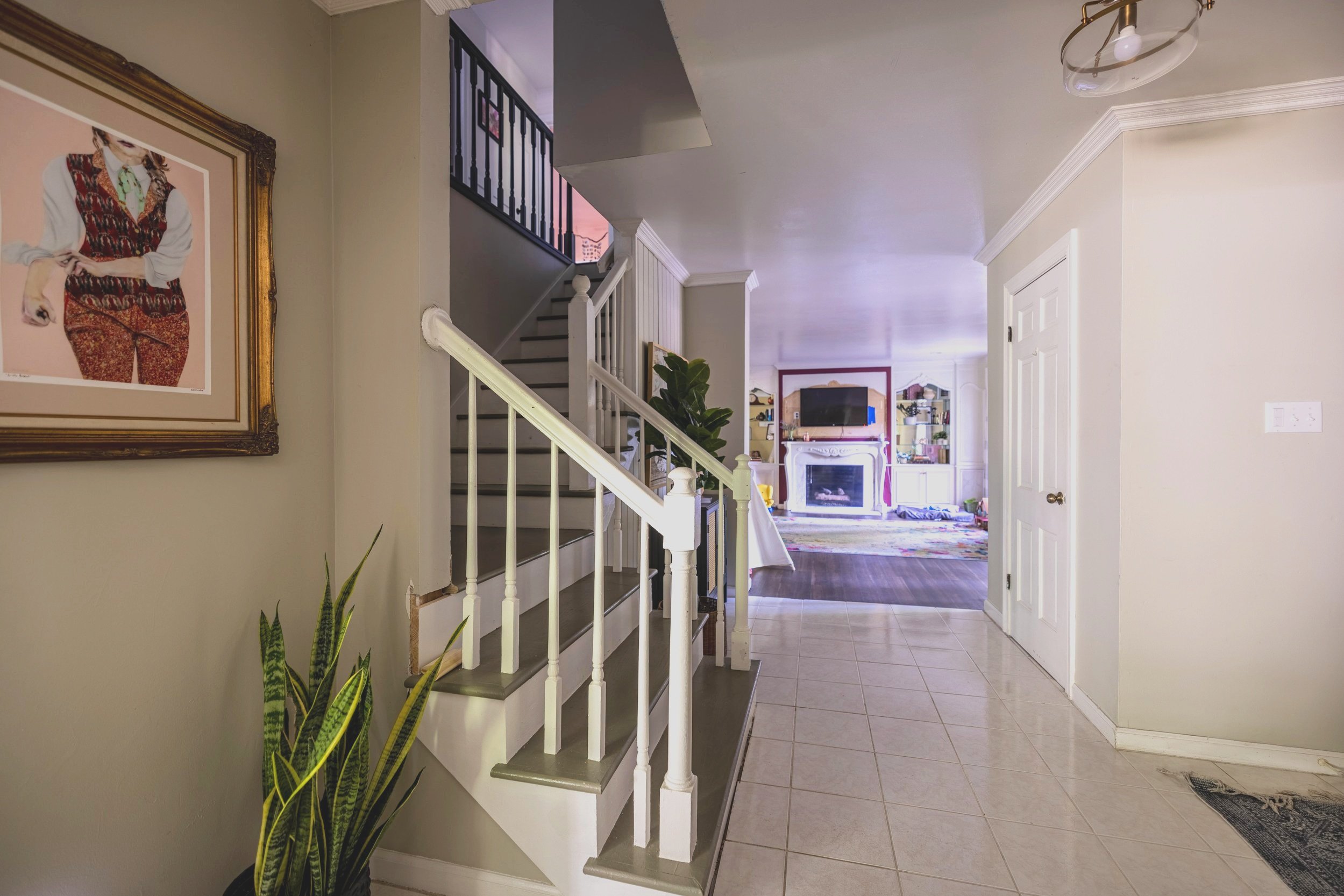
A few things have changed in the foyer since our last house tour - most notably, we opened up the doorway to the living room, which added SO much more light to this space. It’s still darker than I prefer. We have plans to upgrade the solid front door to a glass door down the road, but I think that might actually turn into an entire foyer overhaul.
I also still have plans to paint the railing and the stairs black and add a runner. Oh, and replace the flooring throughout the entire downstairs so it’s cohesive. You know, just a few things.
Related: Painting Our Stairs / Do Painted Stairs Actually Hold Up?
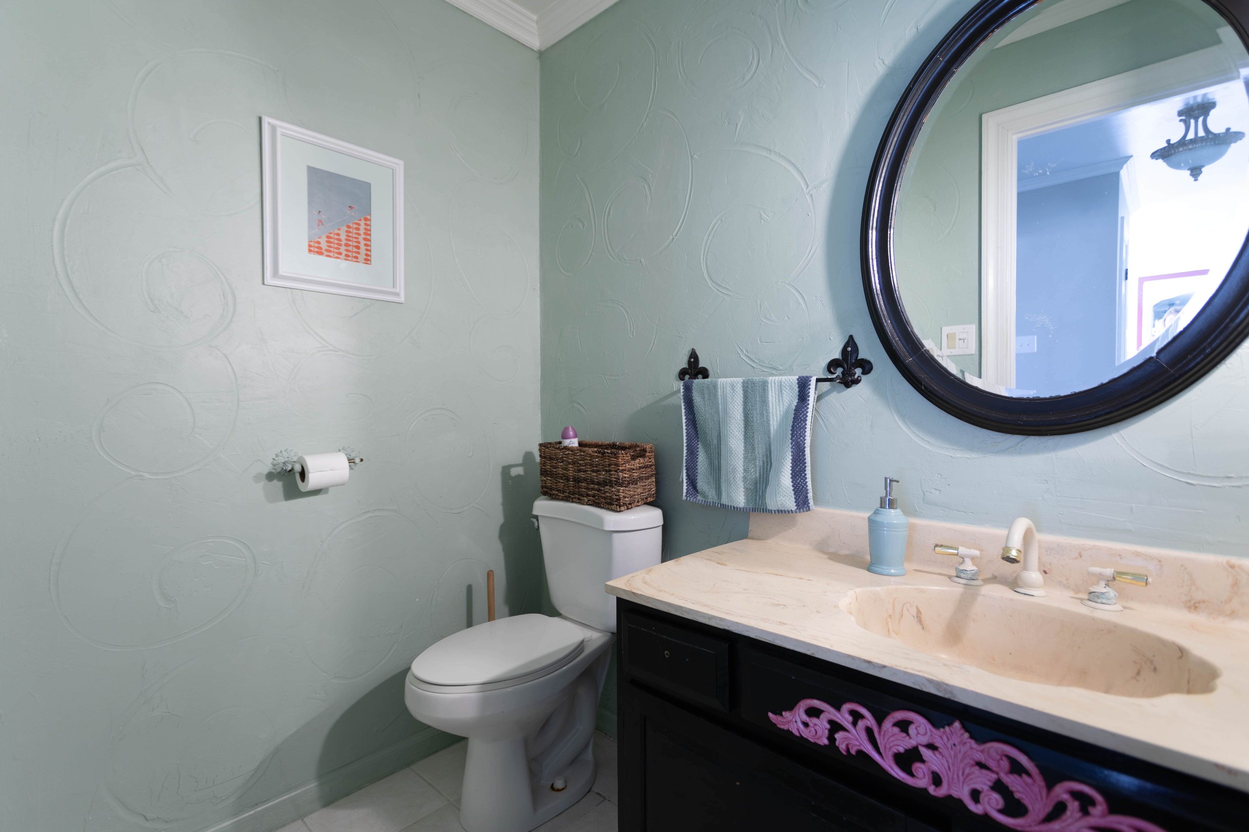
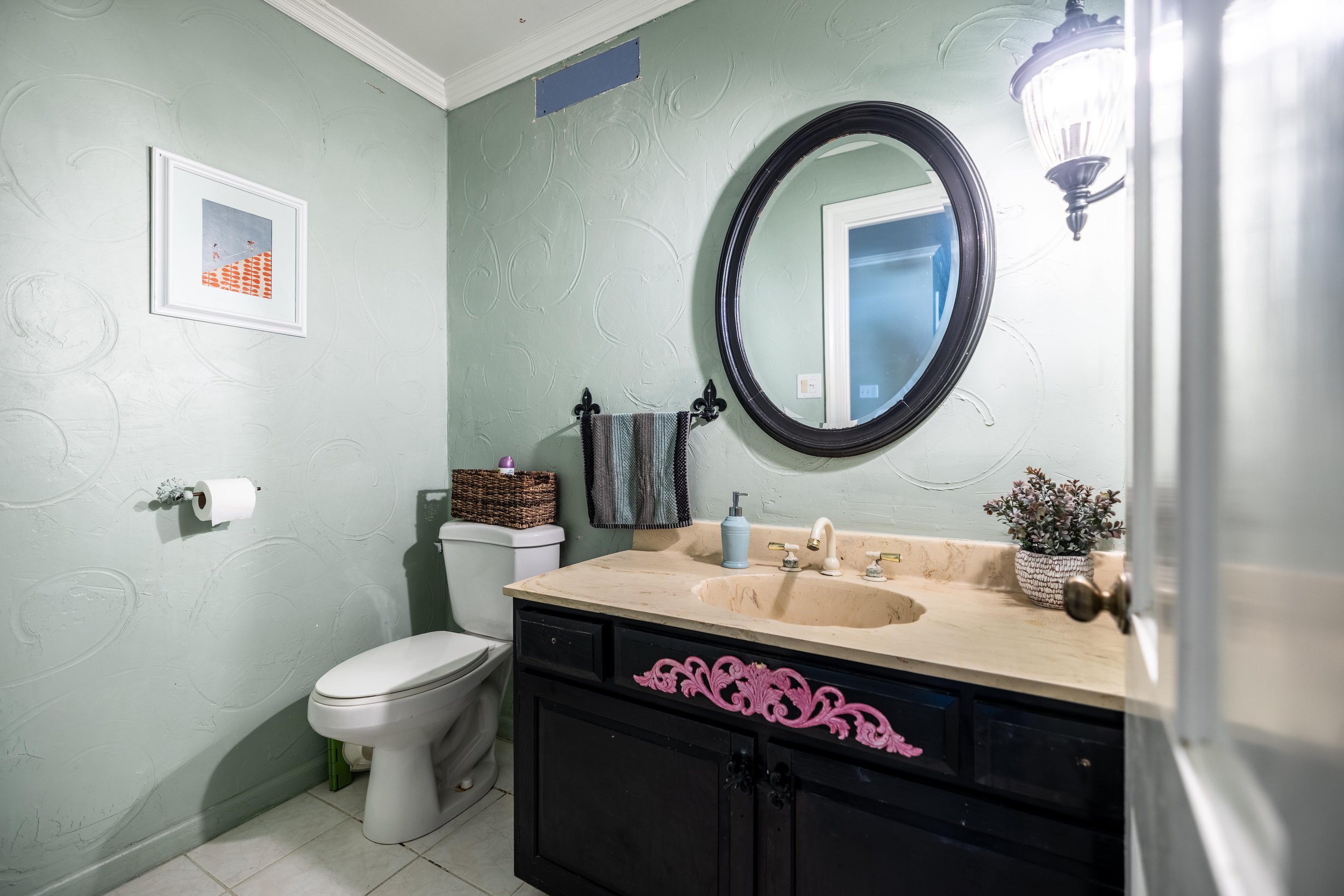
The Half Bath
You’ll notice a theme in this house that while some rooms look wildly different, others look exactly the same, or worse than when we moved in. The half bath off the foyer is no exception. Aside from a few pieces of drywall we had to cut out to reach the plumbing during our master bathroom remodel, this room hasn’t changed one bit.
While I have a design mocked up and am ITCHING to get my hands on this room, I’m impatiently holding off until we finish up the various other projects we have in flight.
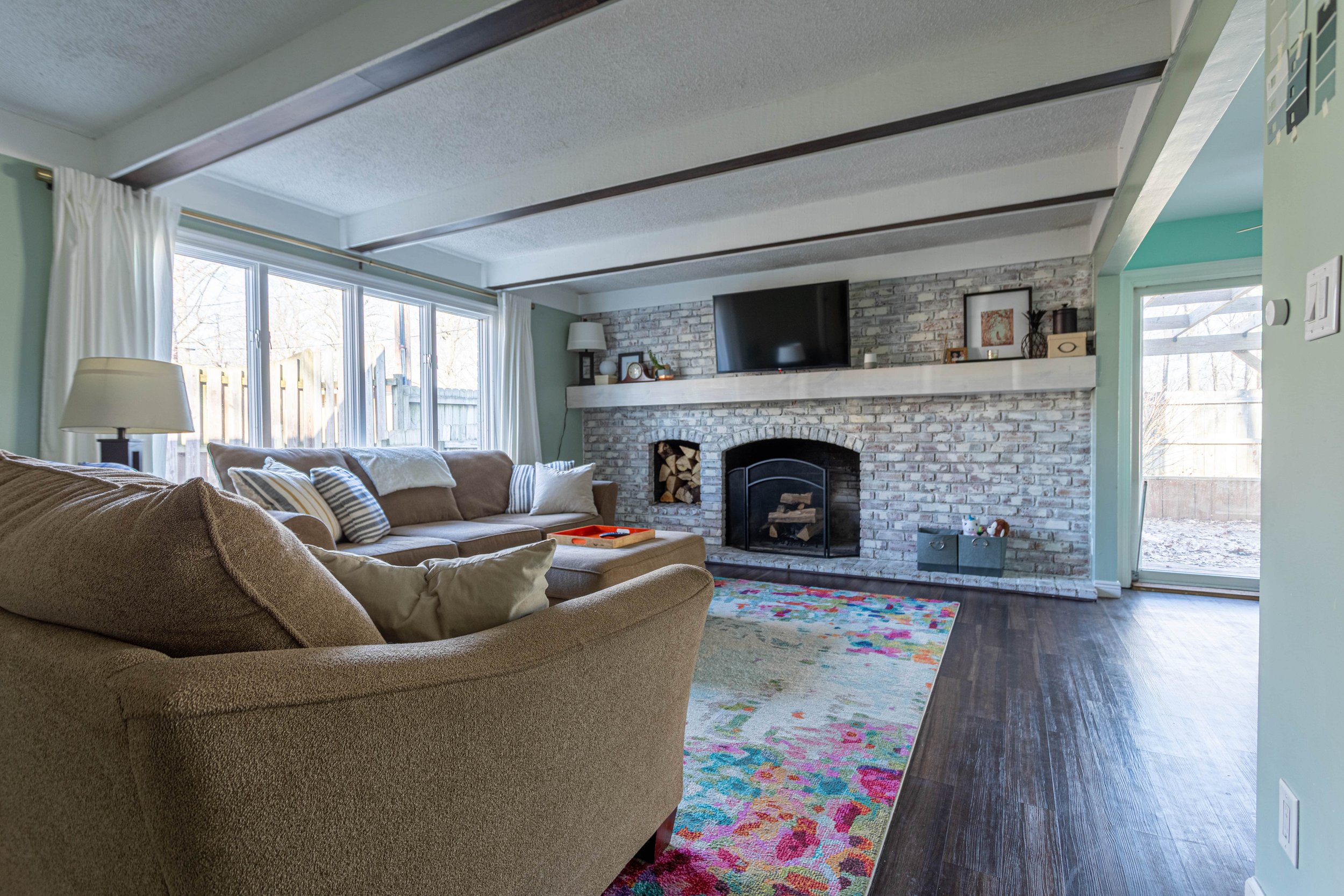
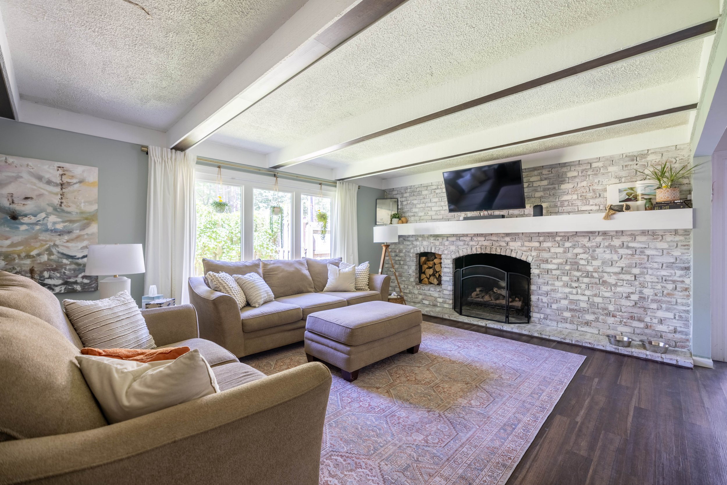
The Living Room
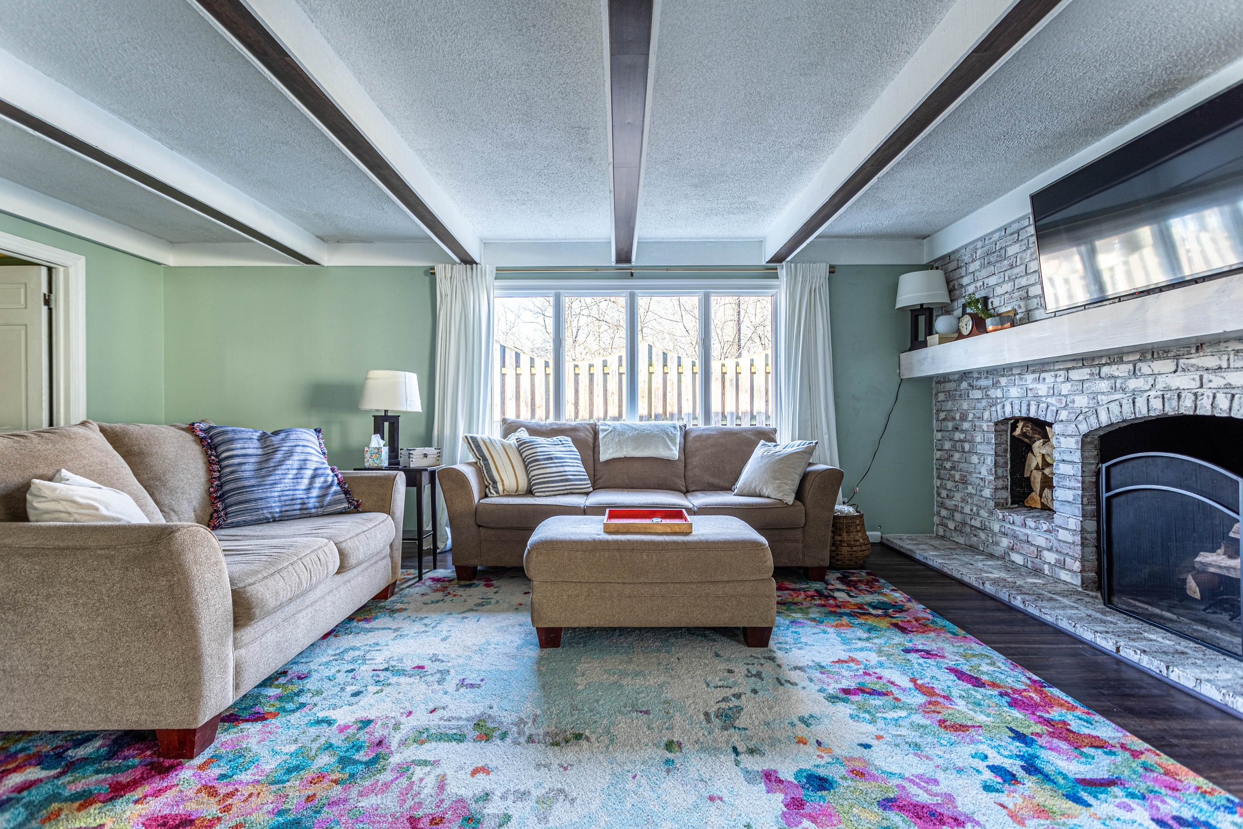
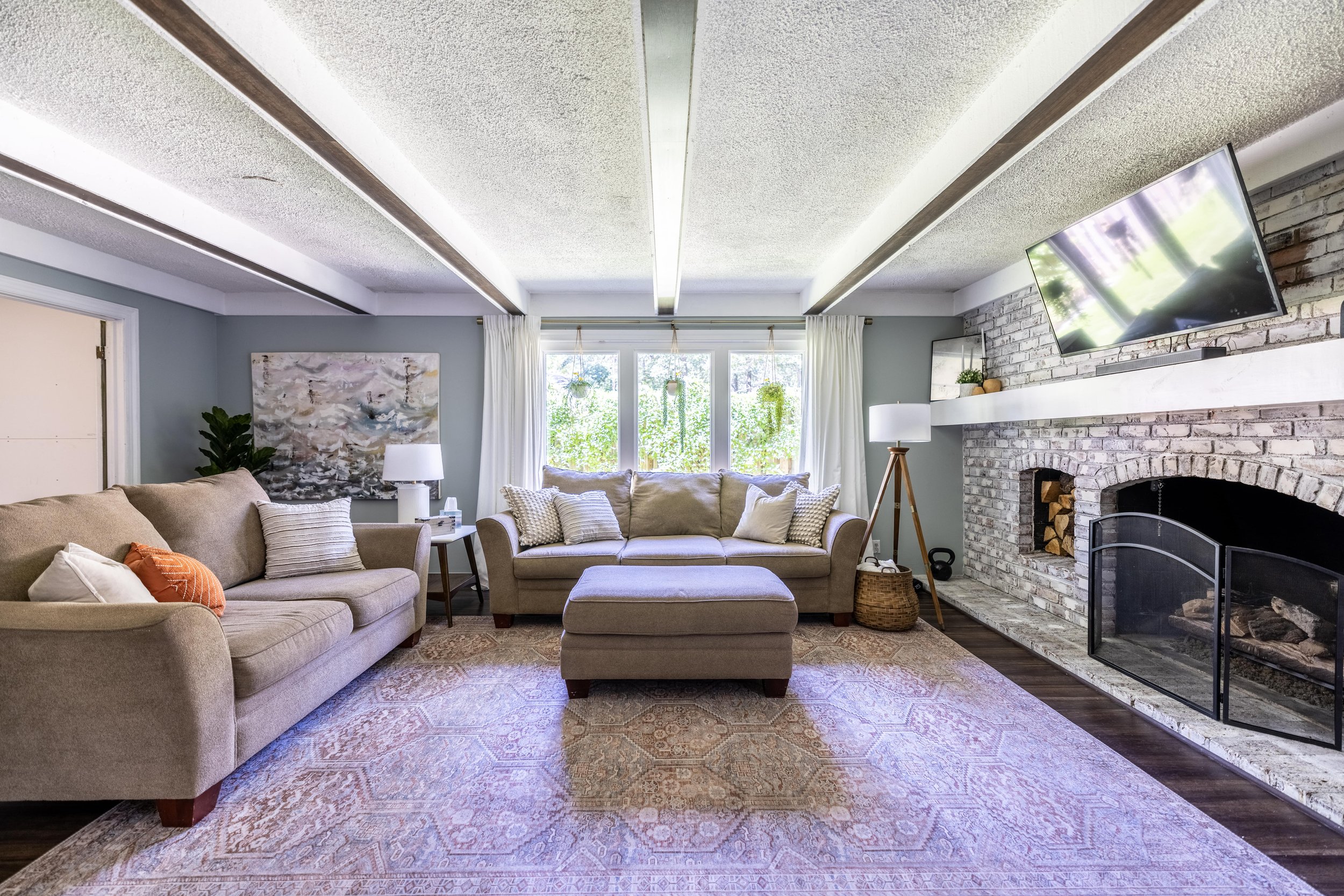
The living room has undergone slight changes over the last couple of years, like swapping out some decor, repainting, and greatly improving the view out the windows.
While I’d love to replace the couches and remove the textured ceiling, those items are low on our list compared to everything else we still want to tackle in this house. Besides, when it comes to kids, these couches have been close to impenetrable, so I’m a little hesitant to replace them until the kids are older.
Related Posts: How to Assemble a Gallery Wall in 4 Steps
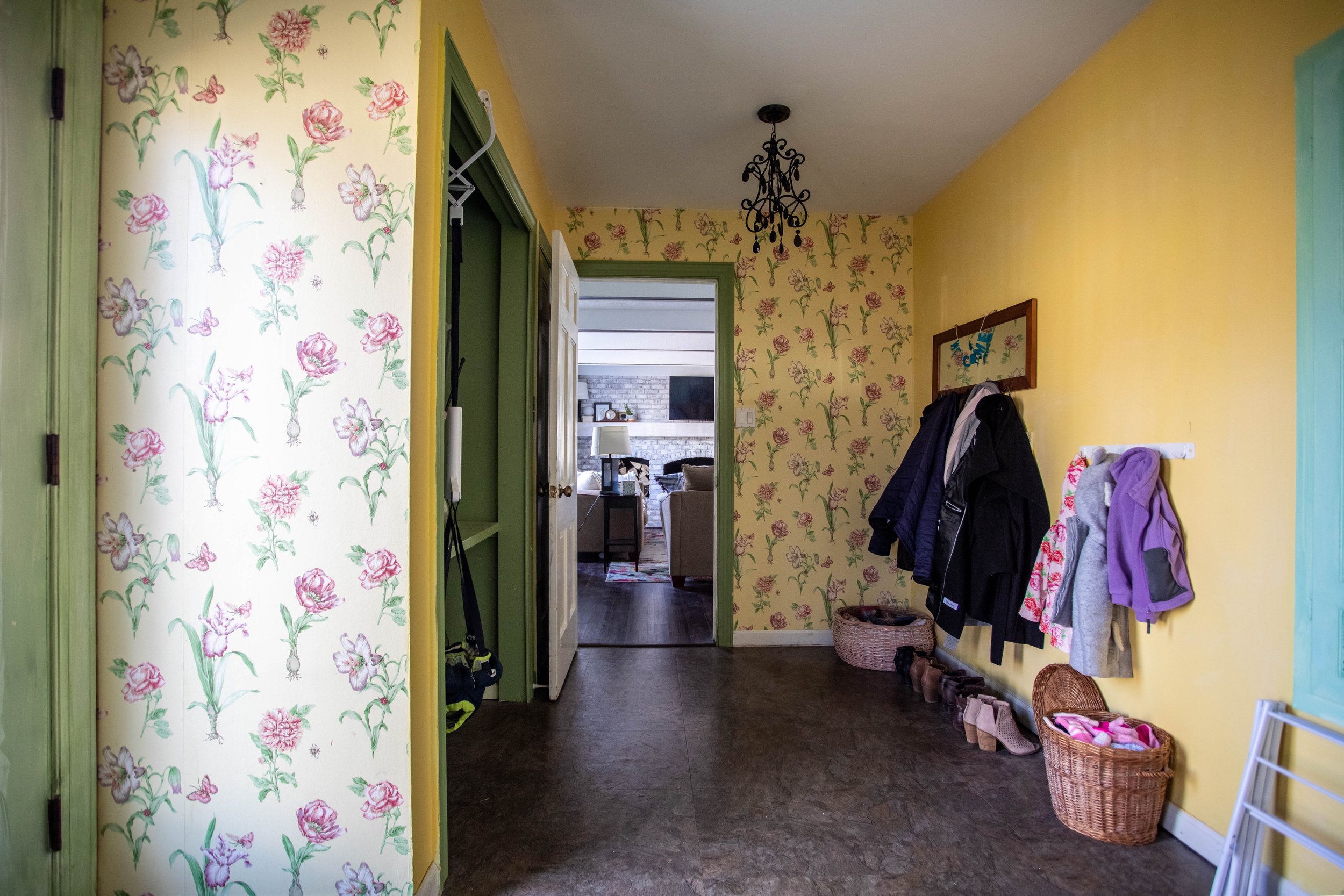
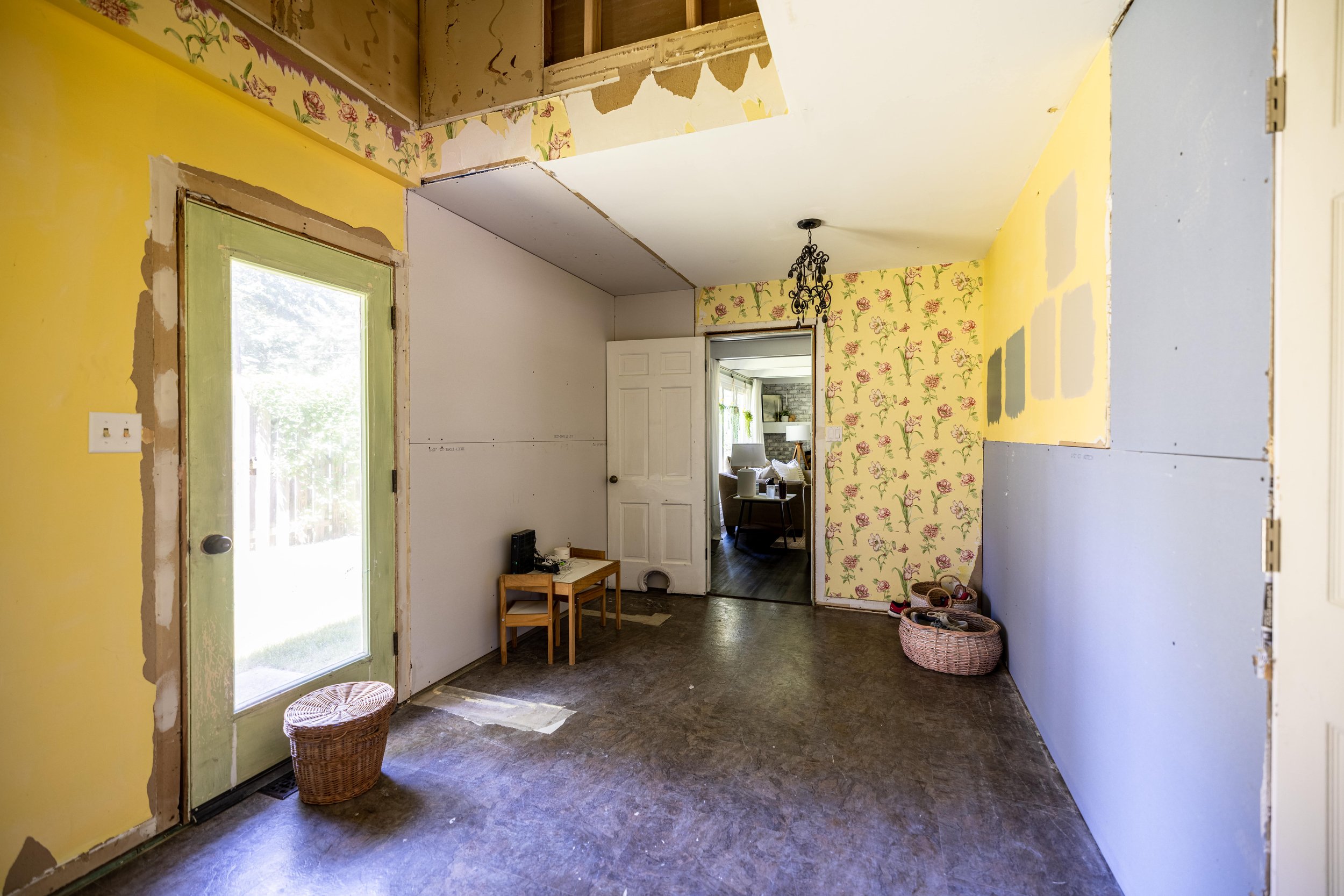
The Mudroom
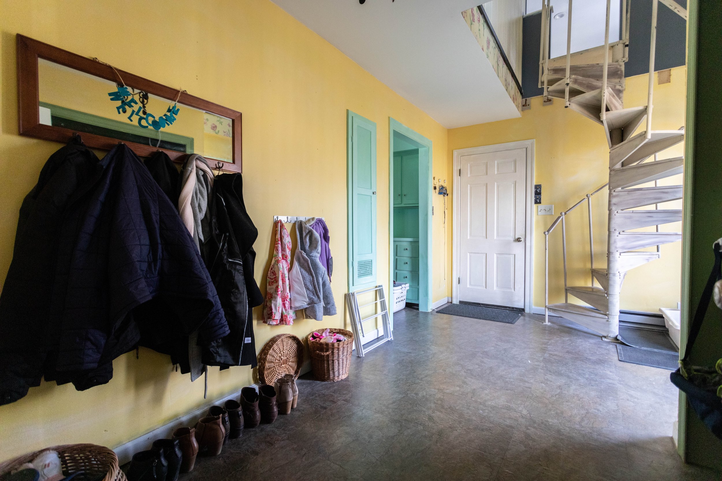
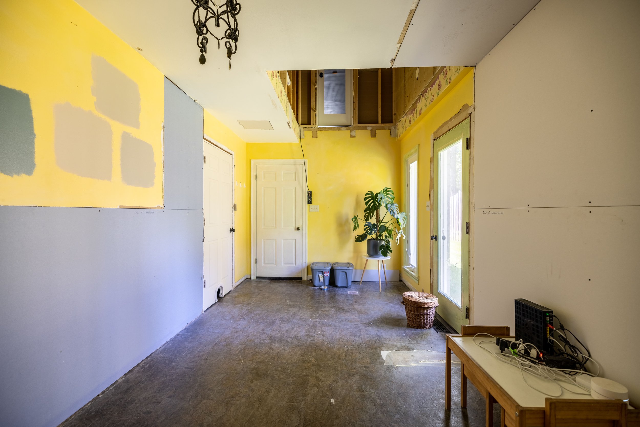
Oh boy, the lovingly nicknamed “Frankenstein” room of the house. This room undoubtedly looks worse than it did during our last house tour - but for good reason!
What we’ve realized is that typically when renovating one room, the surrounding rooms tend to take a hit. In this case, the mudroom room took a BIG hit when we renovated our master bathroom, master bedroom, and loft. Project creep is real, y’all.
Not to mention that we recently removed the two closets in this room because we have ideas for what this room will look like long-term - but I’m not ready to share them just yet!
Oh, but don’t worry, those plans DO include adding the spiral staircase back in. (And I feel that I should mention the door at the top of where the staircase once was is locked from this side so no one can accidentally fall out of there.)
The Kitchen
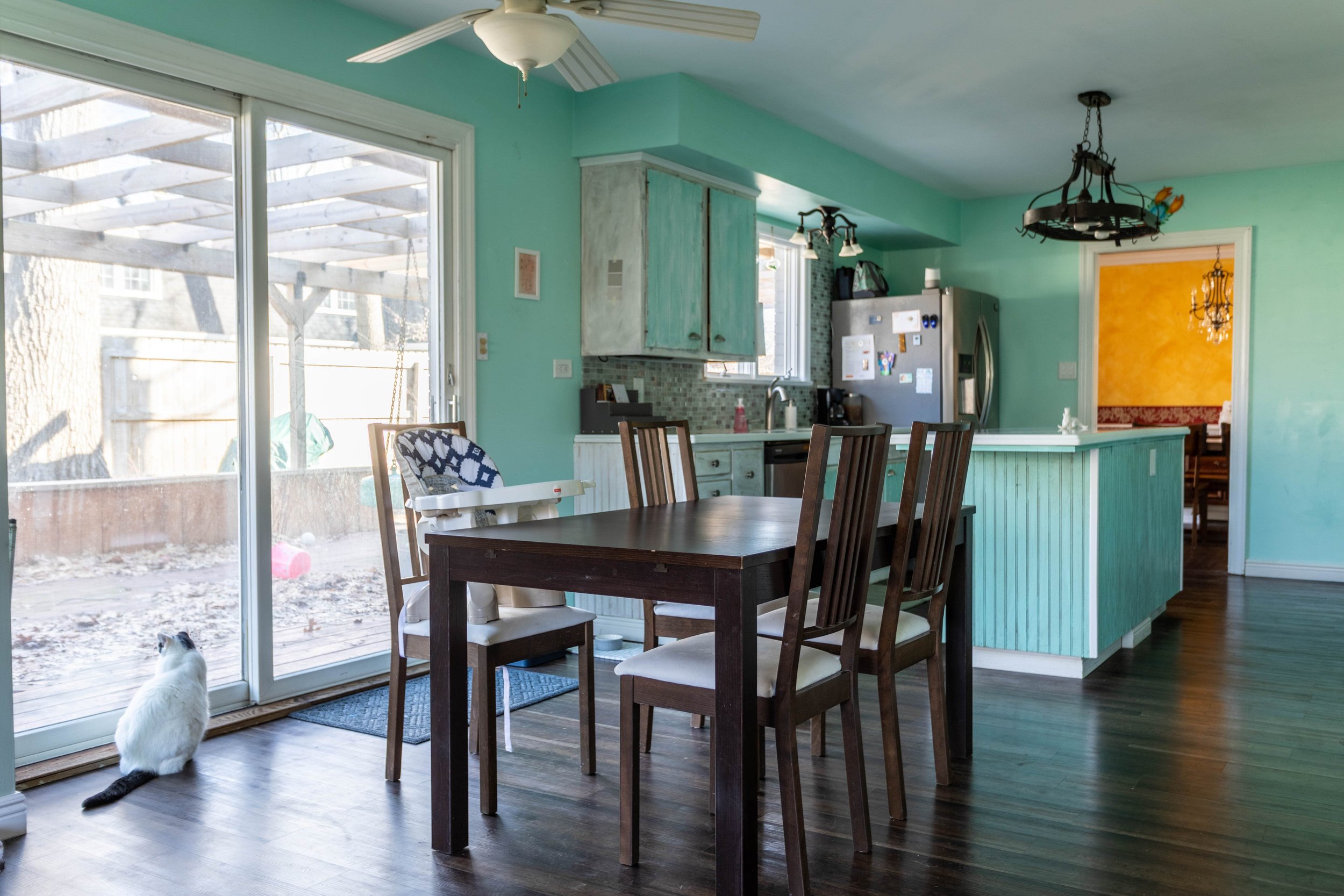
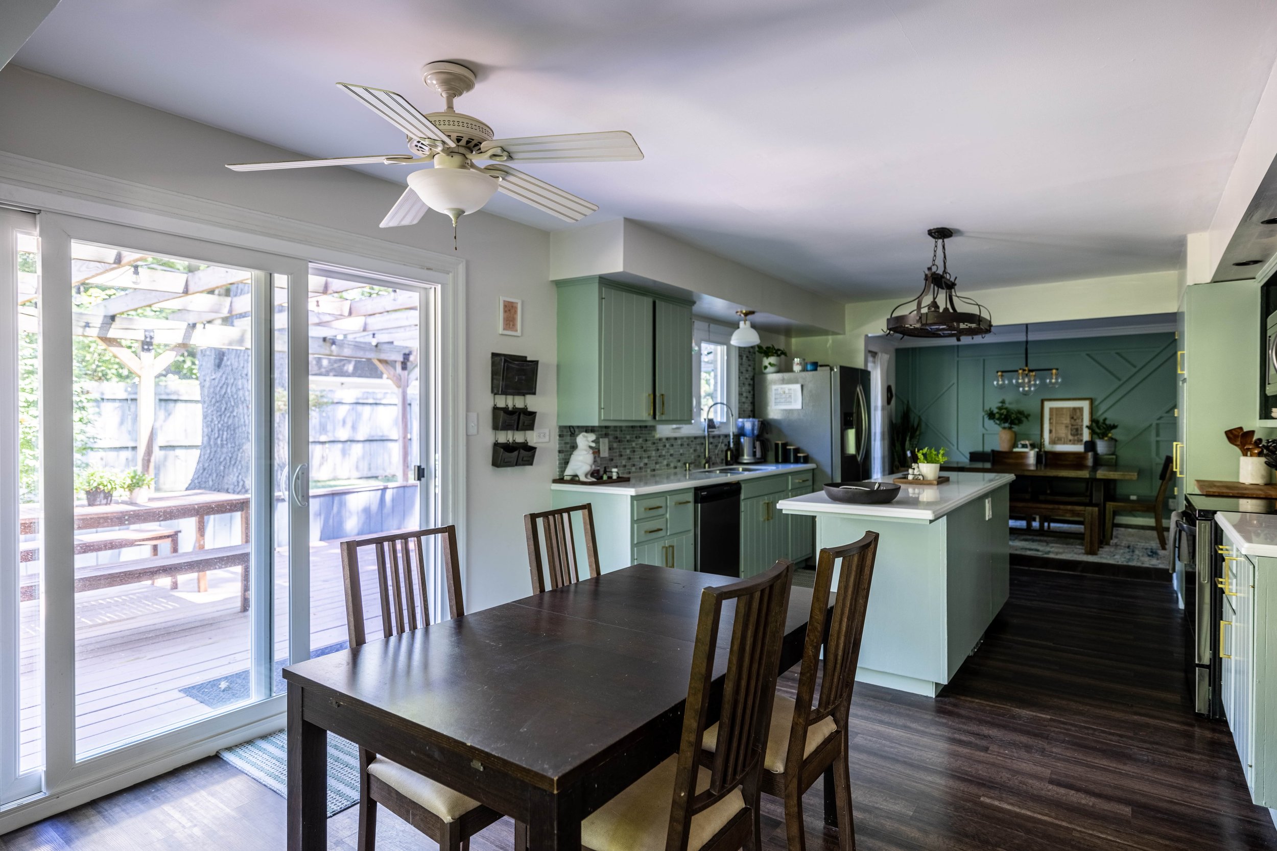
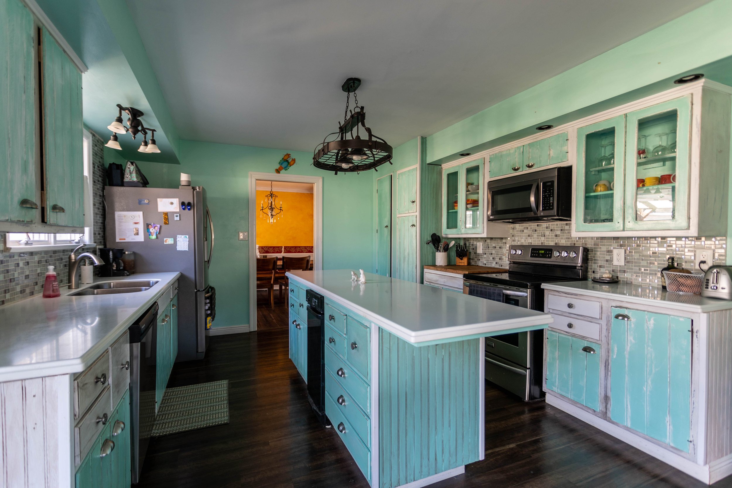
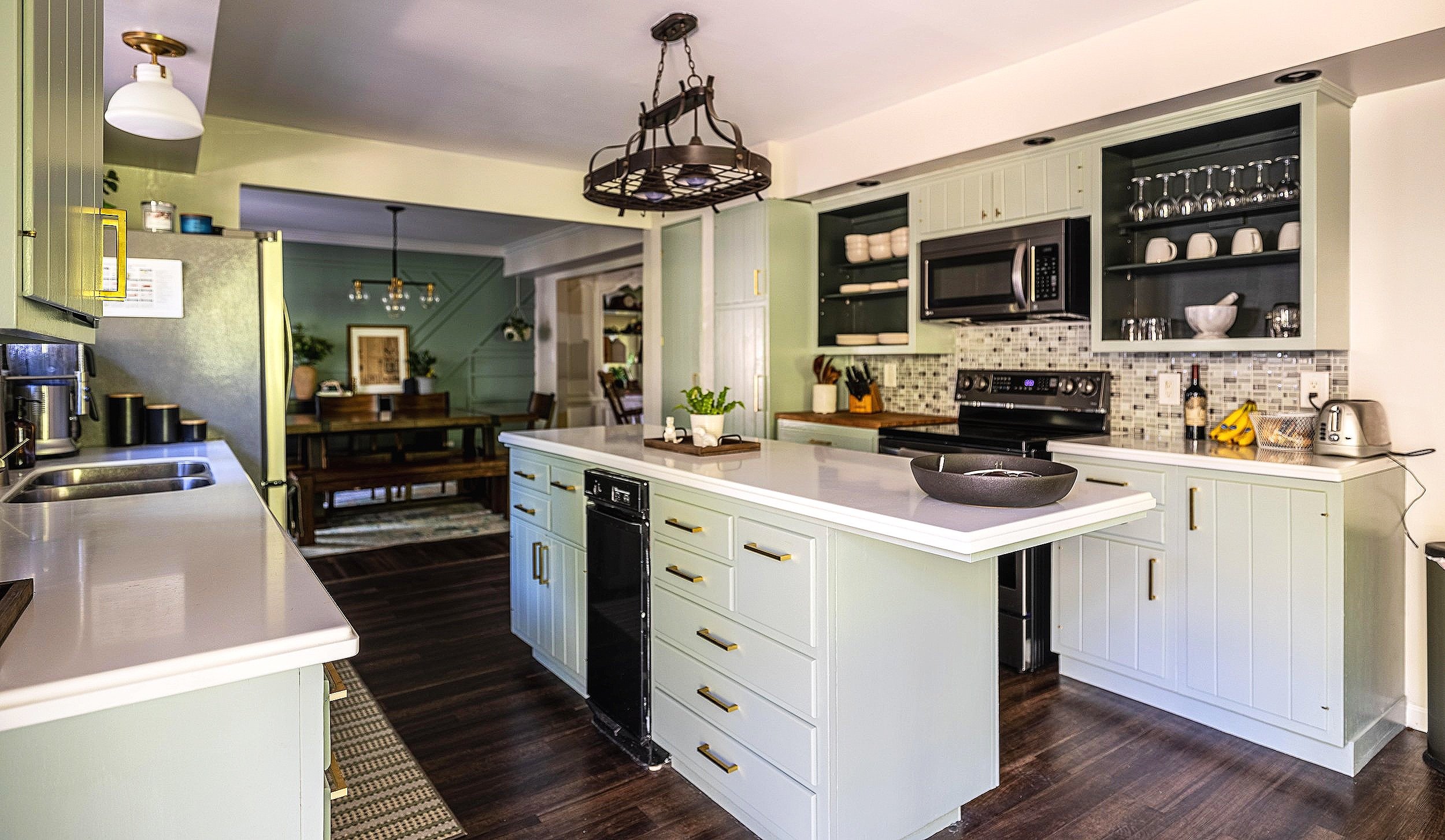
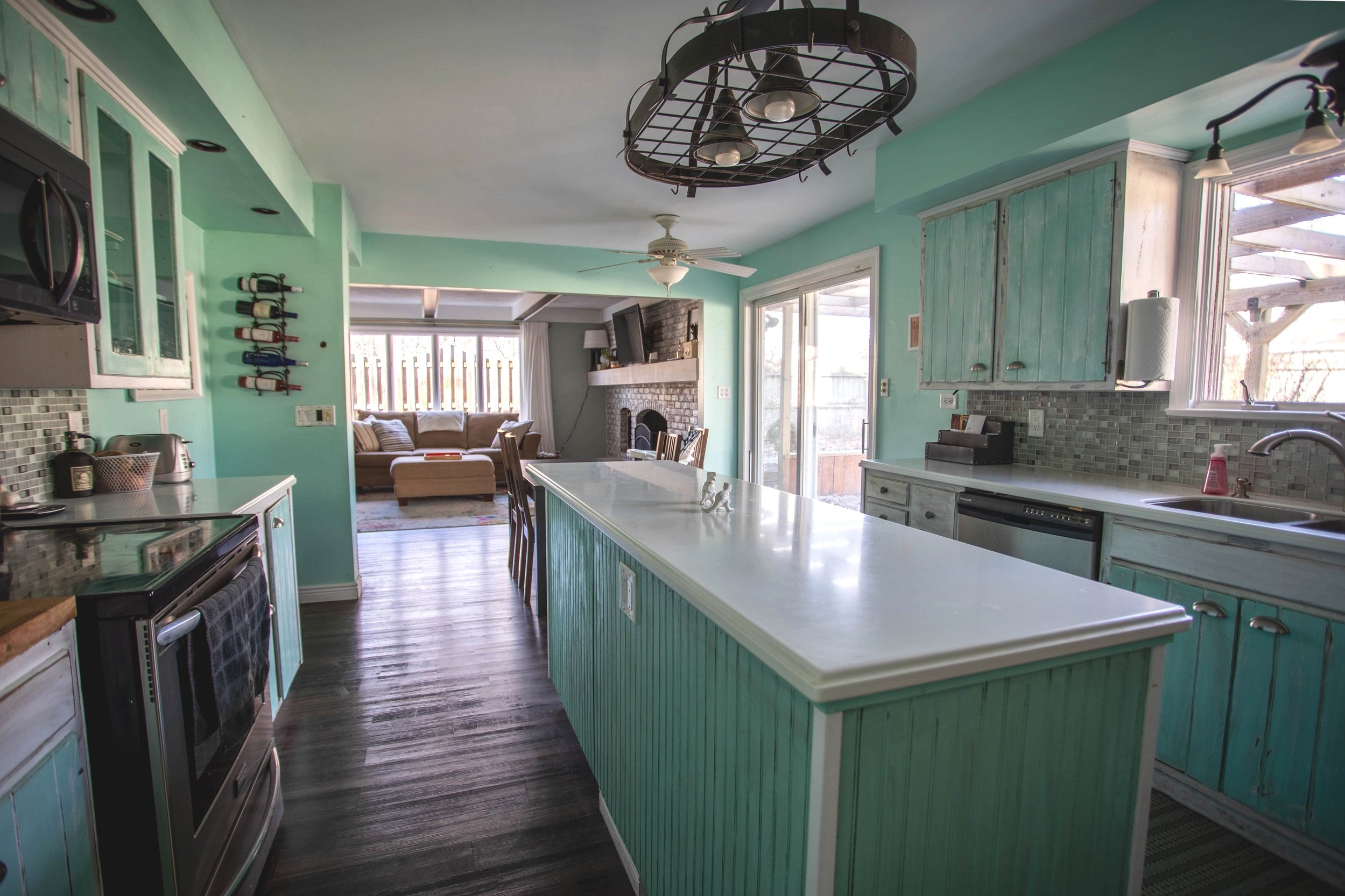
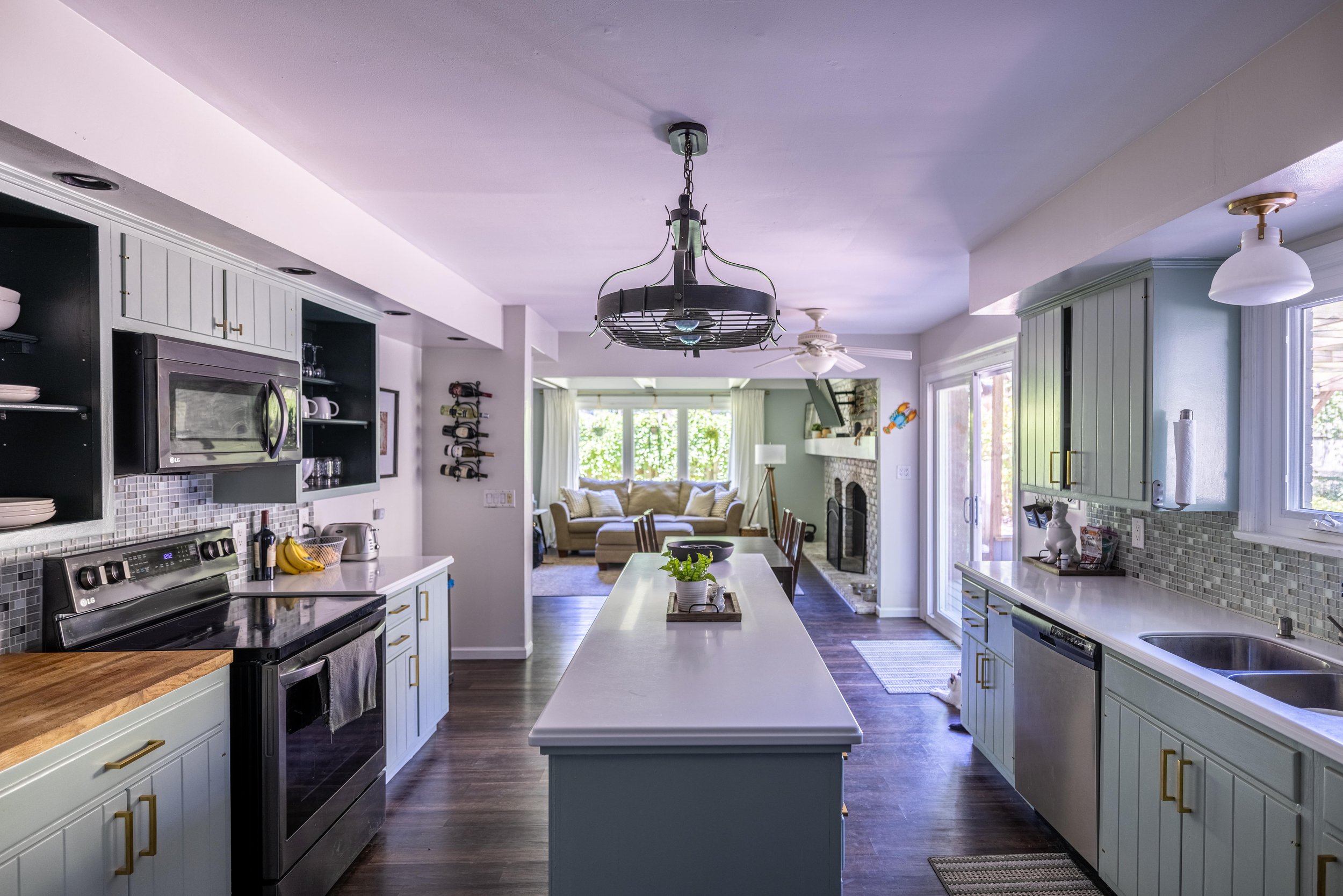
Unlike the mudroom, the kitchen has seen a little improvement over the last couple of years that can simply be attributed to the power of paint! And new hardware.
I shared a post a while back about the green cabinet trend I was noticing and I hopped right on it! I actually painted the cabinets (and walls) about two years ago and NEVER shared the tutorial. That being said, I wrote a new tutorial when I painted the laundry room cabinets recently.
Obviously, opening up the doorway to the dining room was a huge improvement to this space. But aside from that, we haven’t done any construction in the kitchen area.
While this is the best layout I’ve ever had in a kitchen, it still has its faults. The magical “kitchen triangle” was poorly thought out, and we do laps around the island while cooking. Plus, I hate that you can see the trash cans.
If we stay here long-term, we’ll likely gut this space and start from scratch. In the meantime, I’d be happy swapping out the light over the island and centering (and replacing) the fan over the eat-in kitchen area.
Related: Green Kitchen Cabinet Inspiration
The Dining Room
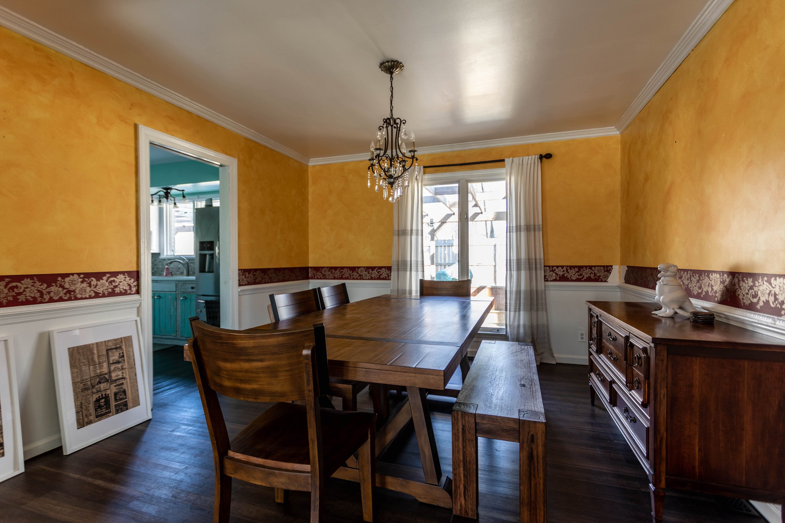
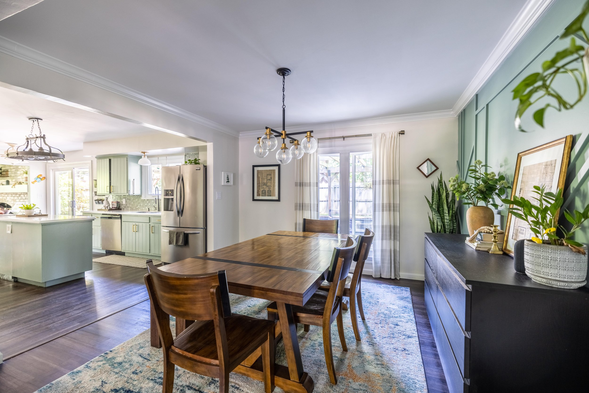
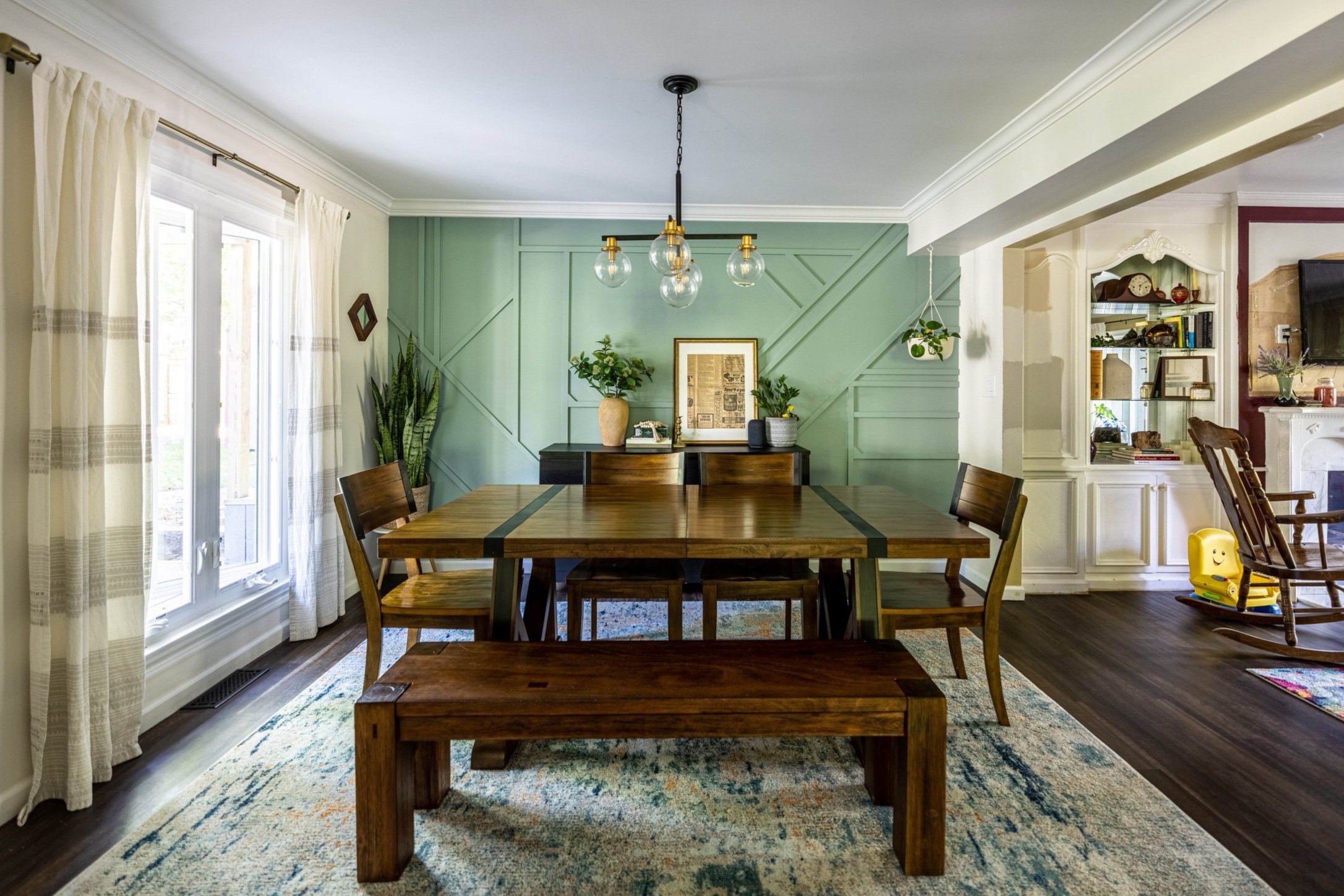
The dining room has seen the biggest change out of any room on the first floor of our house.
I couldn’t wait to tackle this room when we moved in, so we hit it really early on, and it was absolutely worth all the painstaking effort. The accent wall was even featured on The Spruce, which was so.freakin’.cool!
Related: Dining Room Renovation Kick-Off / Dining Room Renovation Progress / Dining Room Mood Boards / DIY Geometric Wood Accent Wall / Modern Dining Room Reveal
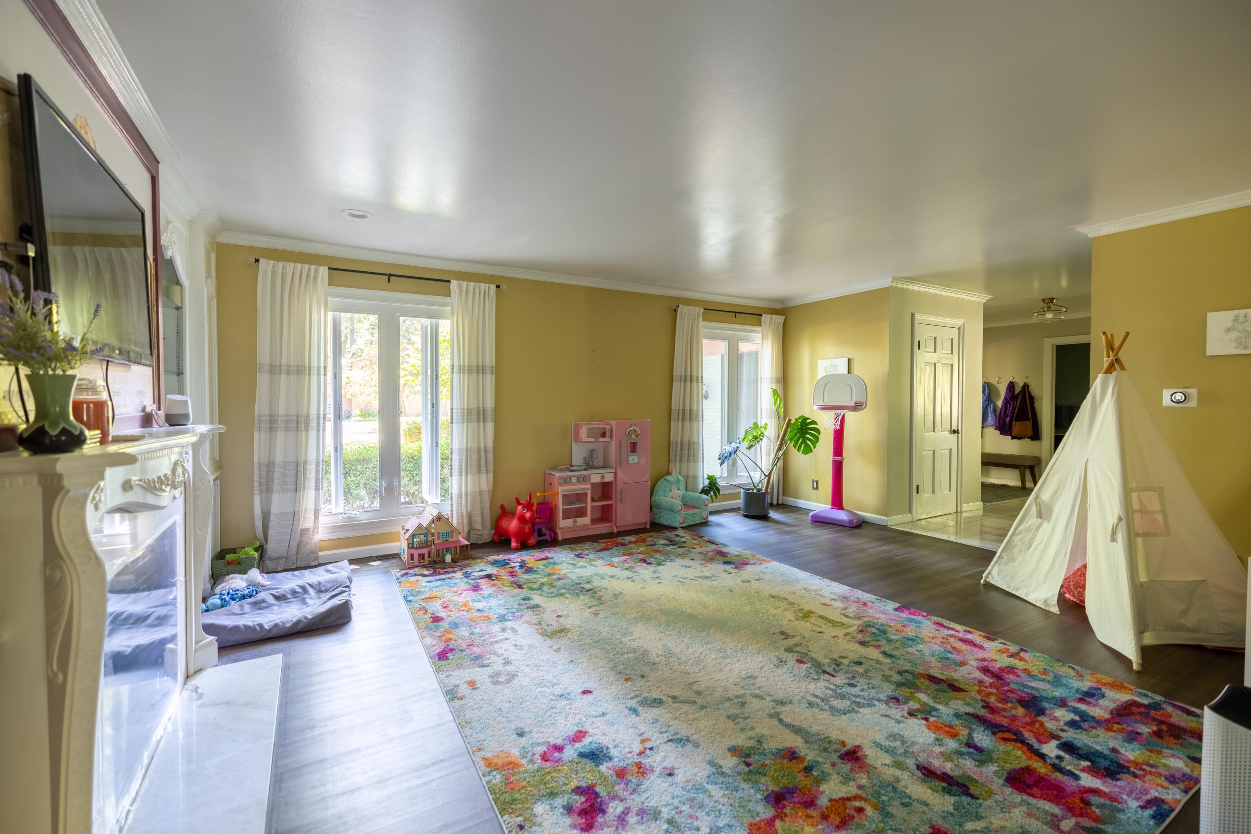
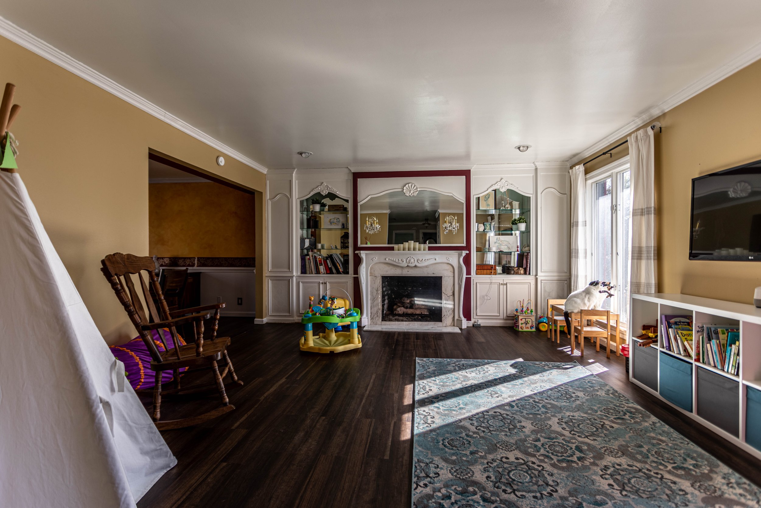
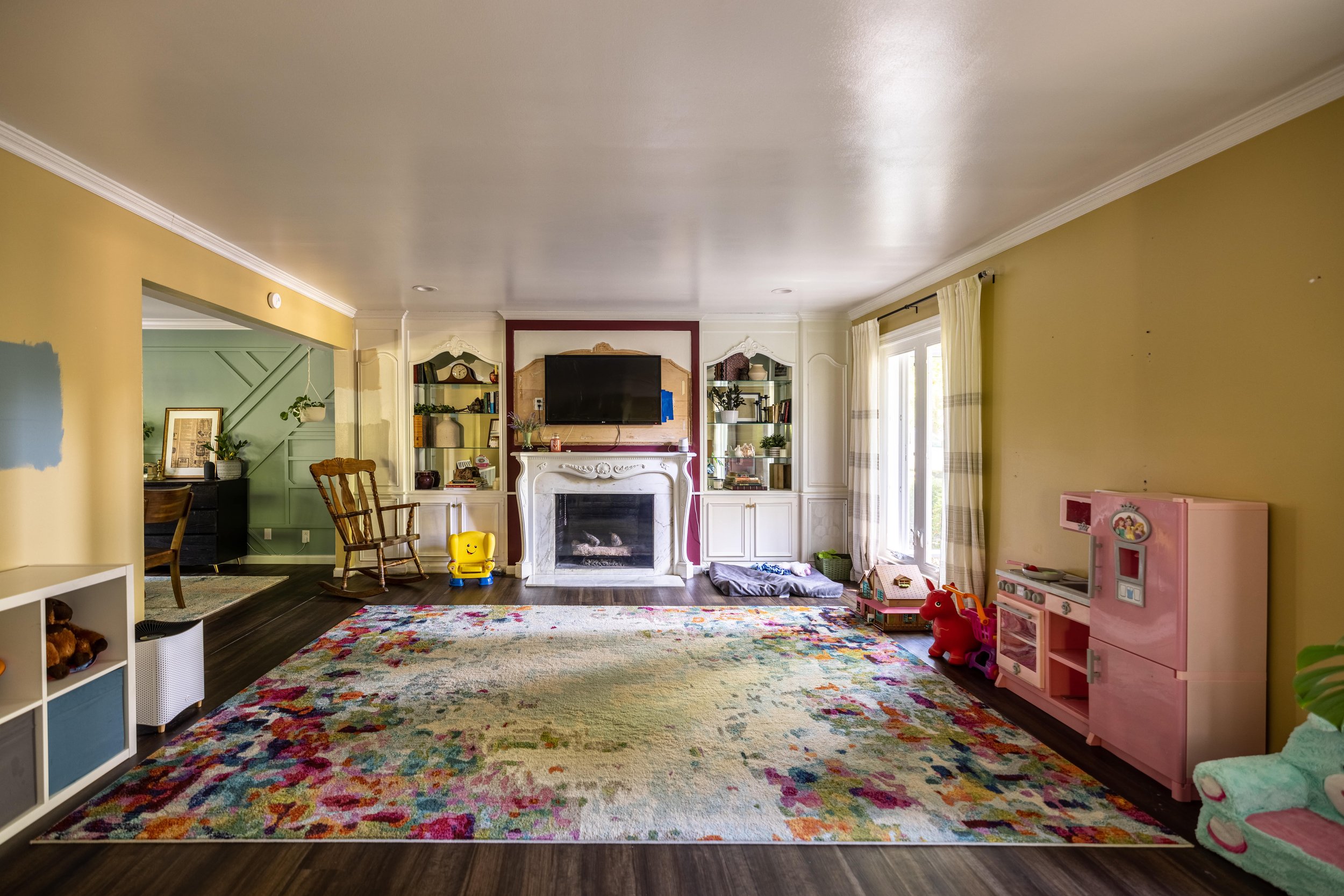
The Playroom
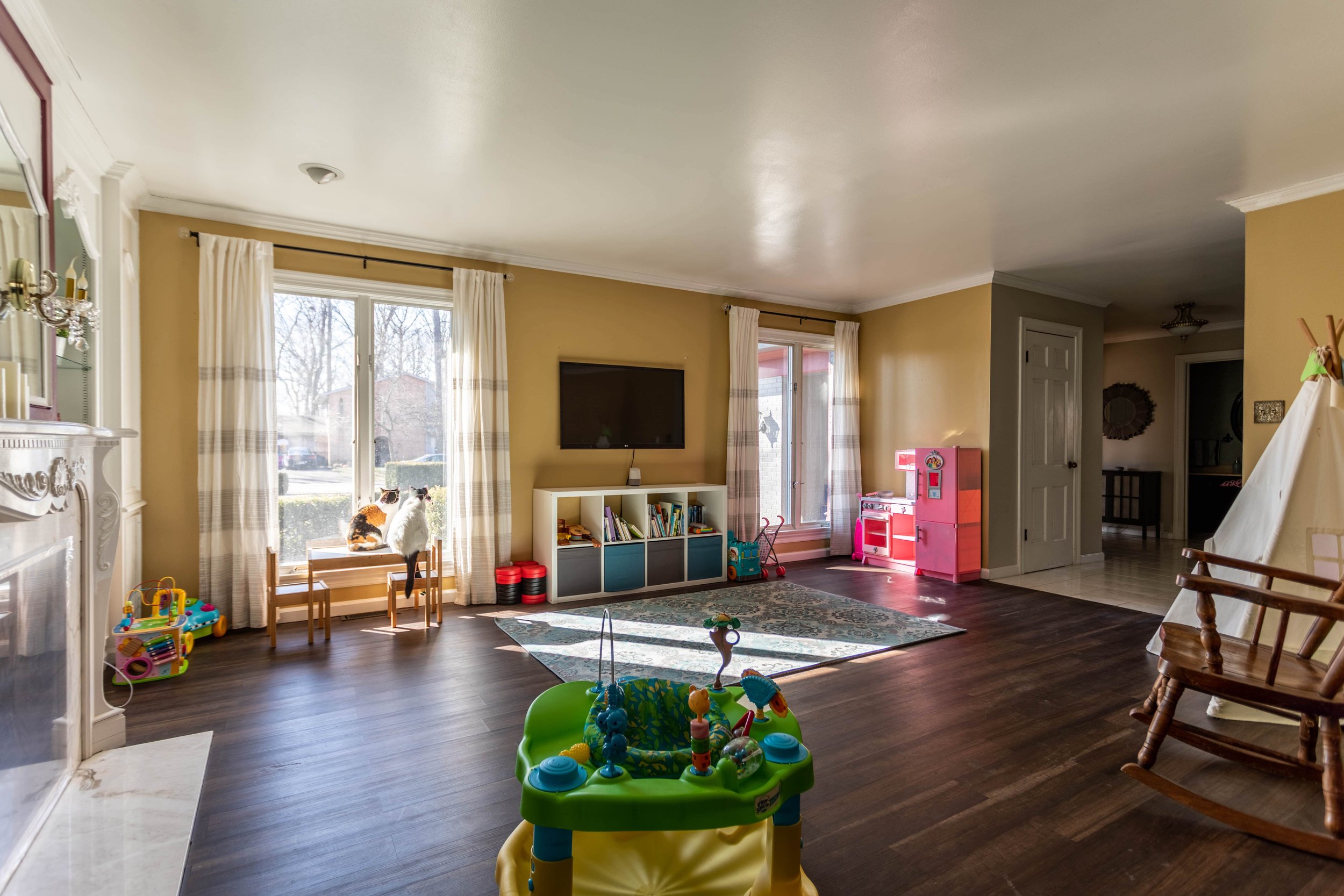
Ooof, this poor conundrum of a room.
We’ve put zero effort into updating this room so far. Other than holding the overflow of toys, it’s rarely used. Plus, the layout makes furniture placement really tricky, so we’ve honestly been kind of stuck with what to do with it.
But we’re starting to get inspiration! I have a good idea of what I’d like to do with the fireplace and bookshelves, and we’ve even brainstormed about maybe turning it into an office for me down the road. Speaking of which…
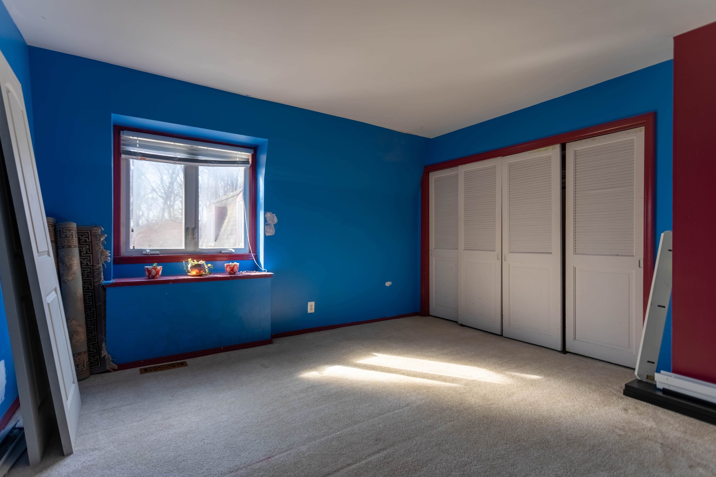
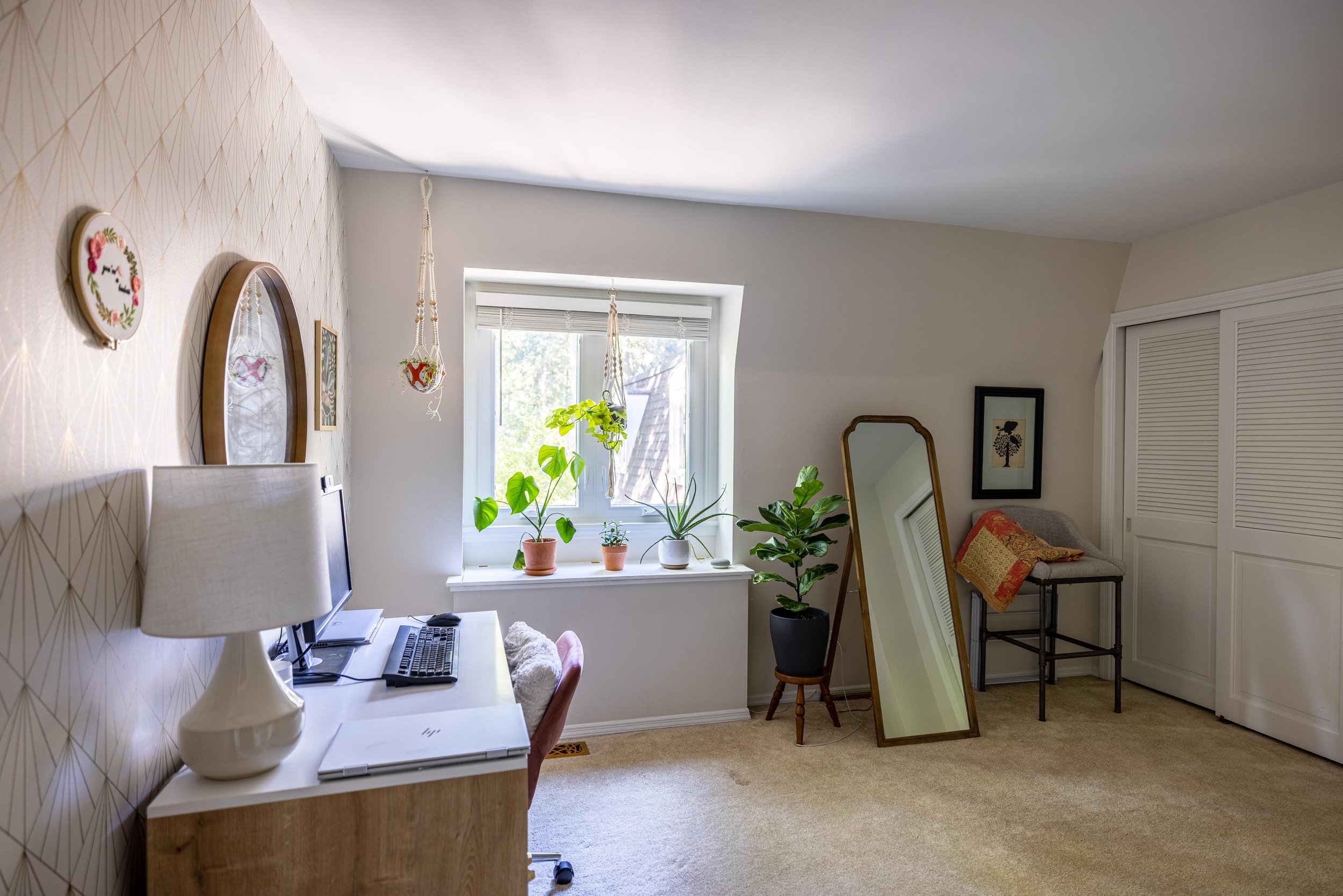
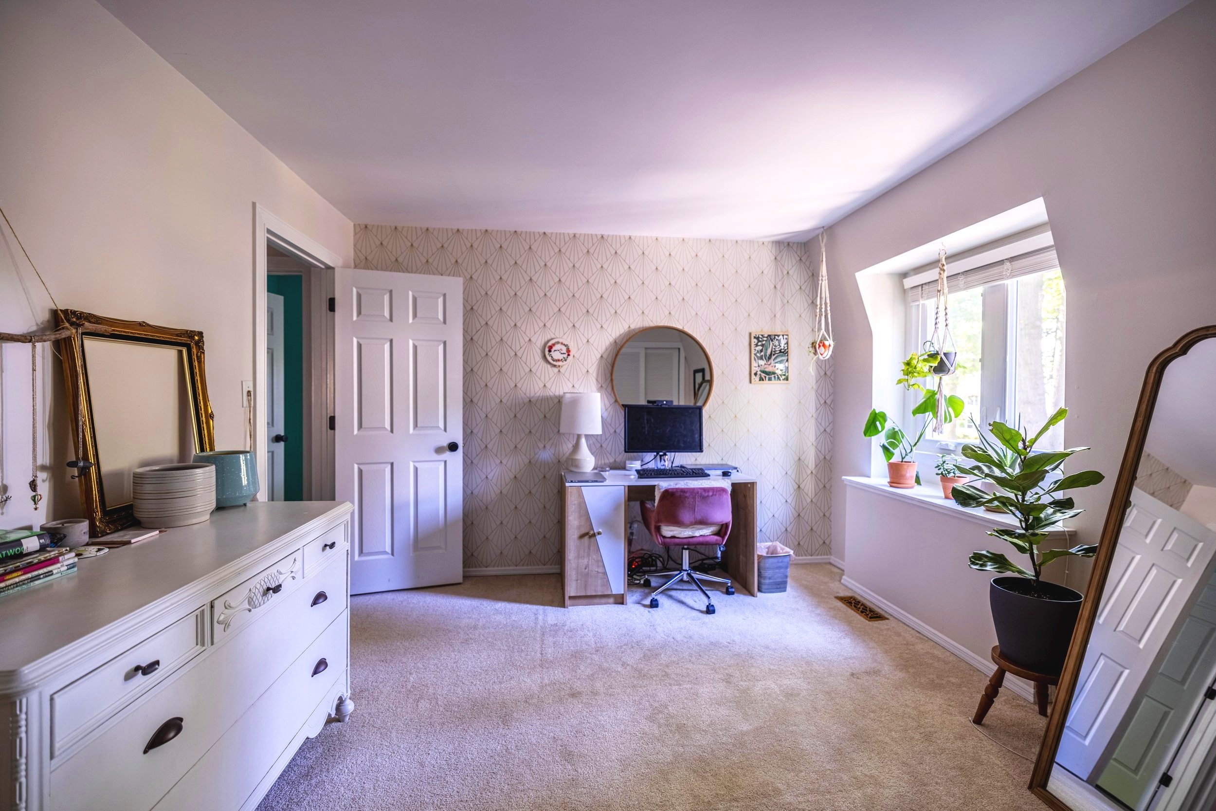
The Spare Room
Since we moved in, I’ve been using the spare bedroom as my home office/wardrobe.
While I really love this room (especially my DIY Sharpie Wall), I’d also like to have a dedicated guest bedroom for when friends and family stay with us. Or an extra place to sleep when Lucius’ snoring keeps me awake…
Besides, when we finally finish my walk-in closet in our bedroom, I’ll use this room less frequently.
Related Posts: Designing a Home Office / DIY Sharpie Wall Tutorial
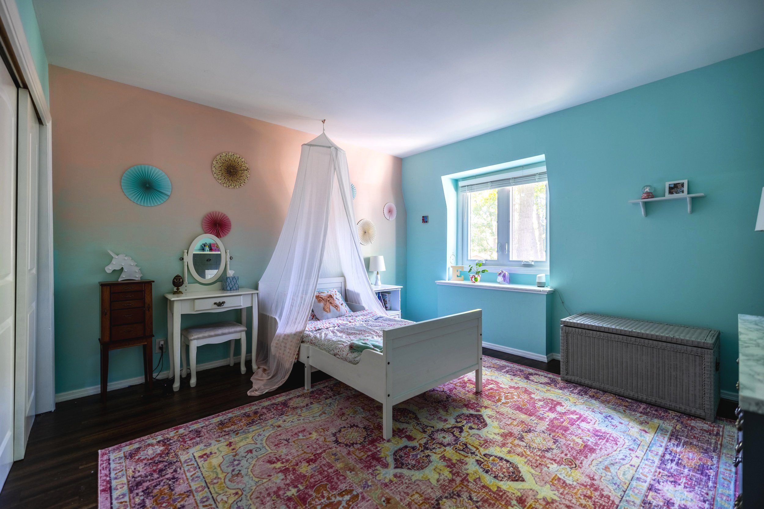
Our Oldest Daughter’s Bedroom
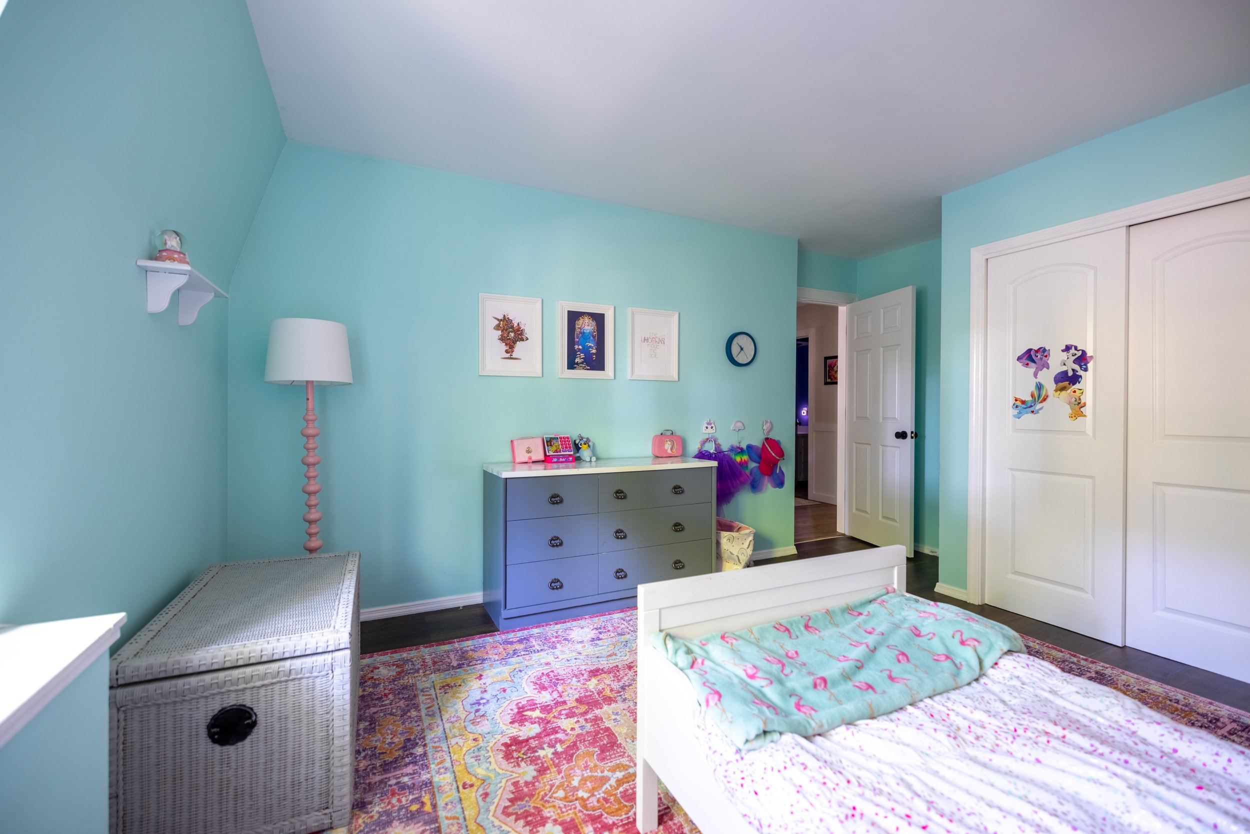
One of the first things I did when we moved into this house was tackle our oldest daughter’s bedroom to make this house feel comfortable for her right away. Aside from adding items here and there, not a lot has changed in this room since then.
Related Posts: Unicorn Room Makeover / Ombre Wall Tutorial
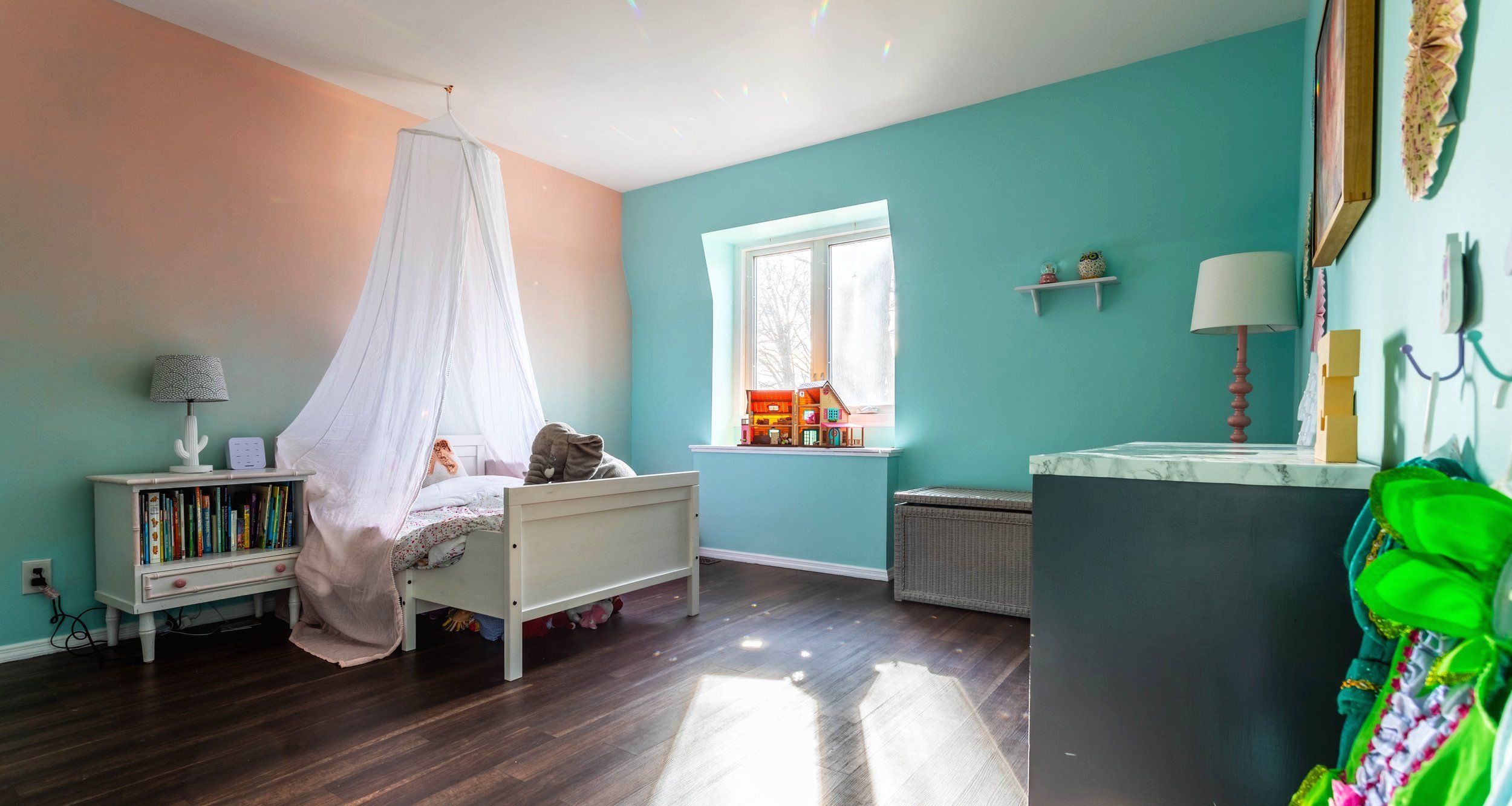
Our Youngest Daughter’s Room
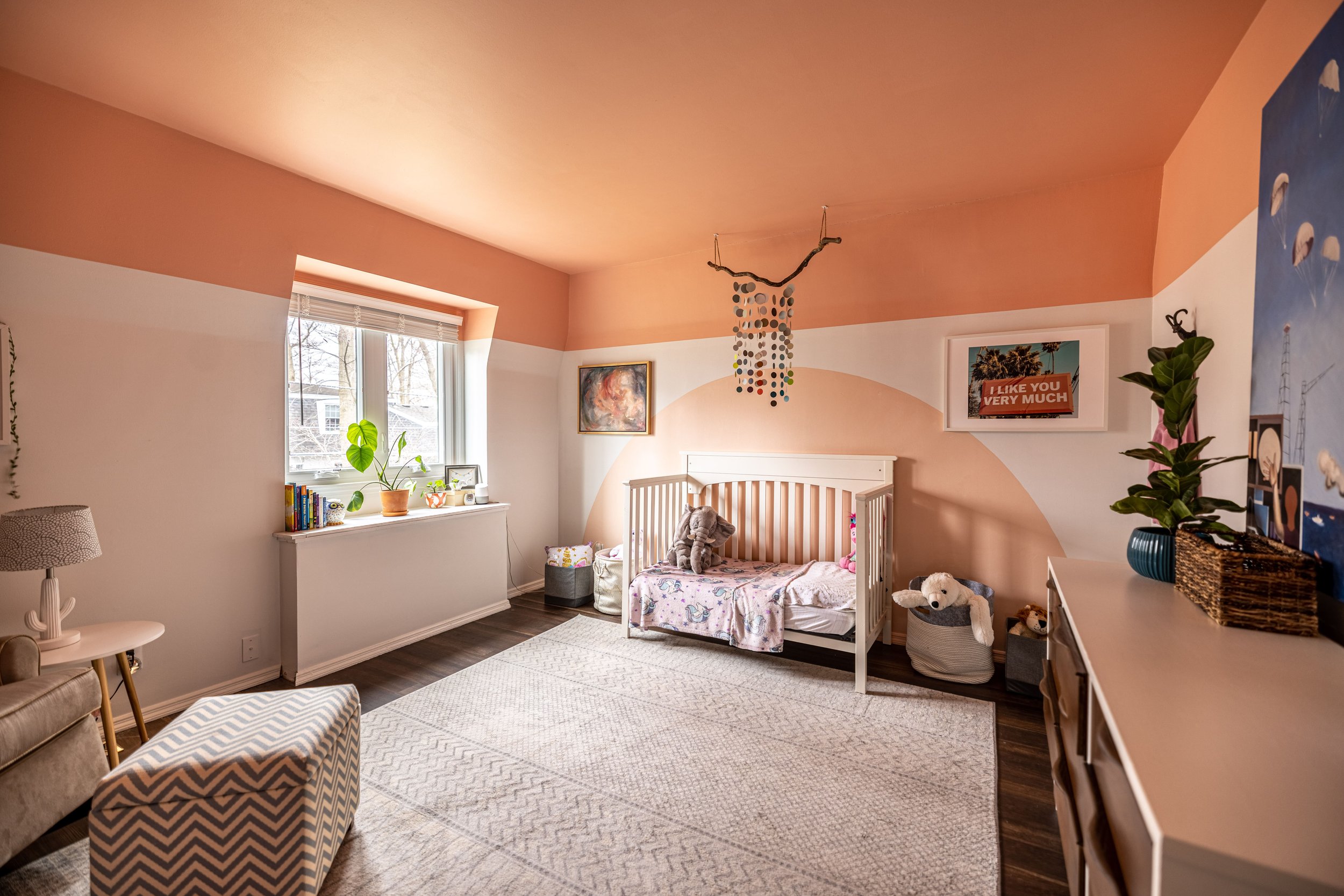
Last summer our younger daughter’s room (finally) got a makeover. At that time, I shared a big ‘ol blog post, but here’s a before/after shot anyway…
Related Posts: Toddler Bedroom Makeover
The Master Bedroom
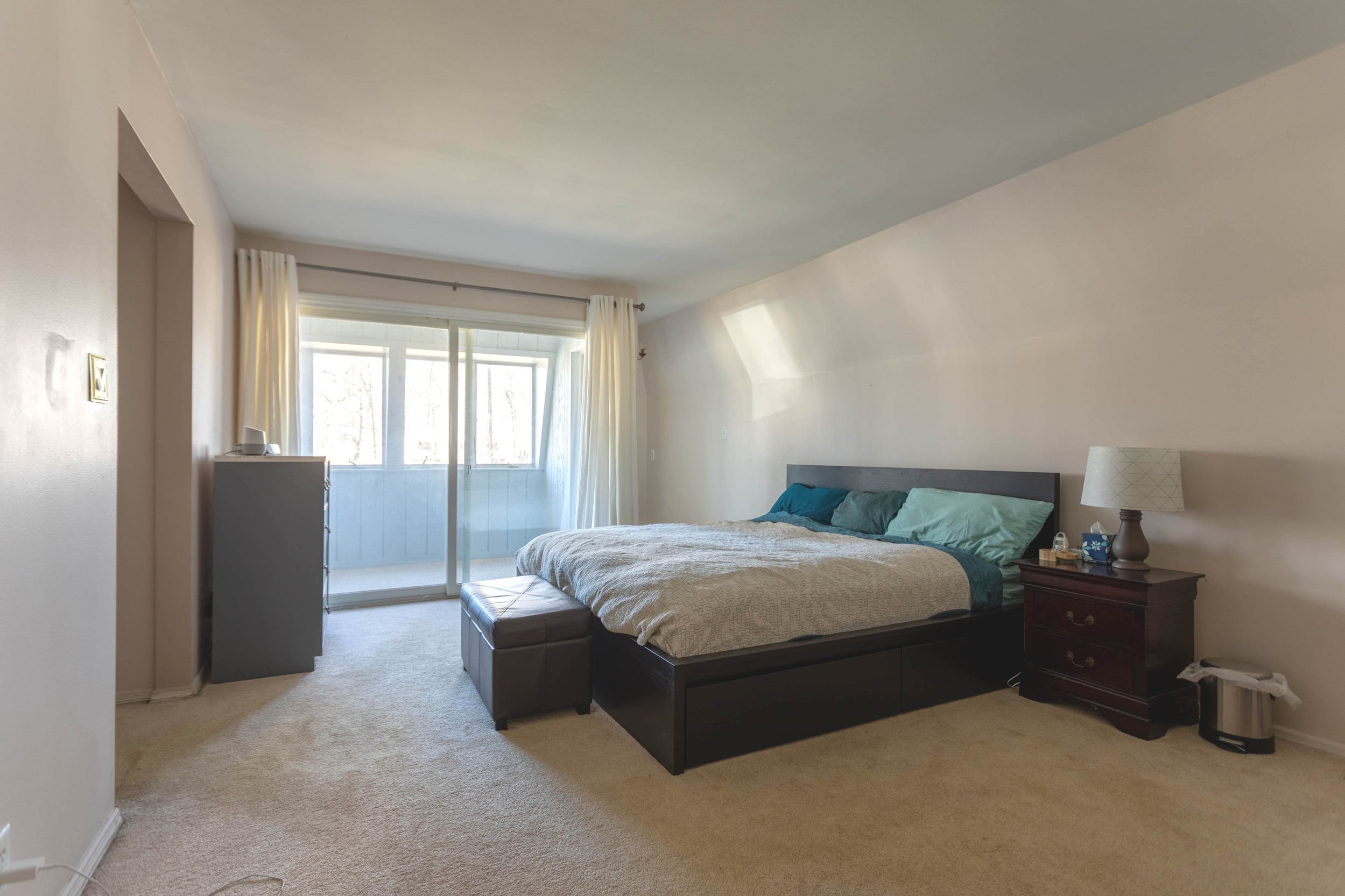
Our master suite went through a total reconfiguration after we bought this house. I never actually did an official “reveal” of the bedroom so…. here’s your reveal? (Cue anticlimactic “Ta-da!”)
I still don’t necessarily consider it done (new furniture is definitely on my list!), but we had a blast taking pictures from the same angles we took them from originally to show how the footprint changed (honestly though, pictures just don’t do it justice).
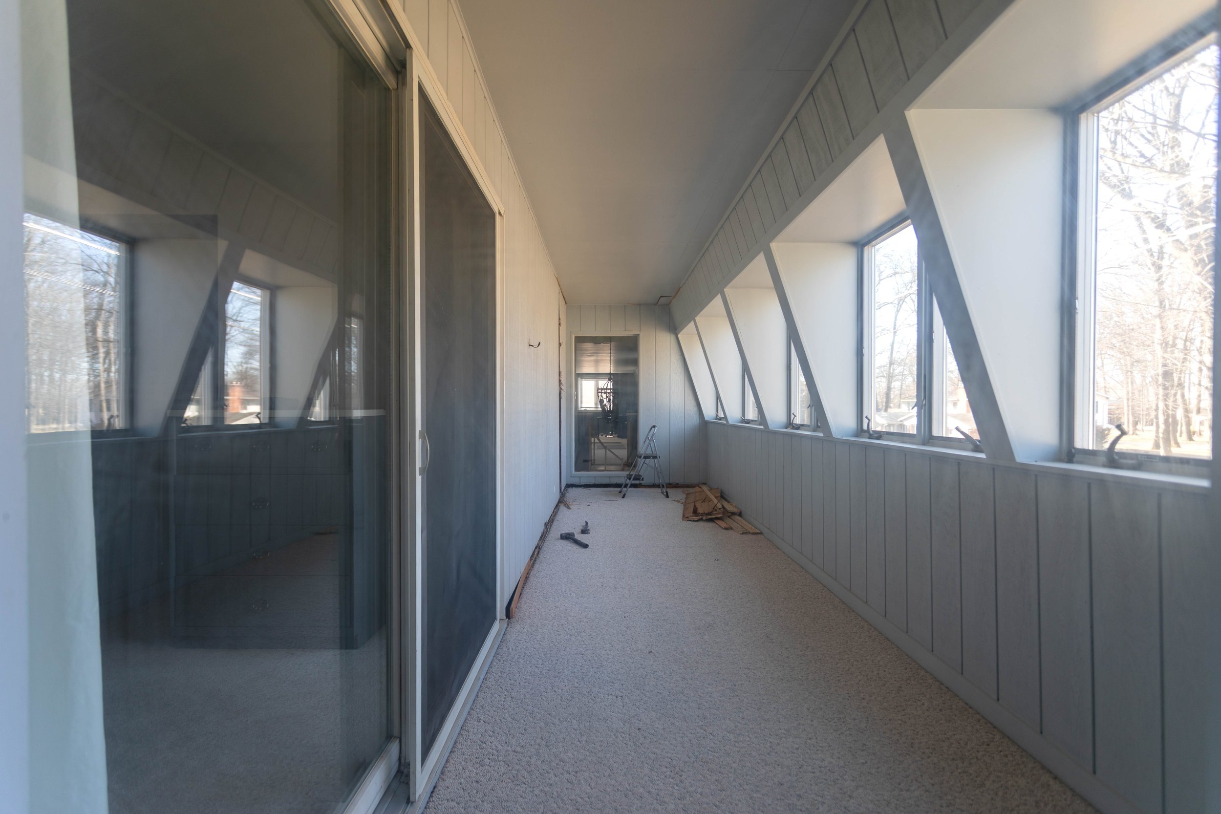
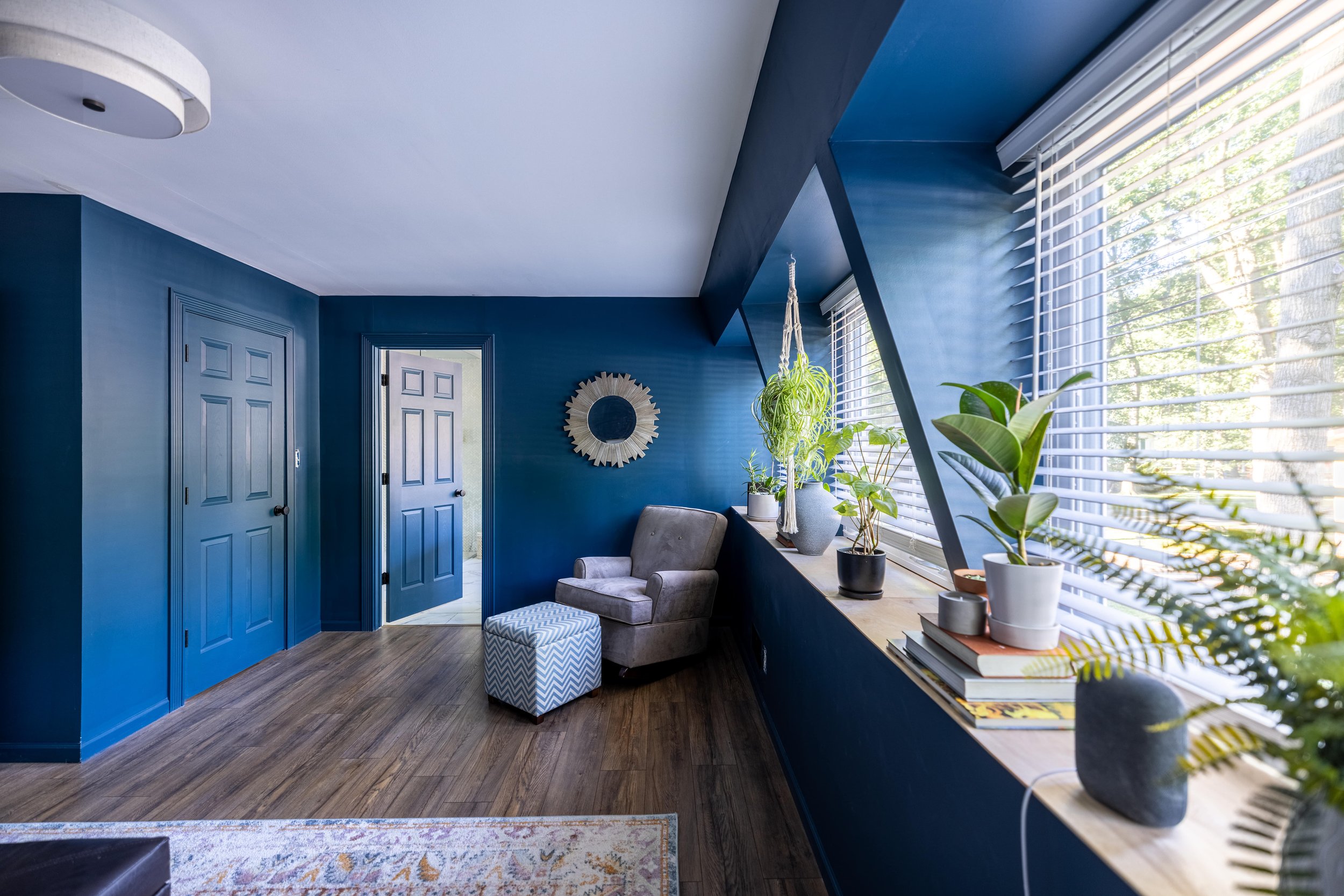
As you can see, allll those glorious windows that are now in our current master suite (and master bath) were once hidden in that long, narrow sunroom. Aside from a little bit that came through the sliding glass doors in the first picture above, most of the light was blocked in the original layout.
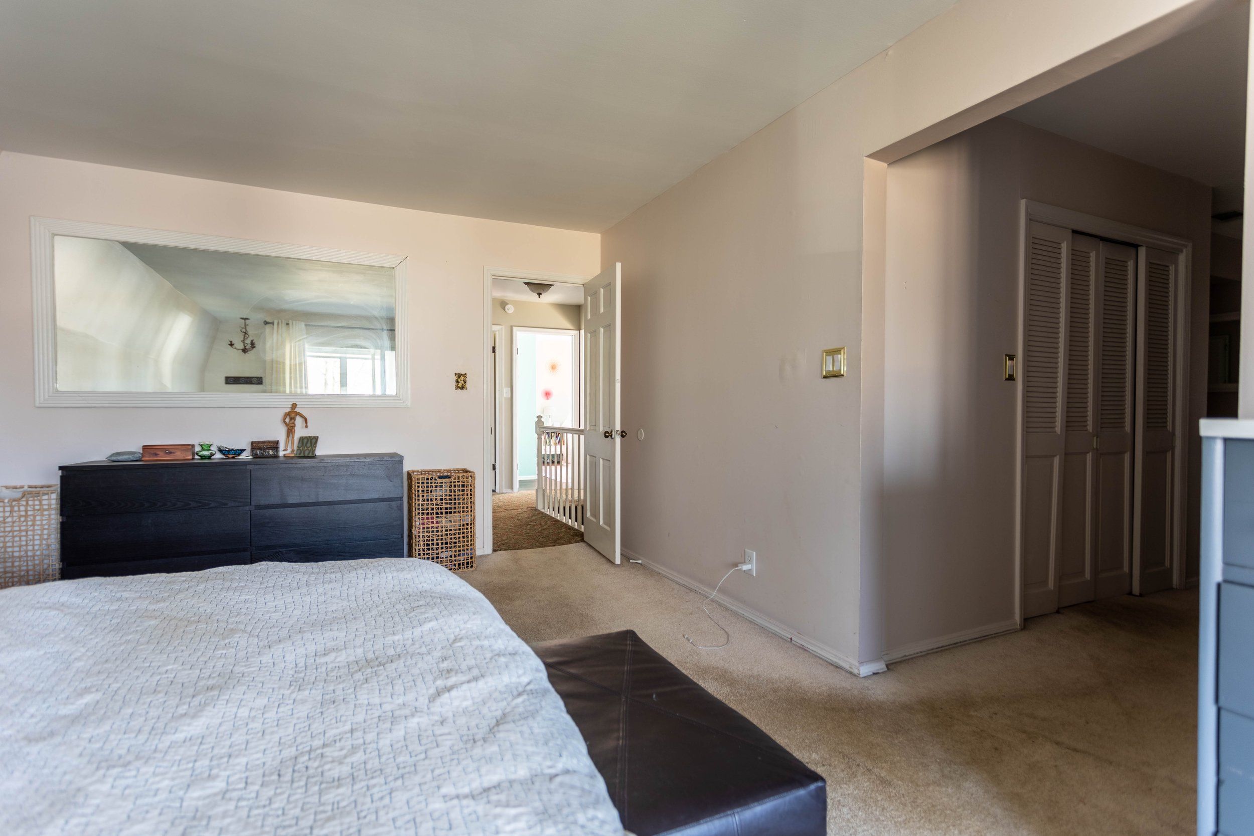
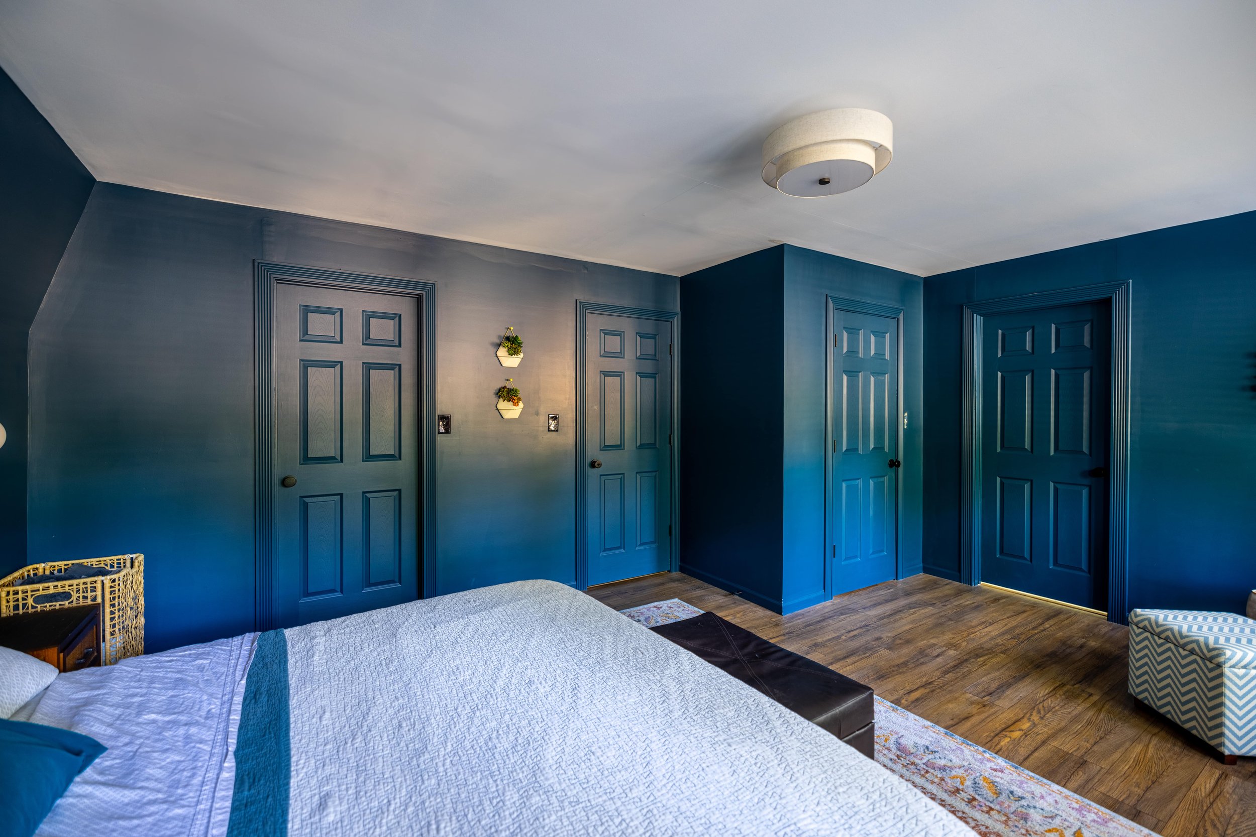
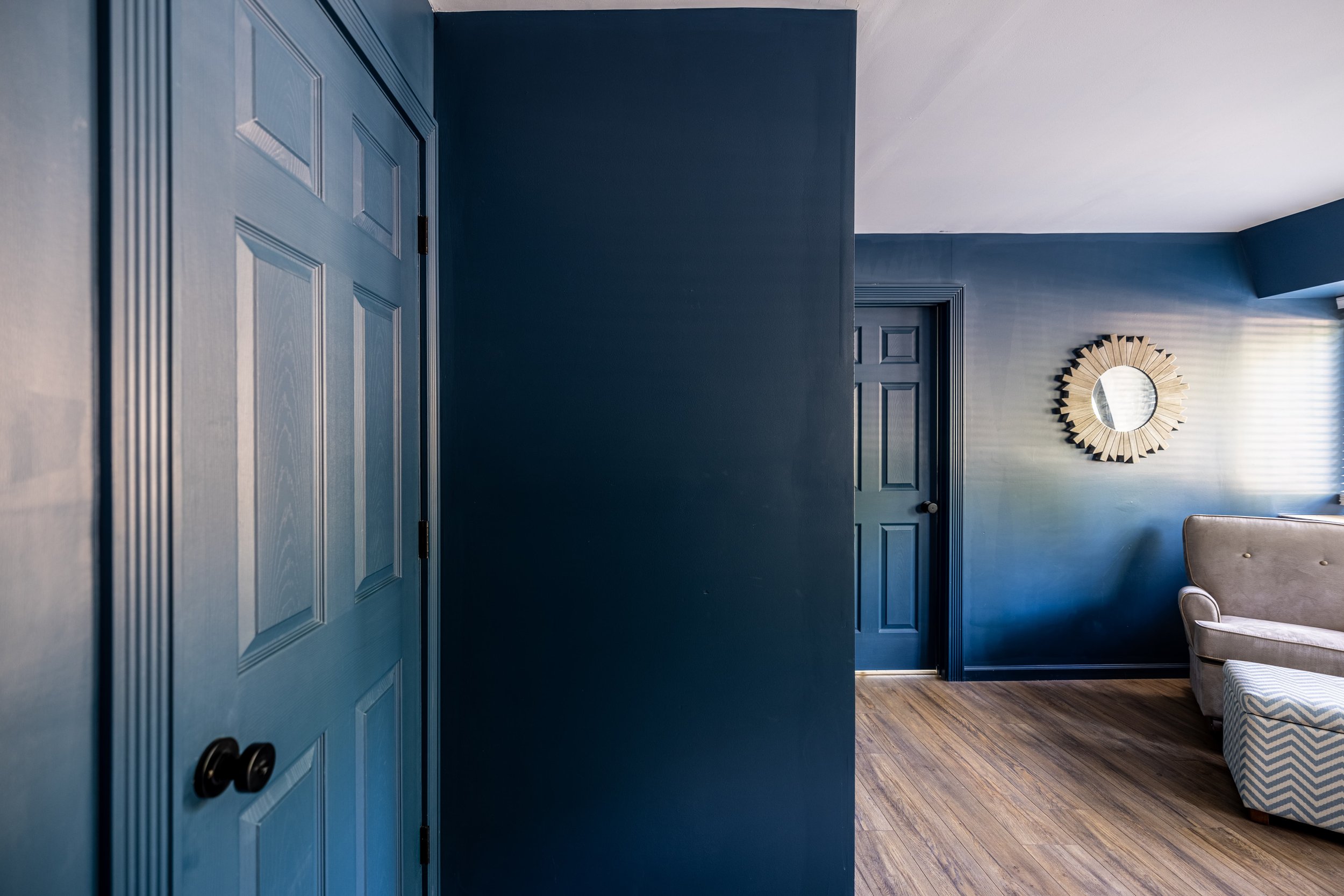
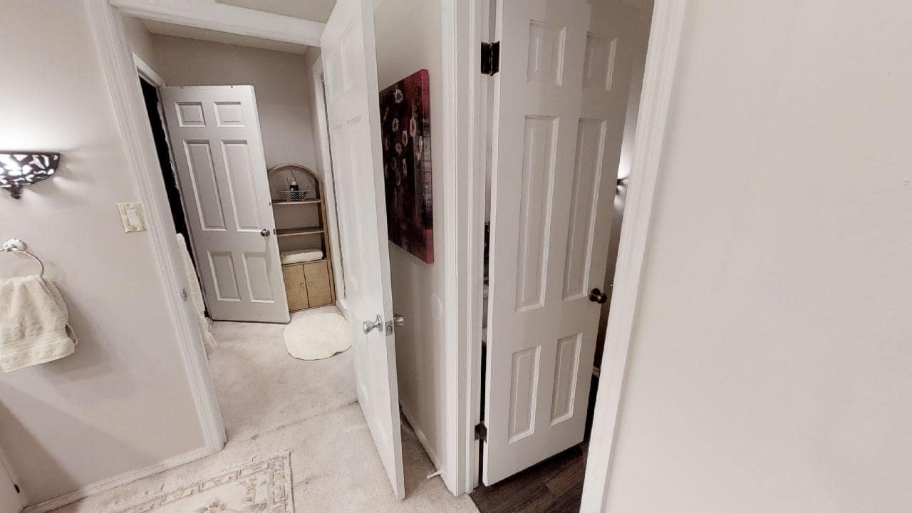
This angle shows the change in footprint from the other side of the room. In the “after” picture from left to right, the doors lead to: my closet, the hallway, Lucius’ closet, and the master bathroom.
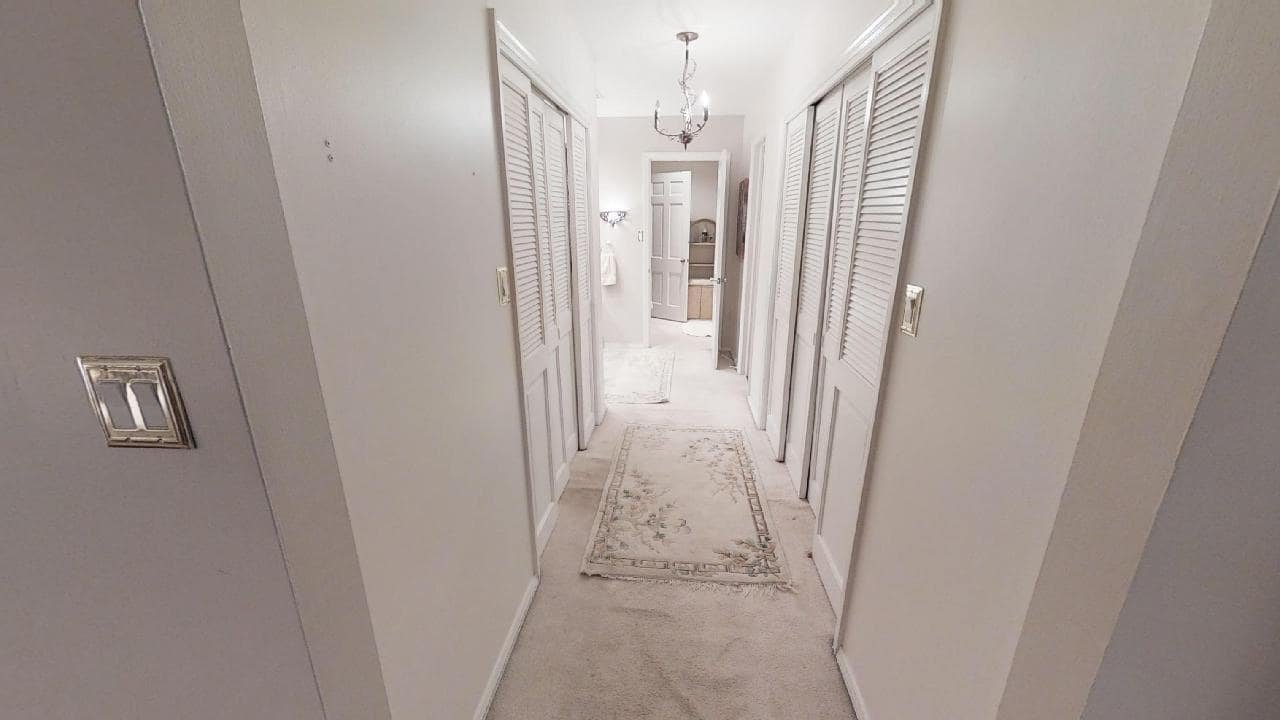
On the flip side, this is what our former journey to our closets and master bathroom looked like.
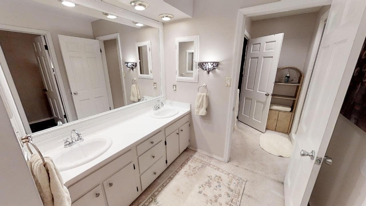
Lucius’ closet was on the left, mine was on the right, and beyond that was the vanity (left), water closet (right), and shower (through the doorway straight ahead - which is now our laundry room!).
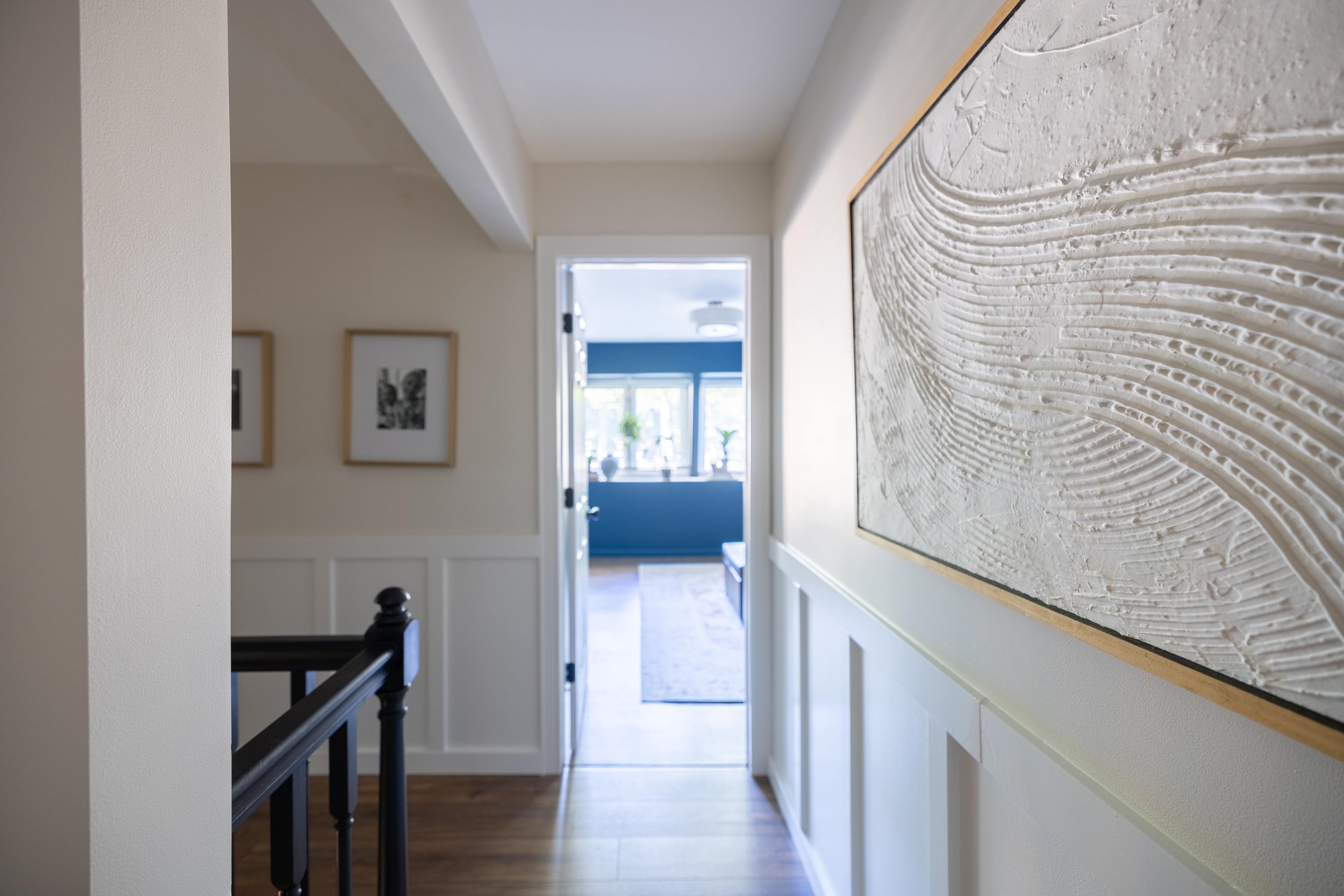
Aaaaand now that view is slightly different since we created a hallway and scooted our entire master suite footprint over.
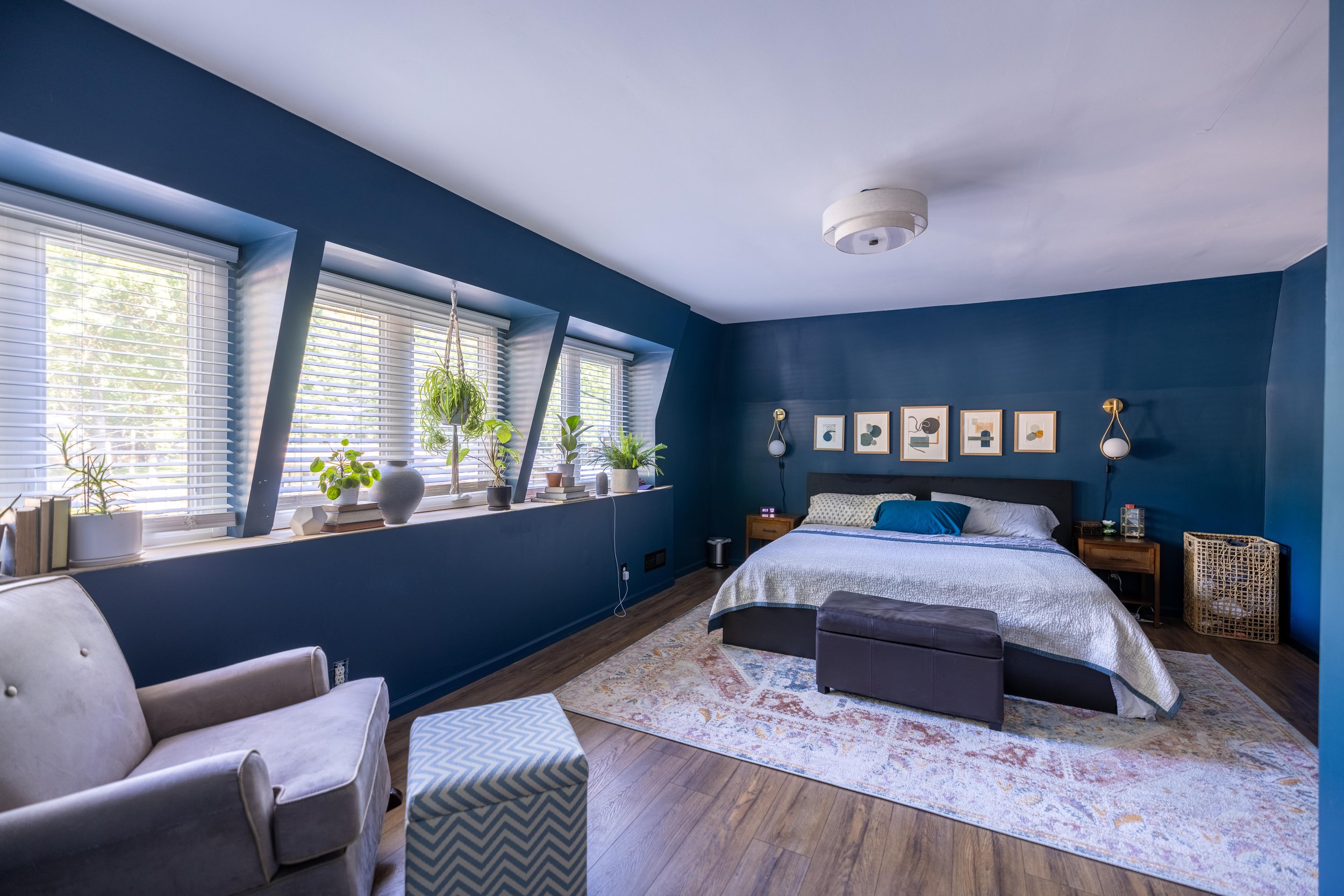
Those four angles were pretty much the extent of our master bedroom previously. Here’s a better picture of the bedroom today in its entirety.
I’ll never get tired of all the light in this room now, especially at sunset.
And like I mentioned before - I still don’t consider this room done. The bed and bench are on my shortlist of items to replace. And the chair and ottoman are just stand-in pieces for now that I pulled from the nursery (making room for more toy storage - IYKYK). They will also eventually be swapped out for something more in line with what I envision for this space. They’re looking very… nursery-ish to me.
Related Posts: Master Suite Remodel Kick-Off / Master Suite Floor Plans / Mid-Century Master Bedroom Mood Board
The Master Bathroom
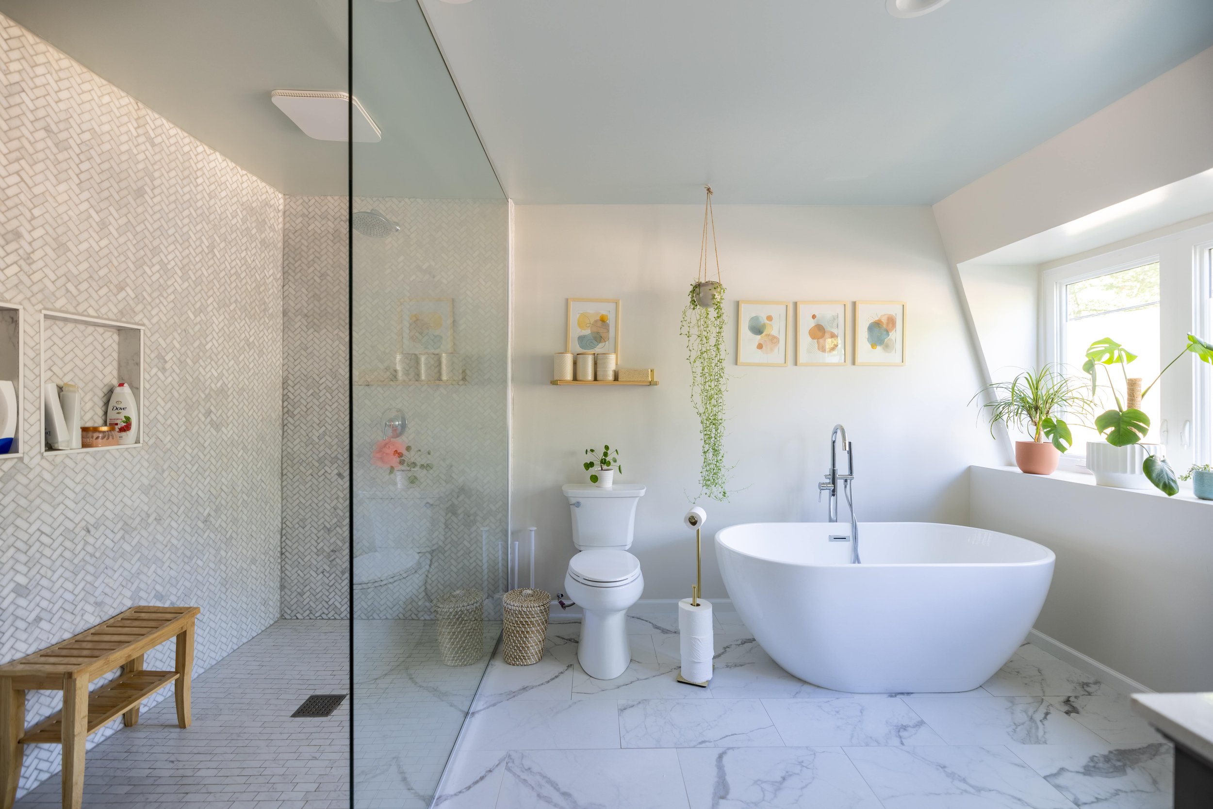
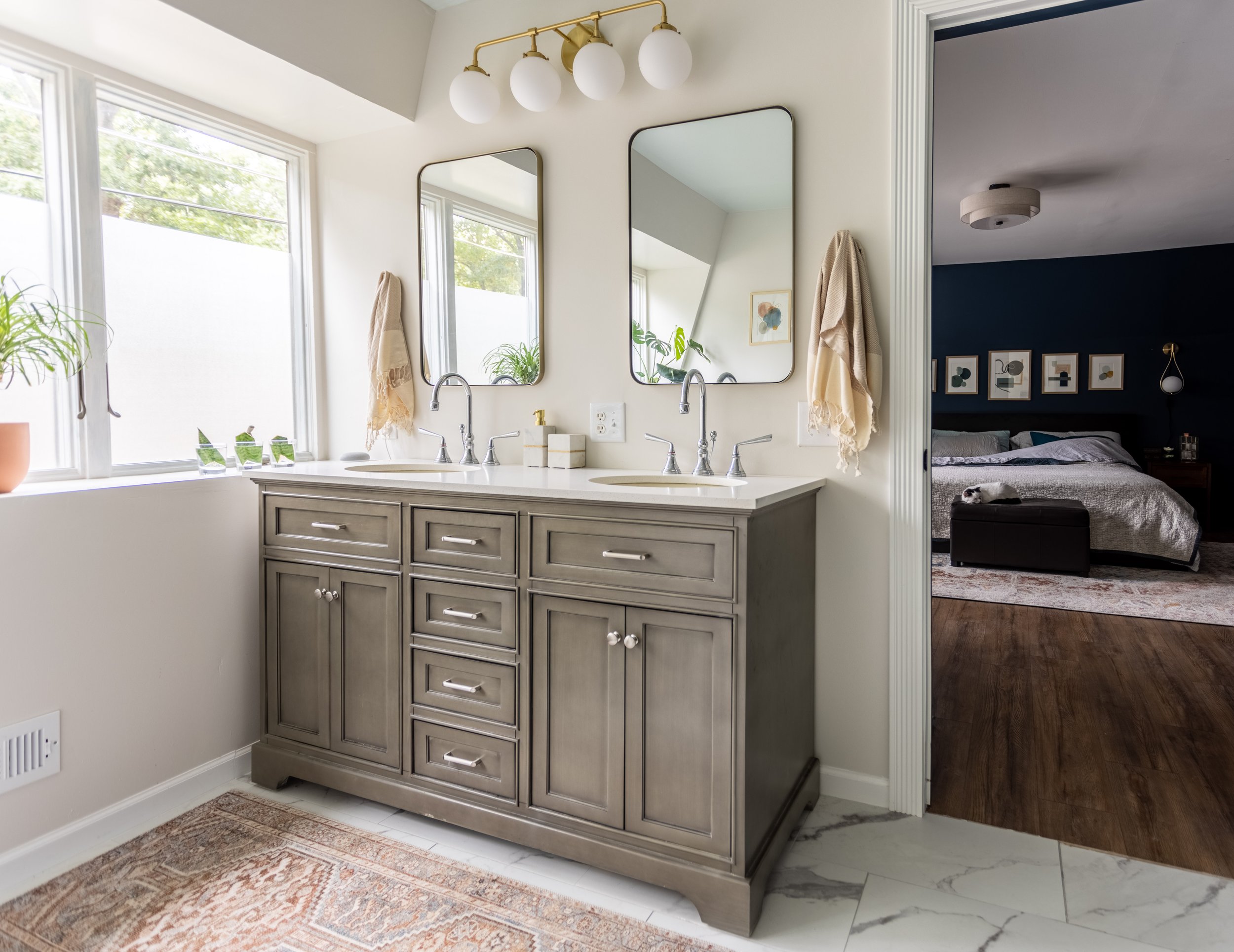
One of the most exciting transformations in our house so far has been the complete renovation of our master bathroom.
The layout originally felt very much like a hotel (and not a super nice one) - where the vanity is separate from the shower.
These days, it’s looking quite a bit different.
I wrote a whole master bathroom reveal post when we finished it last summer so I won’t dive in too deep in this post, but here are some pictures for the sake of comparison.
Related Posts: Master Bathroom Mood Board / DIY Frosted Windows / Master Bathroom Reveal
The Laundry Room
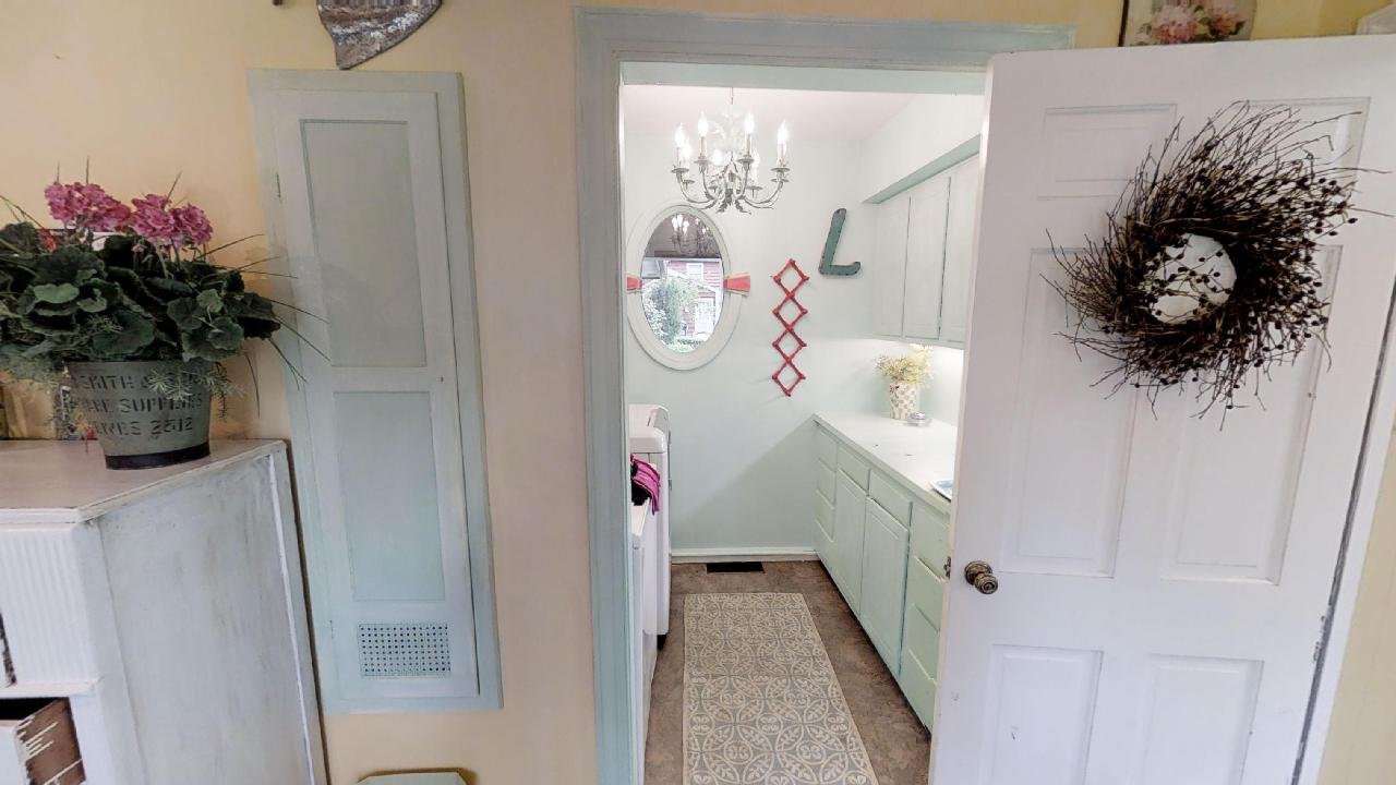
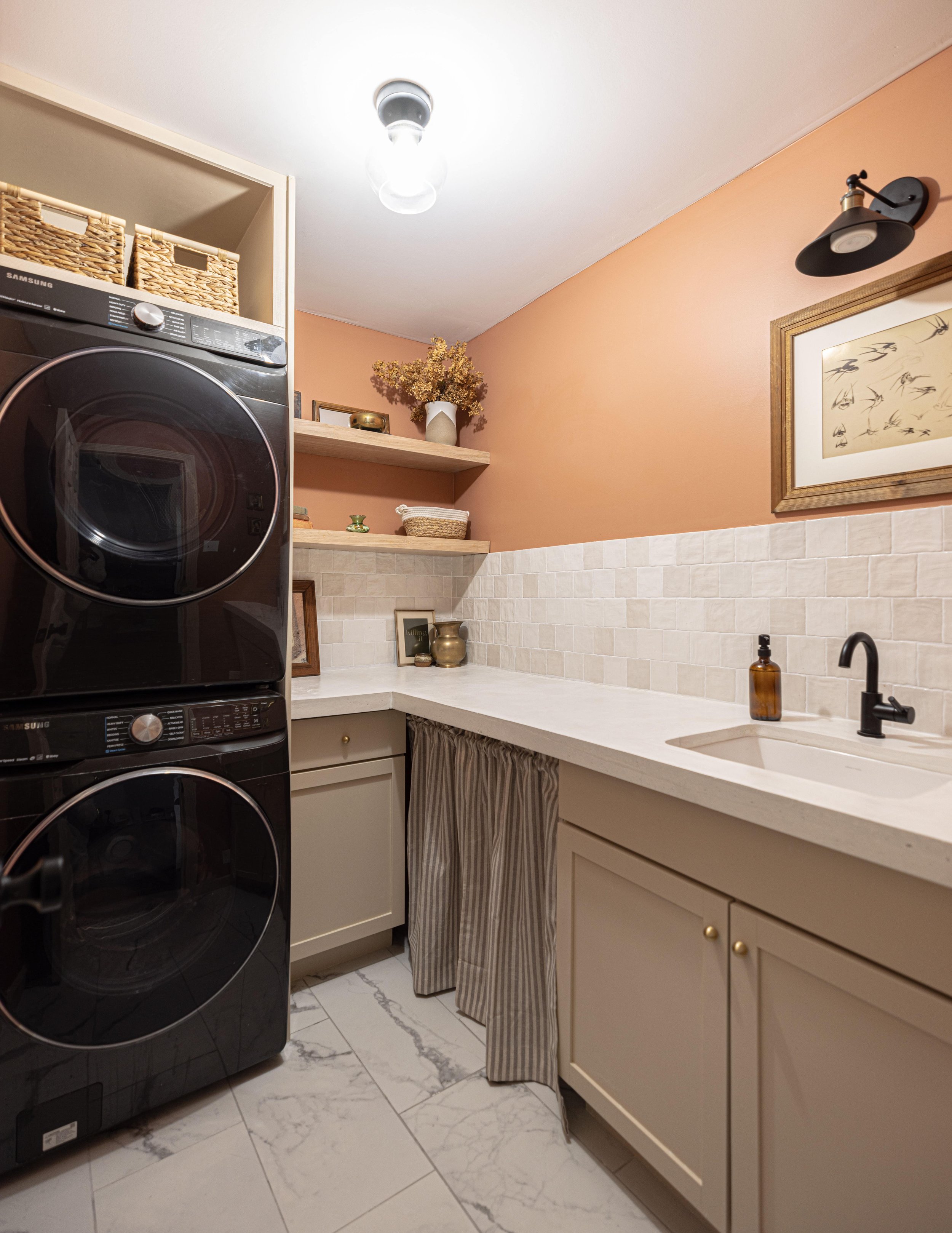
The most recent addition to the “renovated room” club is the laundry room - which I just wrapped up for the One Room Challenge!
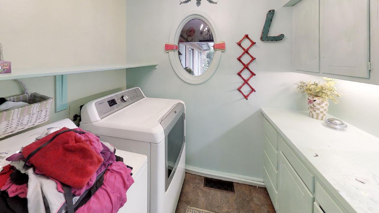
When we moved in, our laundry room was actually downstairs in the mudroom.
But when we renovated the master suite, we turned the former “shower room” into an upstairs laundry room with allll the bells and whistles.
And can I just say how glorious it is to have a laundry room on the same floor as the bedrooms!? The old laundry room is now a makeshift storage closet, but I have plans to make it much more functional than its current state.
The Loft
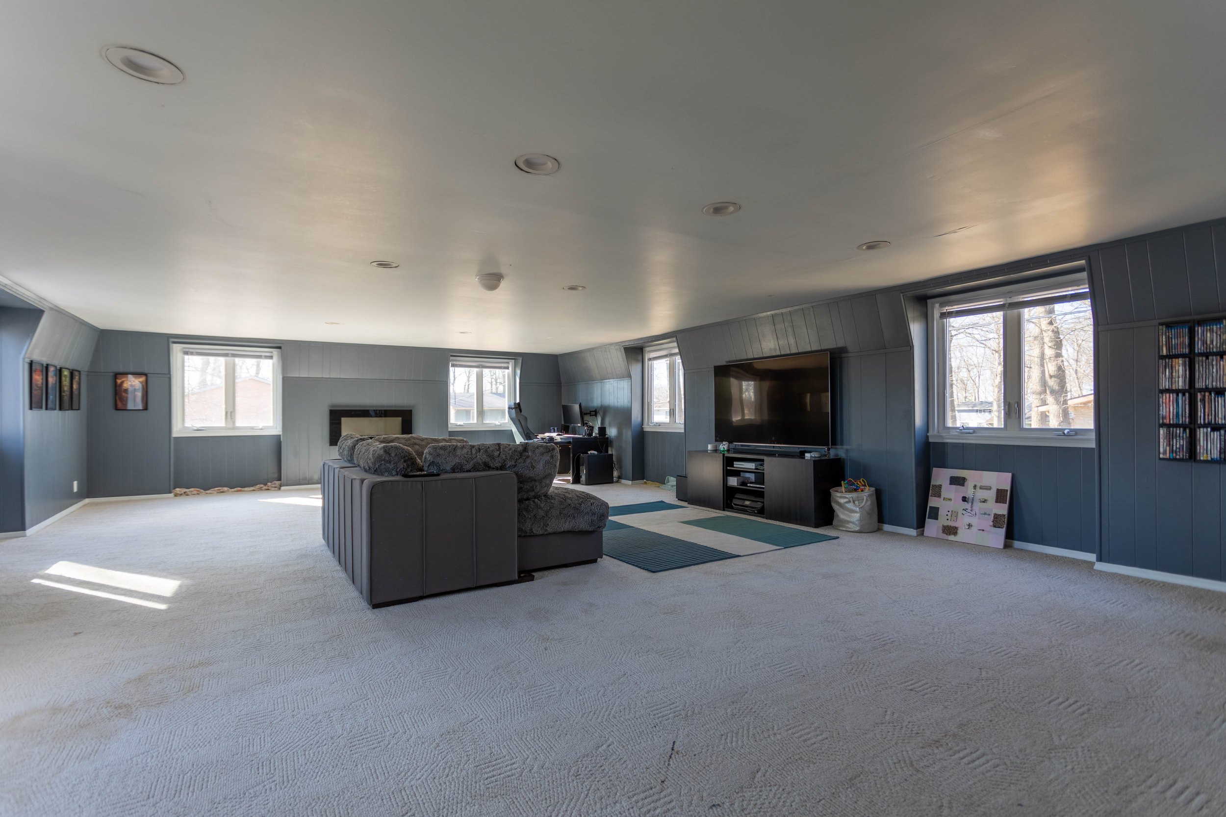
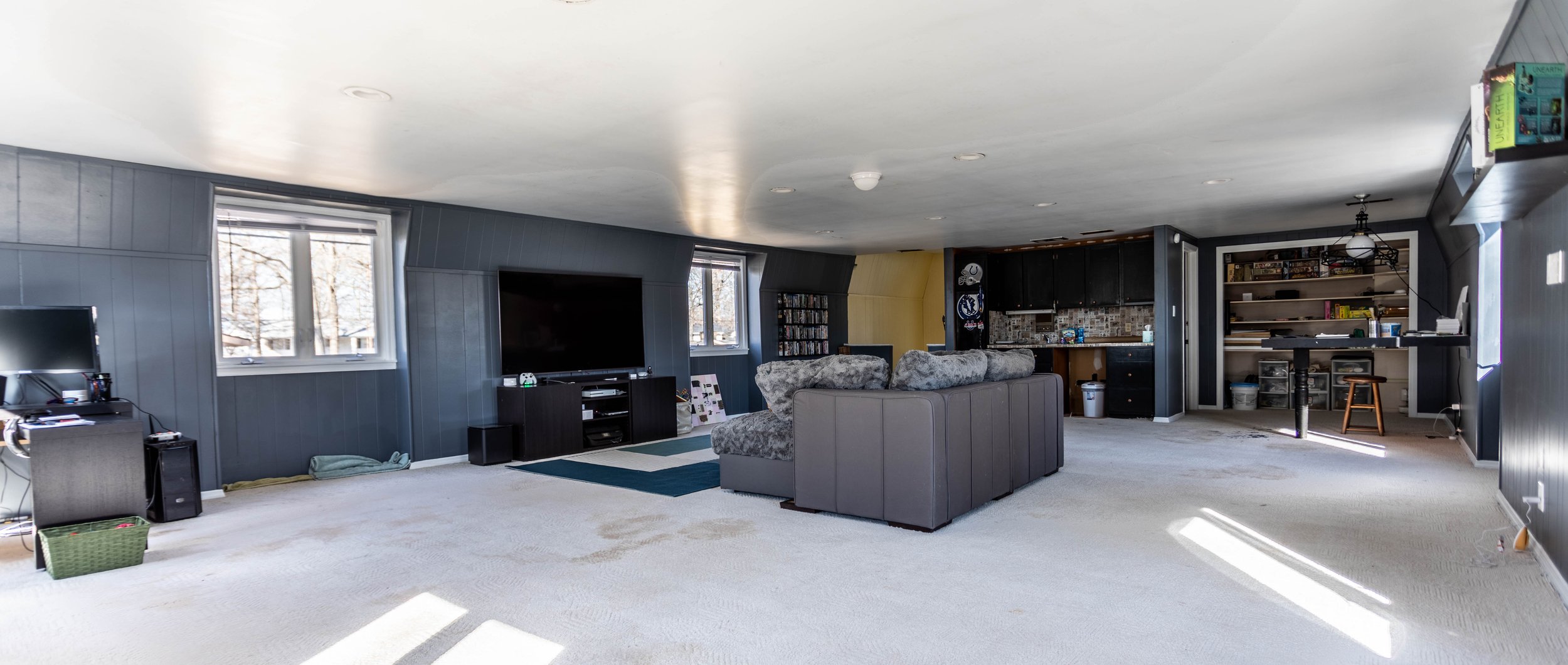
If you’ve been here for a while, you know a lot of changes have happened with the loft. Here’s what it looked like after our phase I update.
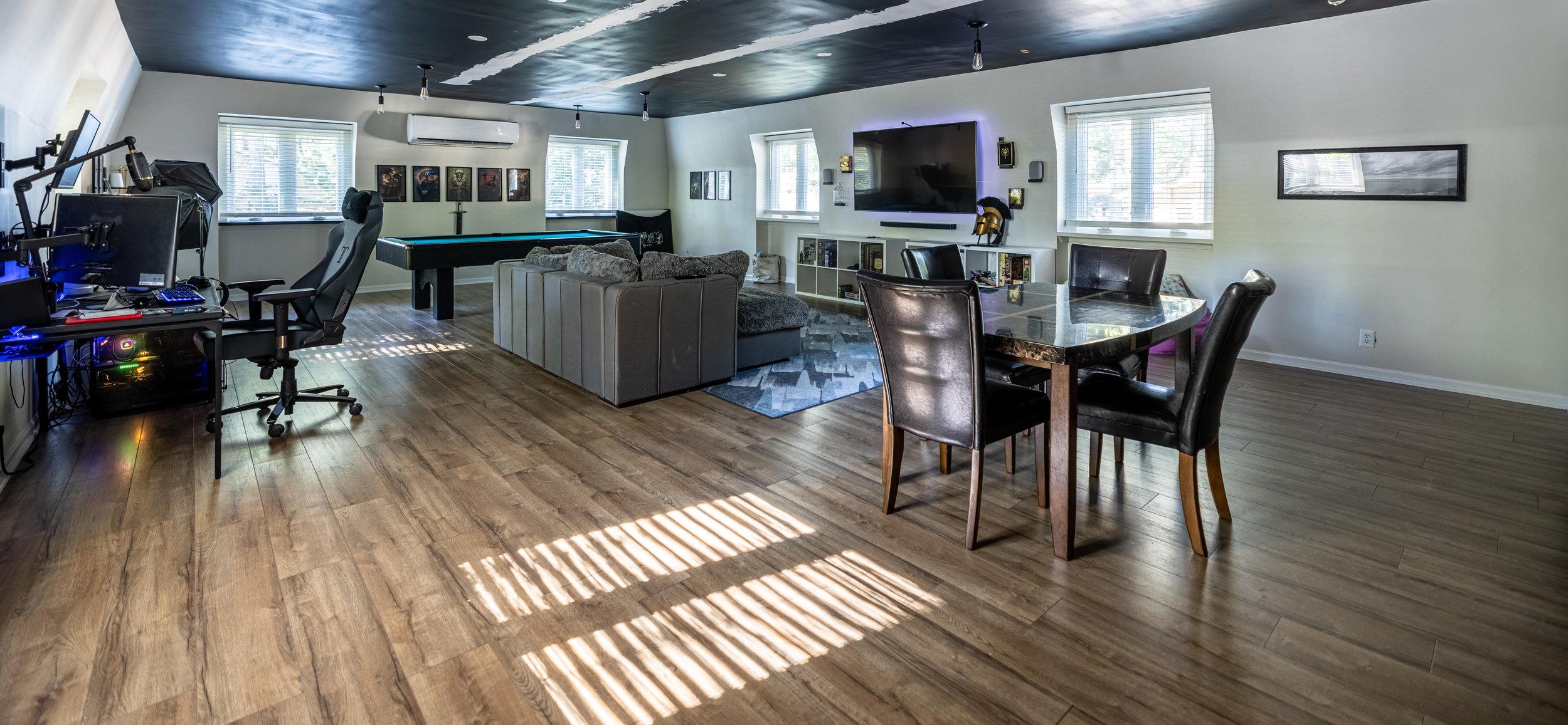
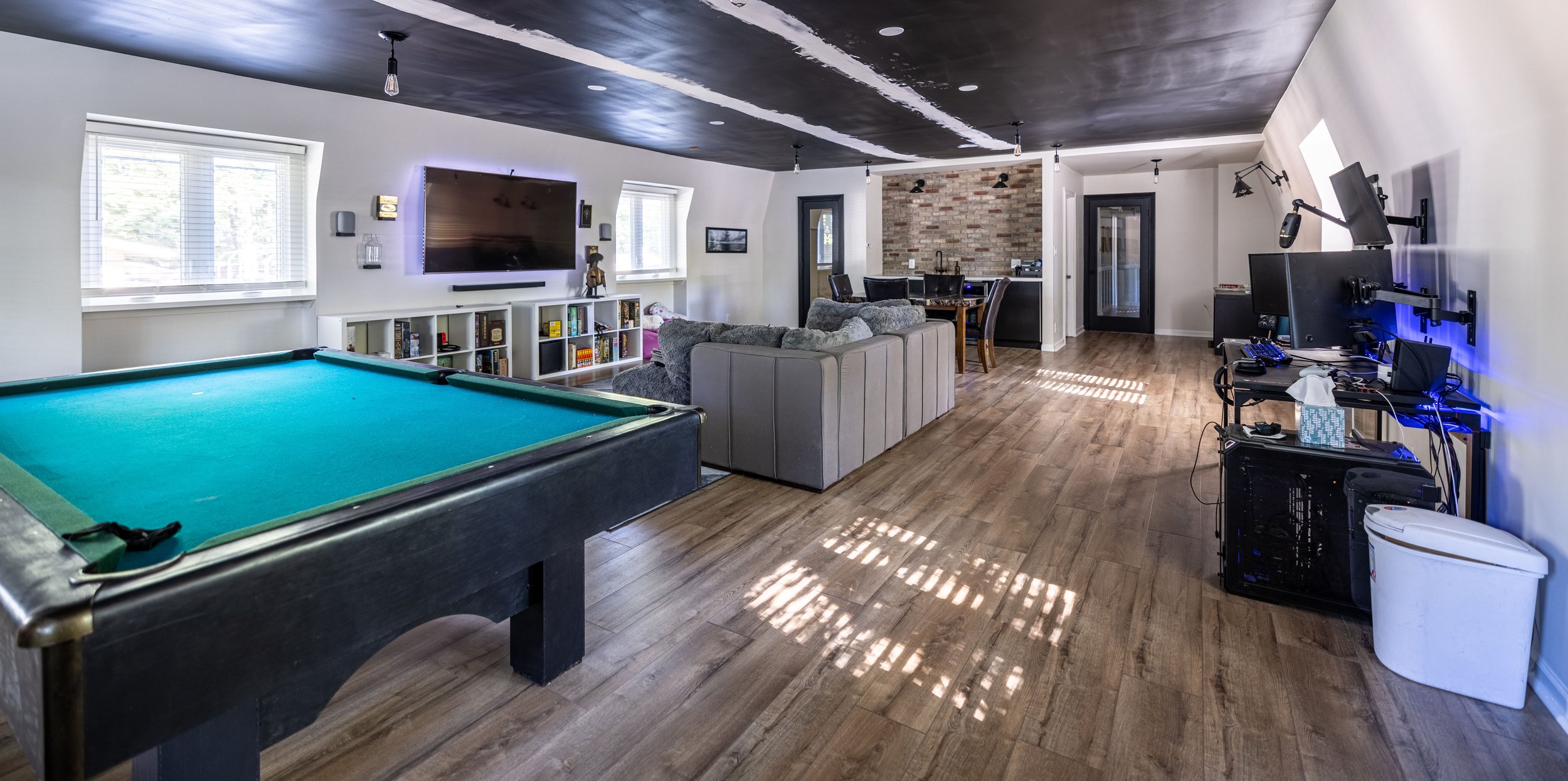
And here’s what it looks like today!
Disregard the racing stripes on the ceiling. We’re in the process of repairing the drywall that was poorly installed when we renovated.
Here’s a peek from the opposite side of the room, complete with the brick veneer we just installed in the kitchenette!
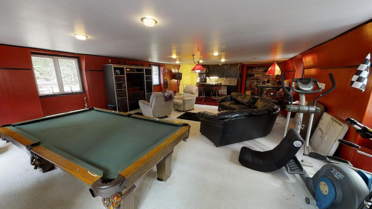
Although we still have some work to do, I’d say it’s looking quite a bit different from where it started:
Related Posts: Loft Renovation Kick-Off / Kitchenette Design Plans / Loft Renovation Updates / How to Install Brick Veneer
Now let’s take this party outside, shall we?
The Exterior
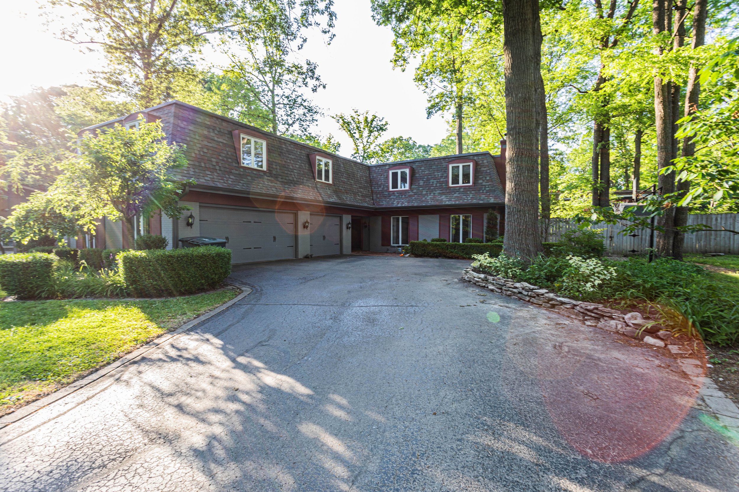
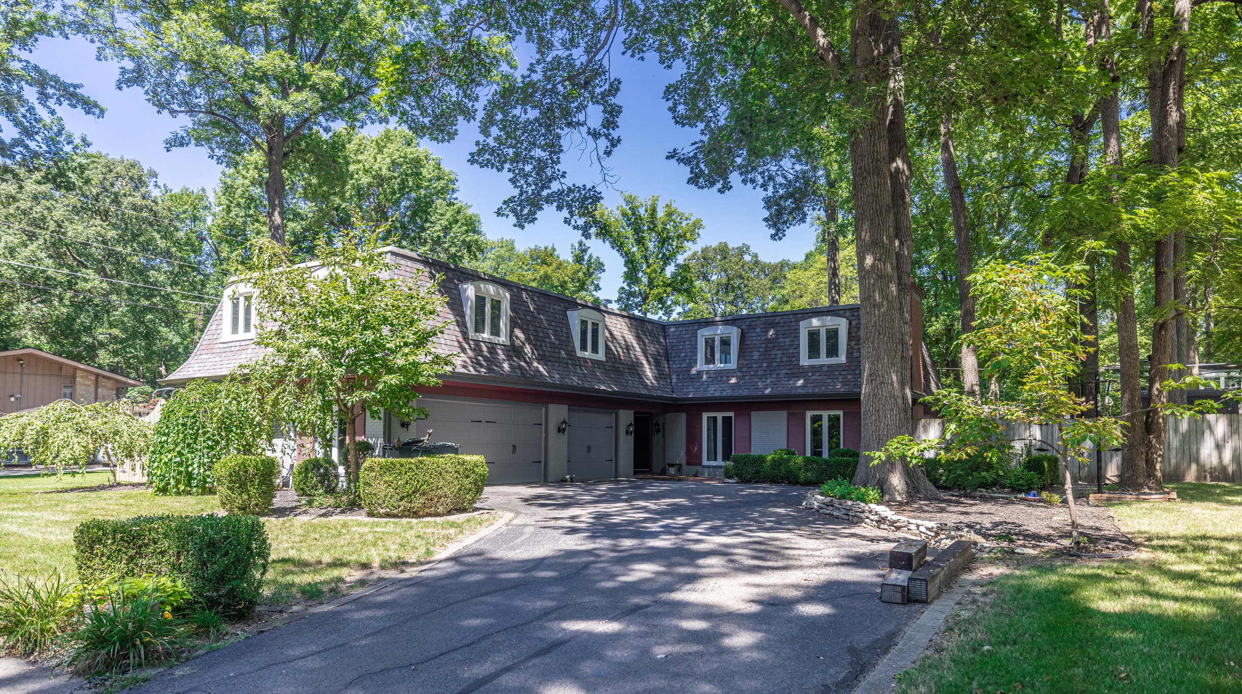
The front of the house hasn’t changed drastically, but you’ll notice the windows on the second story are now white. As I mentioned in our project plans for 2022, we had new windows installed throughout the house last winter!
Also, I’ve spent a TON of time cleaning out the flower beds around the house, so you’ll notice the flower bed on the right is looking a little clearer. I’m slowly working on adding plants back in.
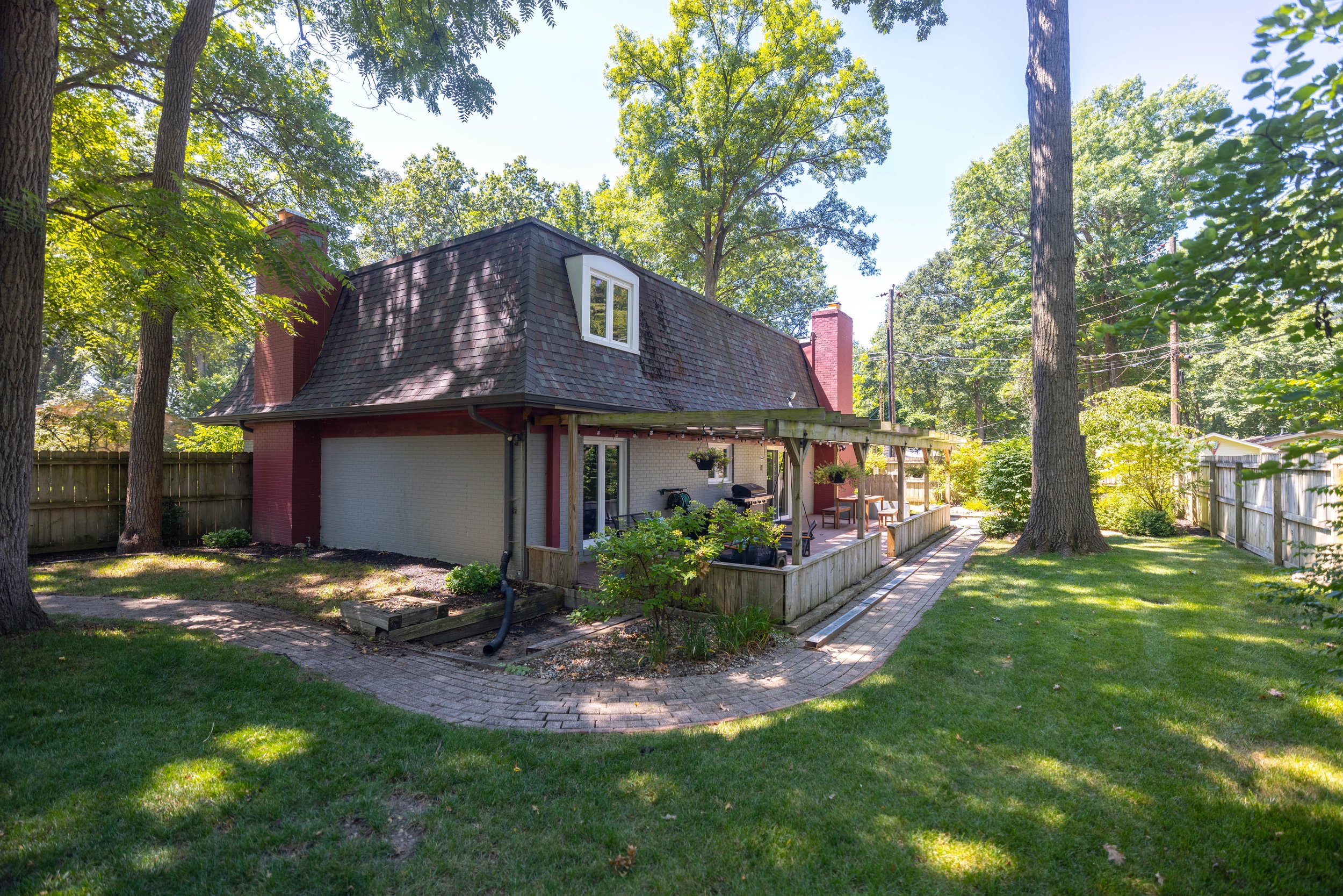
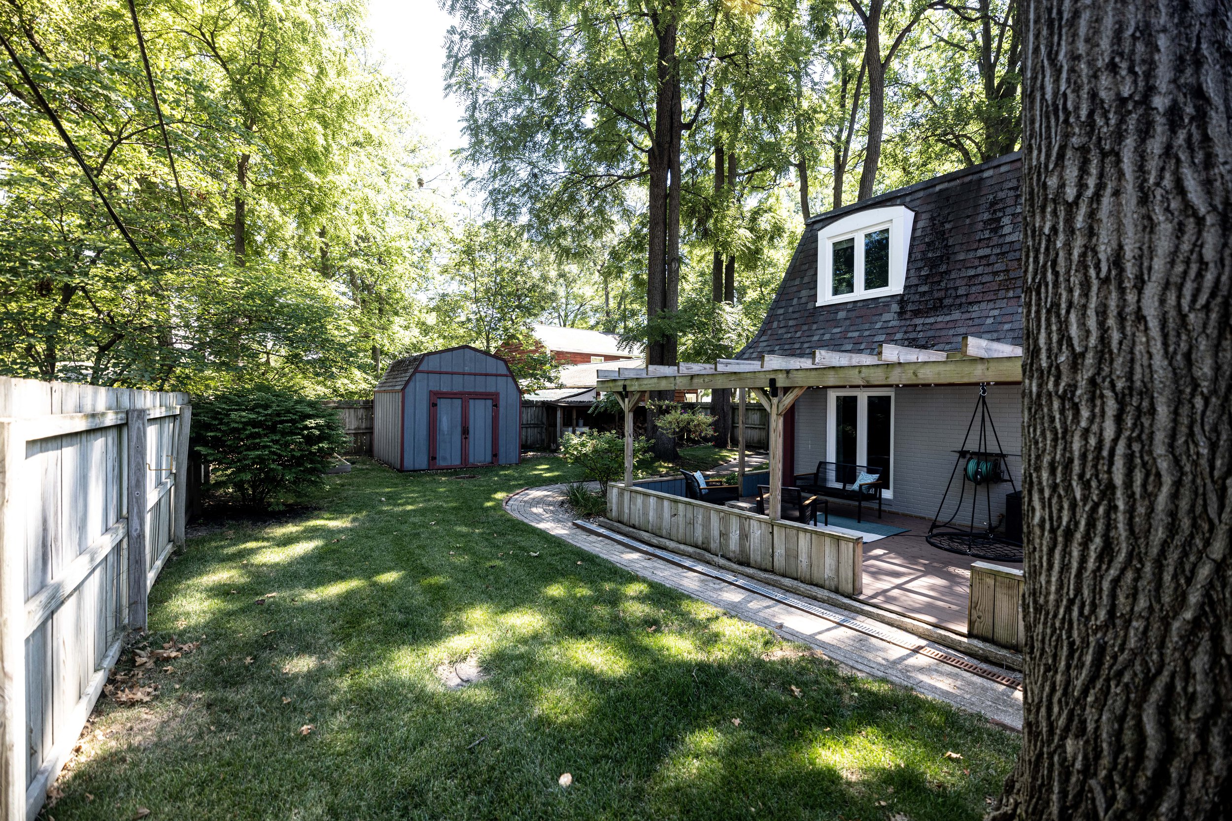
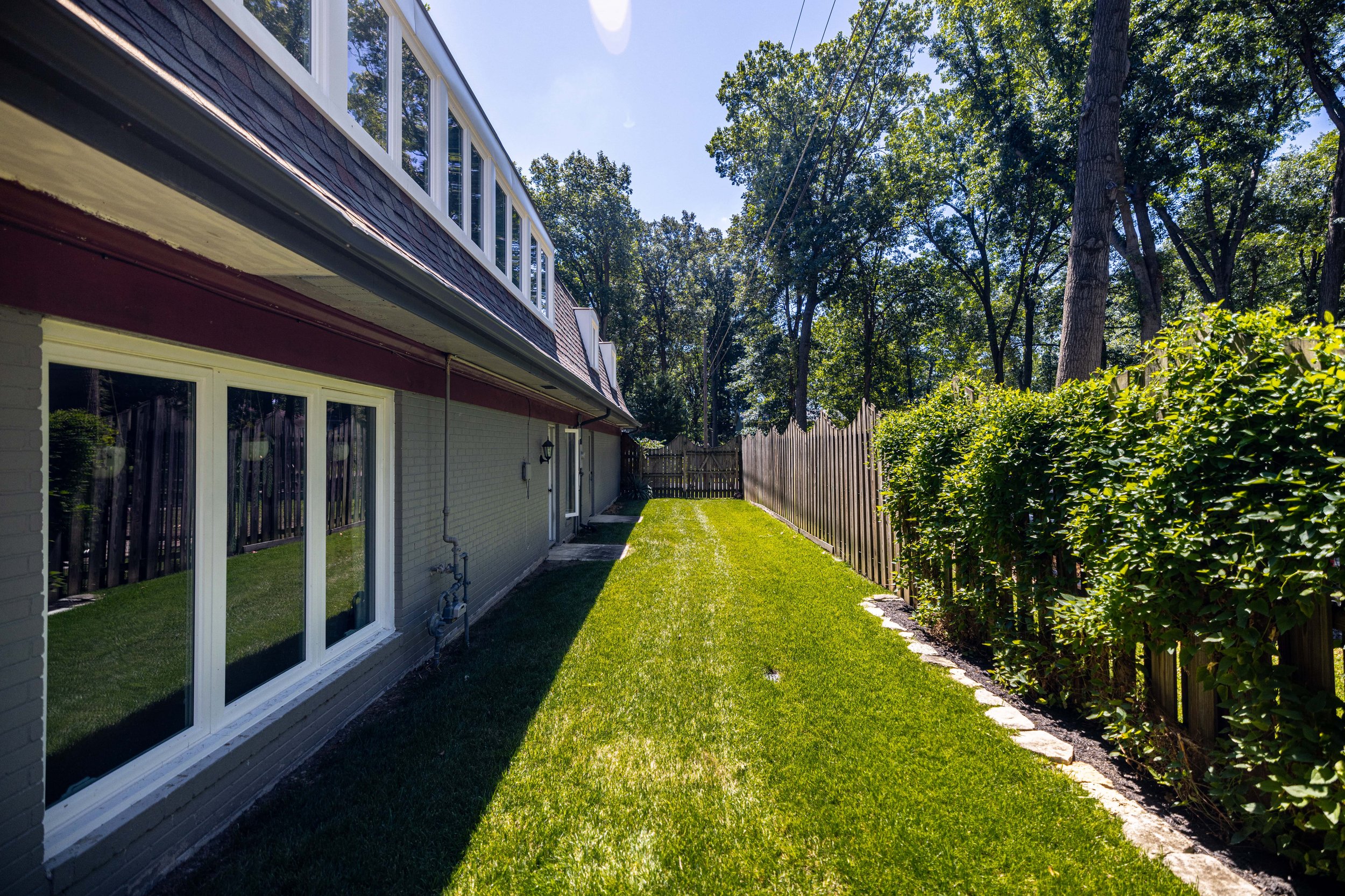
The backyard is where our efforts really shine because WE HAVE GRASS!
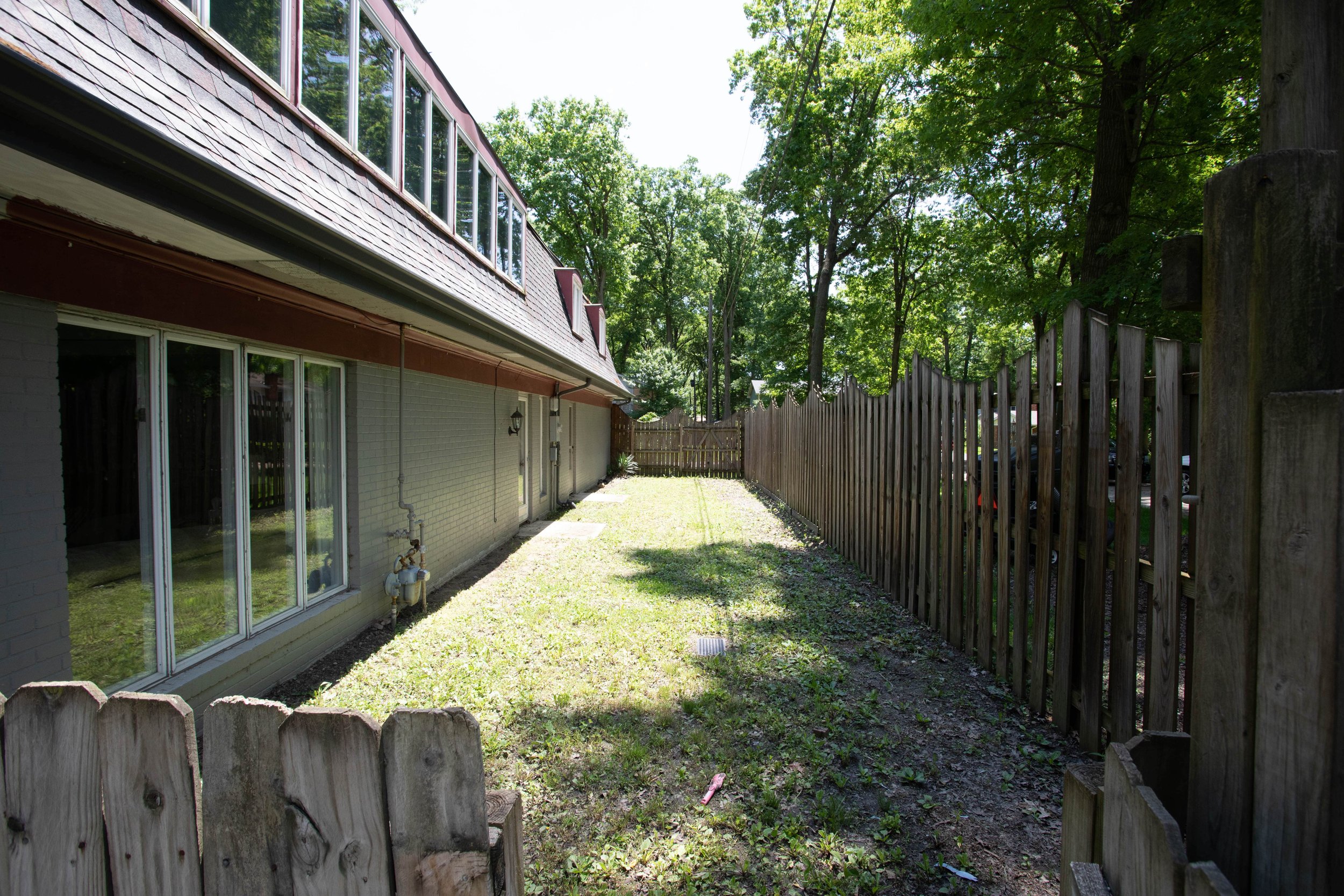
When we moved in, the backyard was just dirt and weeds, which the kids loved (mudpies, anyone?), but I wasn’t a fan. It feels so good to have some luscious green grass back here.
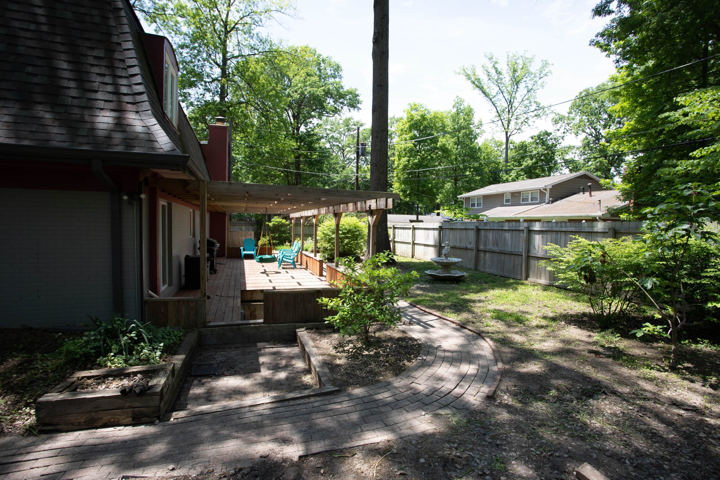
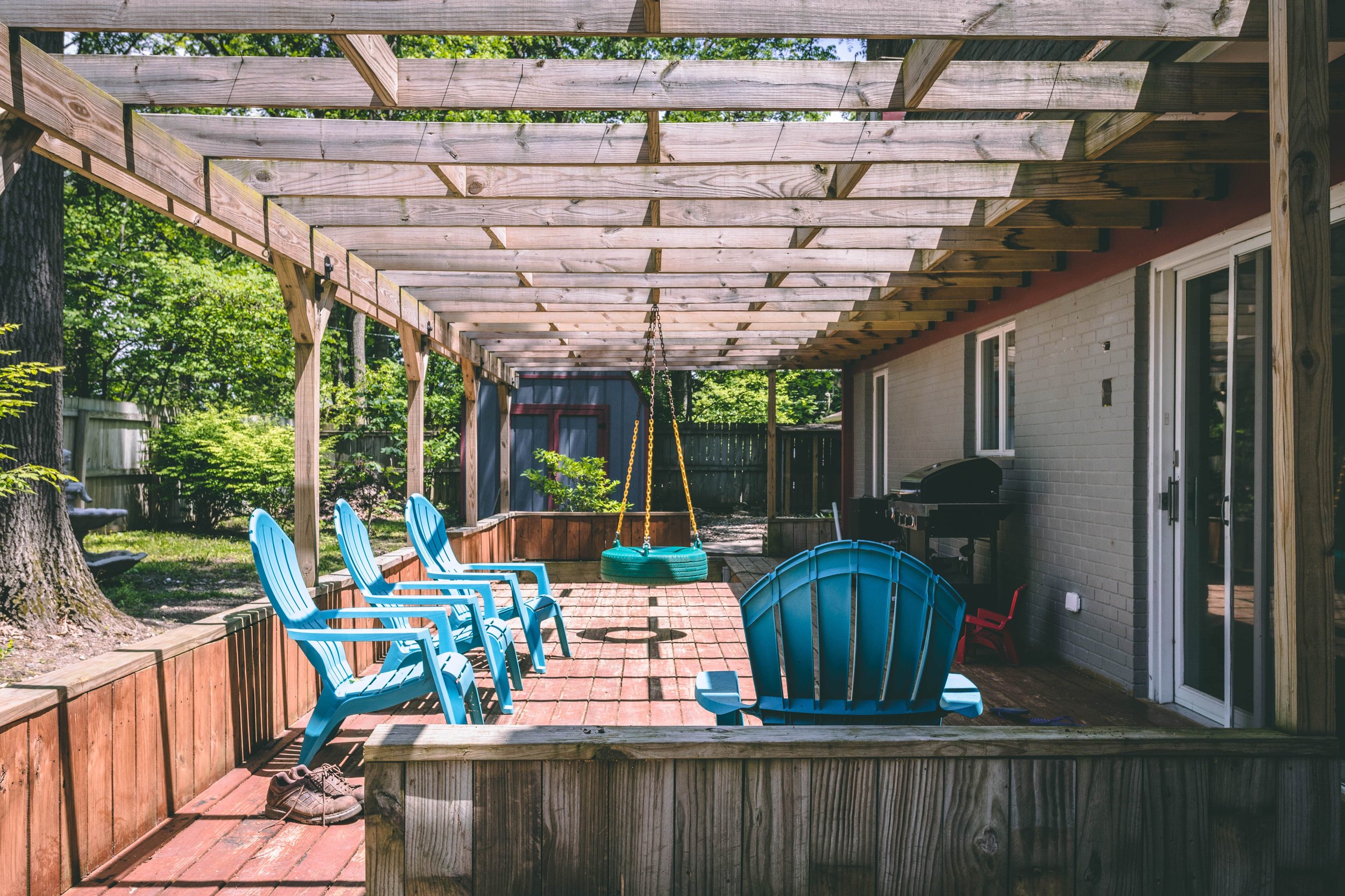
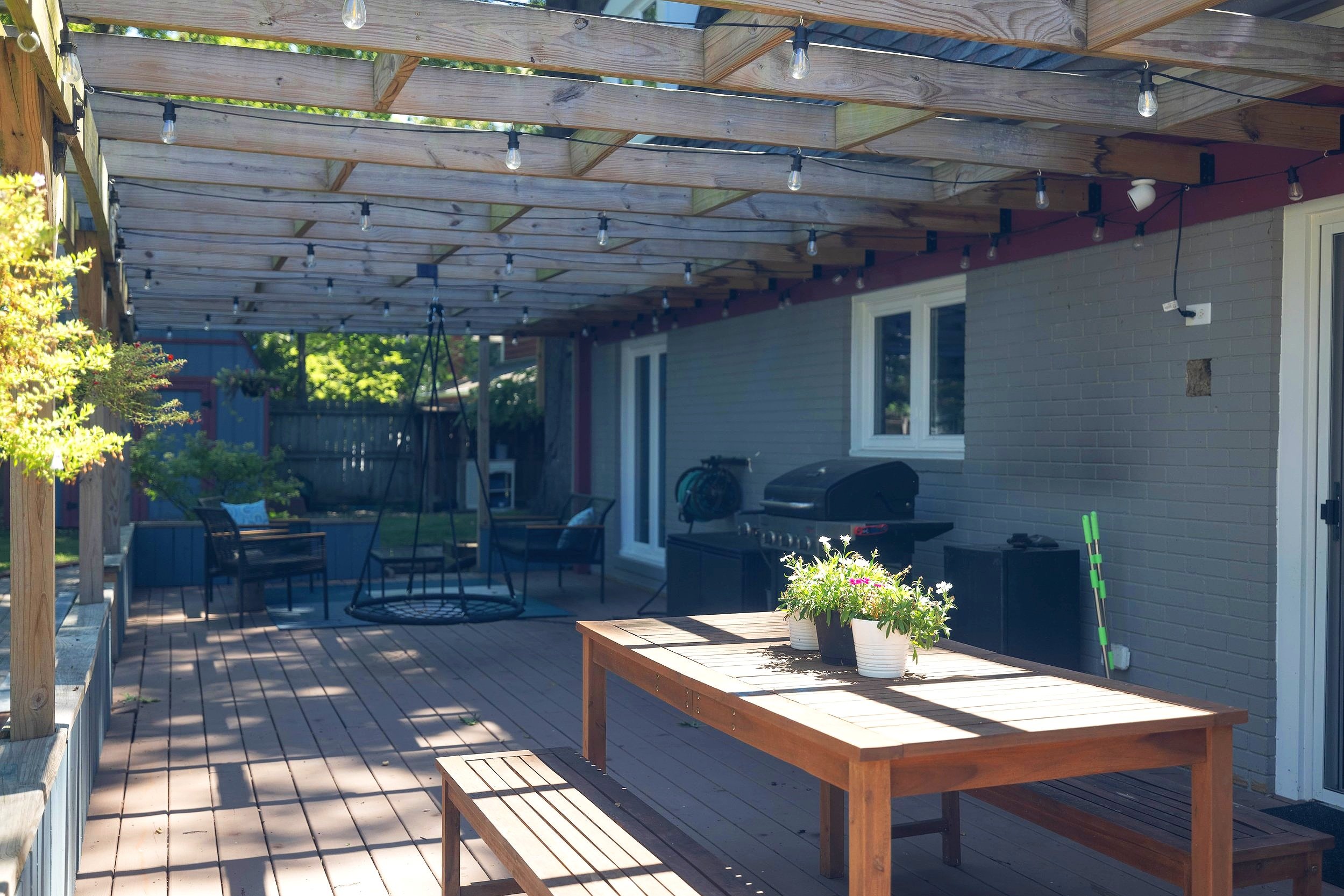
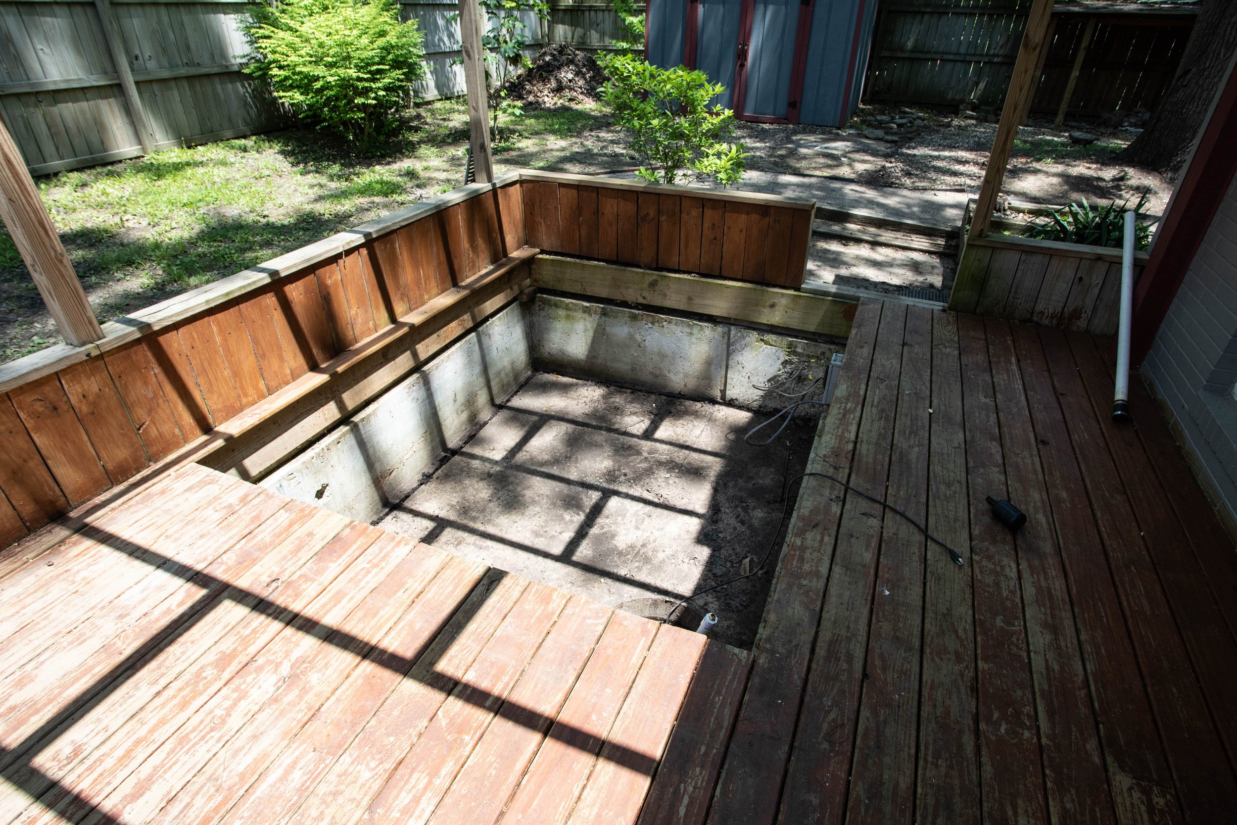
Aside from the grass, the other big transformation in the backyard has been the deck. While we made do before, the stain badly needed redoing, we were lacking sufficient outdoor furniture, and there was a giant hole for a hot tub at the far end of the deck.
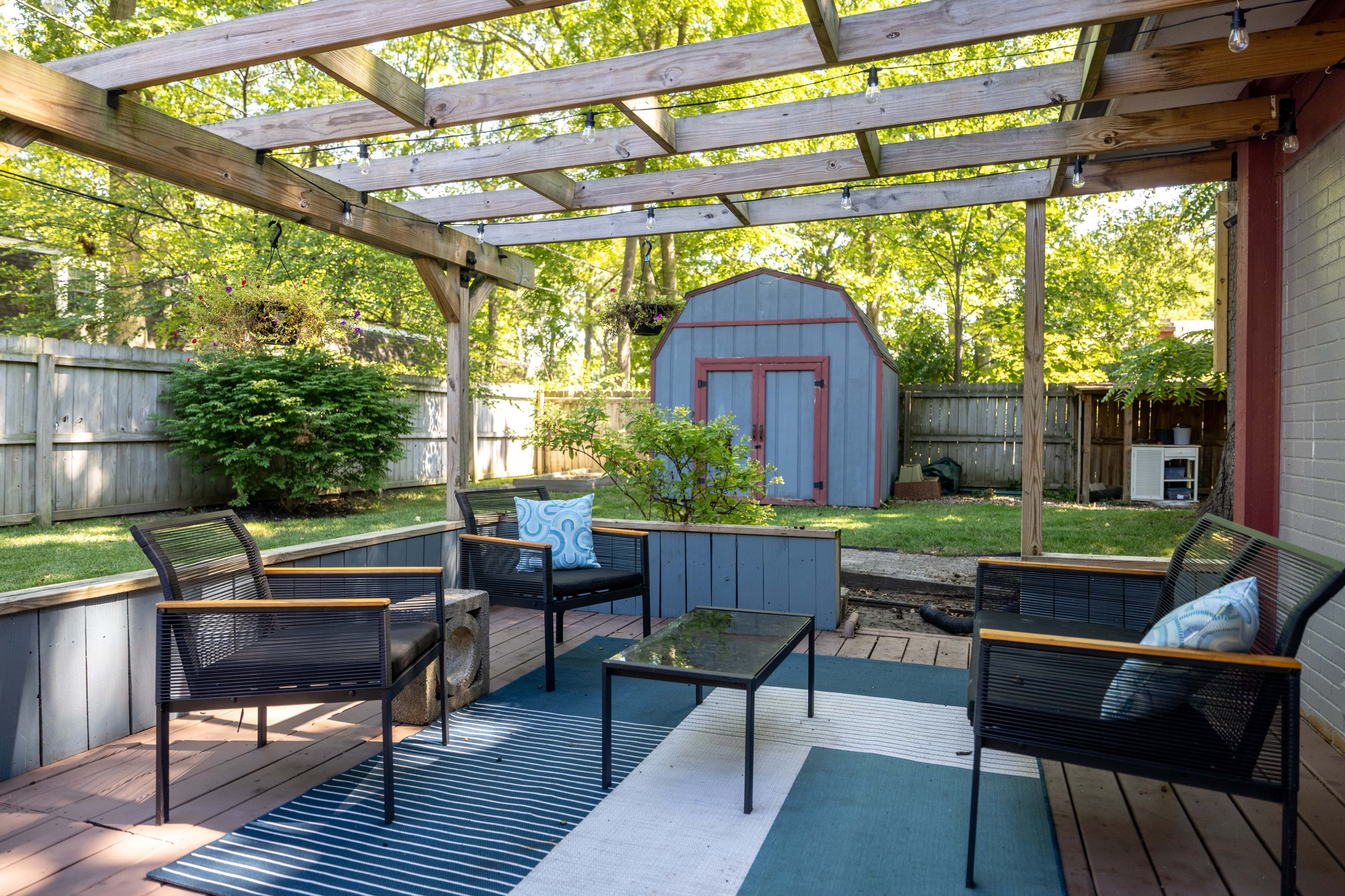
I’ve since jazzed it up by creating “zones” with seating, repainting the deck, and…
Boarding up the hot tub hole!
I really love our backyard now and spend as much time as I can out here in the warm months.
Here’s one more space that’s seen some improvements in the backyard…
How could I forget my Clematis vine trellis!?
But seriously, considering the sorry state of the grass on this side of the yard when we moved in, I wasn’t so sure we’d get anything to grow. I’m happy to report how wrong I was!
And that wraps up the tour!
Final Thoughts
We get asked all the time if this is our forever home, and I can confidently say… I have no idea!
As cool as it is to design a space and get to enjoy it day in and day out, for me part of the fun is the journey. If we finish this house and run out of projects we’ll HAVE to find something else to renovate, right?
I guess only time will tell what’s next for us. In the meantime, we have plenty of rooms in this house to keep us busy still! So tell me - what project are you looking forward to us completing next?

