Designing a Home Office
/How I Designed My Home Office
I mentioned in our house tour that I, like many people these days, have been working from home. During this time, the living room has been my office. (Picture me sitting on the couch in my sweatpants with a cozy blanket and my laptop.)
Well, before COVID-19 when I was only working from home a couple days a week, the couch worked just fine. But once I got the call that I’d be working from home consistently for who knows how long, Lucius suggested I get a desk and set up an office in our previously empty spare room. I was on board right away. Not only because by the end of the day working from the couch I usually feel pretty gross and lazy, but Lucius telling me to buy house stuff? Okay!
I’m the type of person who likes to do lots of research before I commit to anything. I like to know what I’m getting myself into and I like to avoid the unexpected when at all possible. So I figured since I’m starting at ground zero for this project, why not take you guys along as I plan out my home office?
In this post (and subsequent posts on this subject, since I’m just in the beginning stages of this room makeover) I’ll give you a sense of how I tackle a room and walk you through my overall design thought process start to finish.
As an Amazon Associate I earn from qualifying purchases. This post may contain affiliate links, meaning I receive commissions for purchases made through those links, at no cost to you.
Finding your inspiration
I never really thought I’d need a home office, so until recently I hadn’t given much consideration as to how I would want it to look if I were to create one. But now that it was actually happening, my mind was buzzing with possibilities.
One of the biggest pieces of advice I can give is when you’re starting to design a room, don’t overthink it. This can be hard advice to follow, especially if you’re like me and tend to overthink just about everything. But when designing a room I try to force myself to let one thing be my inspiration and build on that, otherwise you can get really overwhelmed really fast.
For this room, the biggest necessity was of course a desk and a chair, so that’s where I started, but really ANYTHING can be your inspiration - it doesn’t have to be a big piece of furniture or the color you plan to paint your room. It CAN be those things, but your inspiration could also be something as simple as a vase or a painting that you like.
Since this room was empty to begin with, using the immediate necessities as my inspiration was the most logical choice for me.
I knew my minimum requirements were to have a desk that fit my computer and all my stuff and a chair that I could comfortably curl up in. (Even when I work in the office at work I tend to sit cross-legged in my chair, so I certainly wouldn’t expect anything different at home.)
Being the cheap budget-conscious person that I am, I started looking at desks and chairs on Facebook Marketplace. I use Marketplace a lot like I use Pinterest to organize my thoughts. I saved everything that was intriguing and then looked at them as a group. This helped me figure out the style I was most attracted to for these staple items and I highly recommend using this technique to figure out your style, too.
Here’s how you do it: hop on Pinterest, search for the item you’re after, and pin anything that looks even remotely interesting to the same board. Once you’re done pinning, look at your board as a whole and you should start to notice some recurring themes/trends. You can take it a step further and either delete anything that doesn’t fit into the general theme or create a second board and pin your favorite items to that. Then go searching in real life for items similar to what you were most drawn to!
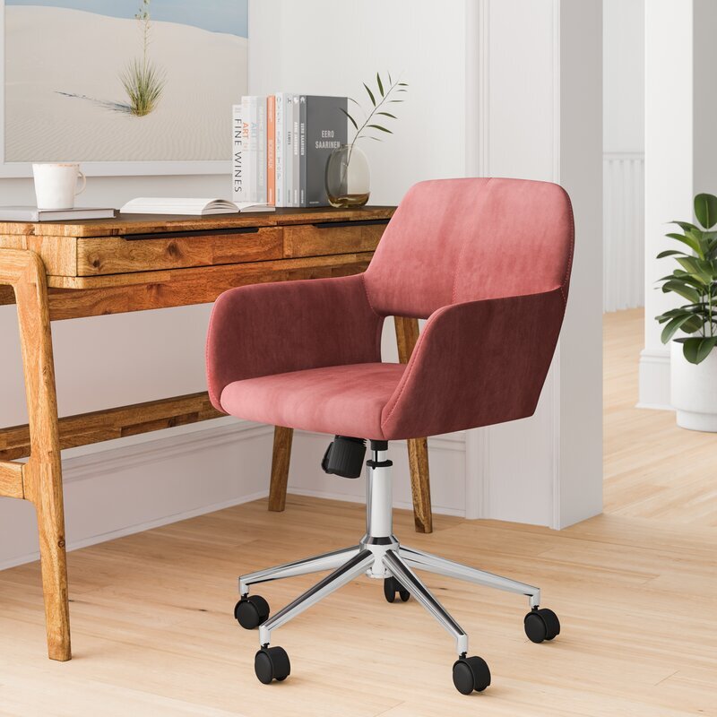
When I looked at all my saved items, I noticed I was saving a lot of light colored desks and velvet jewel-toned desk chairs so I figured that was where my head was at and I ran with it.
Because I have commitment issues, I continued to brainstorm options to make sure I was buying exactly what I wanted. We ended up taking a trip to IKEA to see what they had available too. This trip was a great way to also figure out what size desk felt best by sitting down and “testing” out several options.
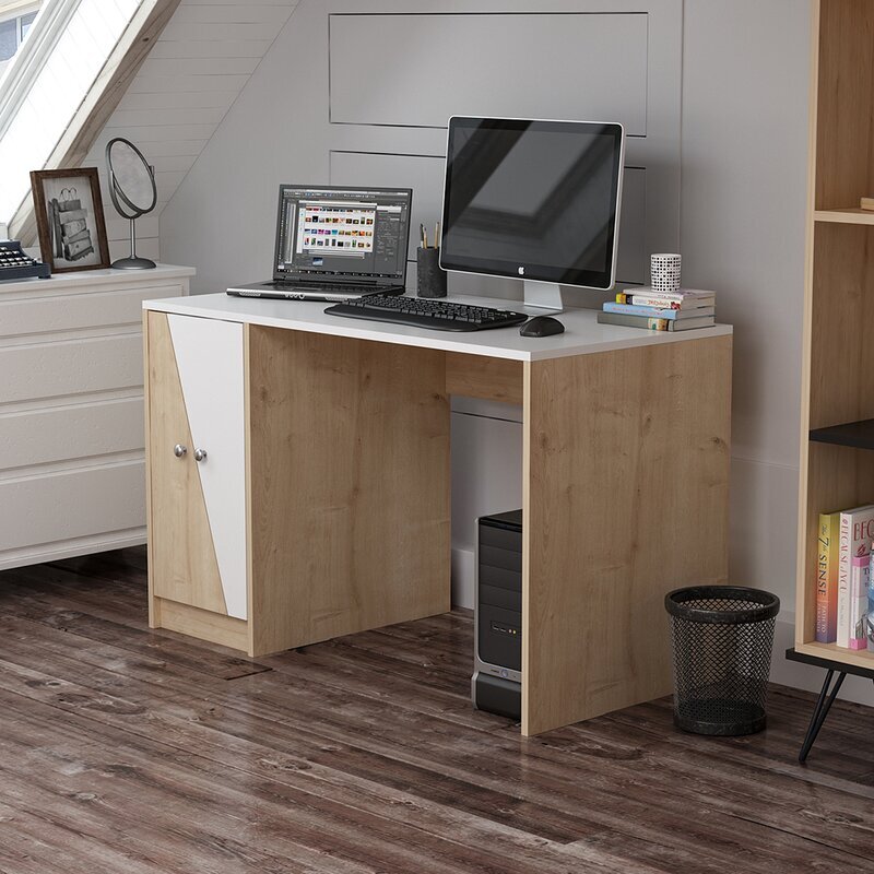
I was most drawn to the Hilver desk and I was really considering pairing it with the Ekero armchair.
We almost bought them, except we didn’t have enough room in the car with both kids. We figured Lucius would just have to take a quick trip back the next day.
This was actually a blessing in disguise because I wasn’t 100% sold on either of those items. The desk felt a little too much like a table and I was concerned with the chair being difficult to move in and out since it didn’t have wheels. There were actual desk chairs at IKEA, but I wasn’t really in love with the look of any of them.
As an Amazon Associate, I earn from qualifying purchases. This post may contain affiliate links, meaning I receive commissions for purchases made through those links, at no cost to you.
One of the most exciting things about designing this room is that the only person I have to think of is myself! Normally I’m trying to design a room with Lucius in mind too so I have to be a little more thoughtful in some of my choices. It’s not very often that I get to run uninhibited with my ideas. With that being said, I totally bought a pink velvet chair AND I LOVE HOW IT LOOKS!
Building on your inspiration
For the past month or so (I’m losing track of my days at this point so it could be longer) I’ve been working in my new office. It’s still lacking quite a bit considering all I’ve done so far is bought the necessary furniture, stole a lamp from our bedroom, threw down an area rug, and hung a mirror I had lying around.
But of course I’ve been daydreaming and planning like crazy! Now that I have my staple items, my wheels are really turning.
My next tip: once you have your main source of inspiration, use that to drive your design. You can pull colors or patterns from your inspiration piece and use them elsewhere in the room. You can look on Pinterest for rooms with similar items as your inspiration piece(s) and create a board to pin images that get you excited and pull ideas from there. You might even realize that what you thought was your original inspiration shifts to something else once you start building up some reference images.
Here are my thoughts for this room…
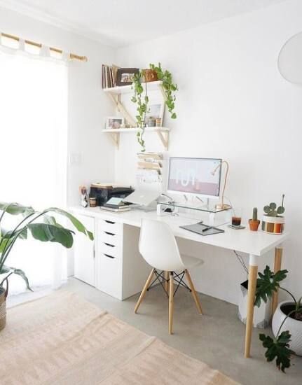
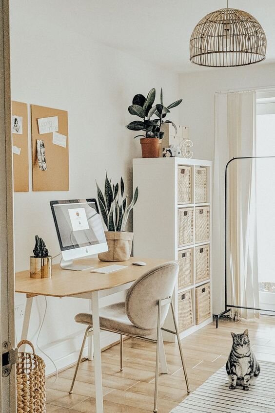
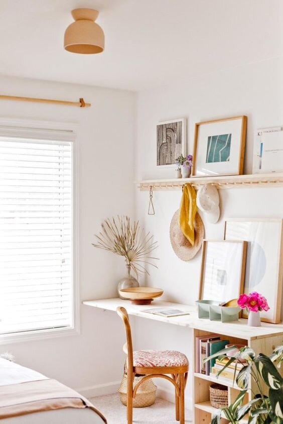
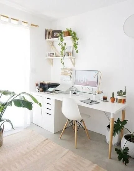
Maybe it was the trip to IKEA, but I picture this room being somewhat Scandinavian design inspired: bright and airy, small bursts of color, natural wood tones, clean lines. I already had the desk with wood tones and the chair with my burst of color, so I was on the right track. Below are examples of some inspiration photos.
But I also want a little more dimension and excitement in the room than what you see above. I considered doing wallpaper in here but I’d like to save that for the nursery once I get to updating that room. And if you haven’t noticed, I really like trying new/different wall treatments so in this room I’m going to draw a pattern with Sharpie paint pens!
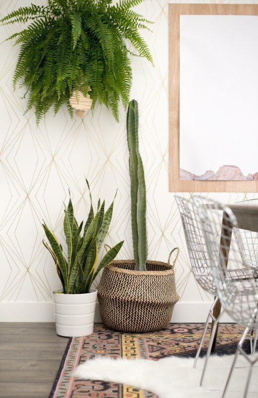
I’ve been obsessed with the pattern below lately. It’s a little bit art-deco but I think I can make it work with the Scandinavian-inspired elements.
My plan as of right now is to paint the walls a light gray/off-white color and draw the pattern on the wall that my desk is facing using a gold paint pen. The design could end up being too in your face if it were black or high contrast compared to the wall color, so I think the gold paint pen with the light colored paint will help make the pattern more subtle.
Below is an awesome example of a Sharpie paint pen wall using the gold pen and a really cool design.
I have a strange addiction to mindless, tedious tasks (painting rooms, peeling wallpaper), so this undertaking doesn’t scare me in the least. In college I even created a conceptual art piece where I made a tally on a piece of wood for every dollar I owed in student loans!
This represents one student loan. I actually made one for each of my loans! Apologies for the terrible photo. And yes, it currently lives in my garage because I graduated college years ago and don’t know what to do with it but can’t seem to throw it away.
The point being, if I’m feeling really crazy I might even draw on all the walls! We’ll see how difficult it is and how much I like the design.
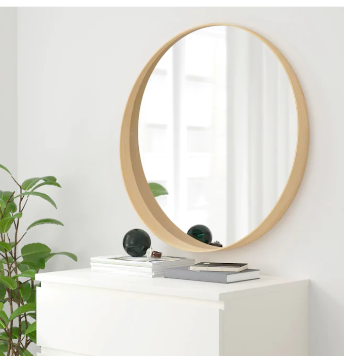
Since the desk has some strong lines in it and the wall pattern is very geometric, I’d like to switch out the current mirror with a simple round mirror. I’ve been stalking this one at IKEA for a while now.
I whisper sweet nothings to it every time I pass it in the store.
I think the circular shape of the mirror will really help soften up some of those hard lines and tie in nicely with the softness of the chair. Plus, it has more of the wood that I’d like to pull into the room.
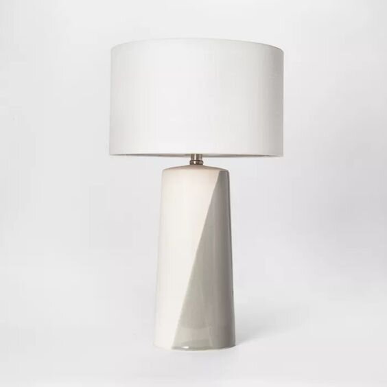
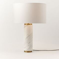
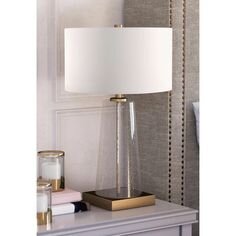
I’ll also need a new desk lamp so I can put the one I’m currently using back in our bedroom. Here I might introduce some more natural materials like stone or at least go with a softer, rounder silhouette for the lamp. Here are a few ideas:
Rounding out the room
Now that I have my office space somewhat planned out, there’s a whole other two-thirds of the room to consider! We planned on turning this into a guest room originally and I’m confident this space can still serve that purpose. It’s just a matter of working it into the overall design.
Obviously to make this into a guest room we’ll need a bed.
The natural wall where you’d place the bed is actually where I’m setting up my desk area. I could put my desk elsewhere in the room, but I figured since this will primarily be used as my office I should make it the most inviting space possible for me - and this wall gets the most light and has the best view. With that being determined, I have to rethink the bedroom portion of the room.
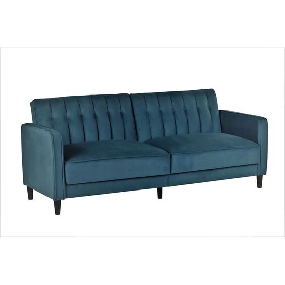
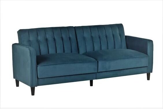
I think a normal bed might be a little awkward in the space available, but a daybed or stylish sofa bed could work! Apparently I’m pretty into jewel-toned velvet right now in general, because I’m really feeling this sofa bed:
I’ll also likely bring some end tables, maybe a footstool, and a dresser into this room. I’ve been thinking about stealing the dresser from the nursery and putting it in this room instead too.
I picked this dresser up from a thrift store years ago and refurbished it. I love it, but it can be difficult to open and I figure once our younger daughter will want to start dressing herself she’s going to have a heck of a time getting to her clothes. Plus, I think this dresser will fit nicely in the spare room both in style and function.
In a perfect world this room would have hardwood floors and I would have an awesome area rug in place of the carpet that’s in there currently. Replacing the flooring in the house is pretty far down the line, so for now I’ll just keep dreaming of what’s to come. I’m picturing a natural fiber rug, but I could be swayed for something with a design…. don’t even get me started on rugs. I’ll go down a rabbit hole I might never come out of.
Finishing touches
Of course the room wouldn’t be complete without some artwork on the walls and just some general decor items so I’ll be sure to add those once I get to that point. In the meantime, I have one last piece of advice: be comfortable changing your plans.
I find that a lot of times when I’m updating a room I’ll think I’m in love with an item I’m planning on buying or an idea I’d like to run with but once I make other updates it just doesn’t make sense in the space anymore. And that’s okay!
We’re not perfect and you can’t expect to get it right on the first try. I’m sure some of the things I’ve shared in this post won’t make it in the final room. Flexibility is key to winding up with an end product that flows. And at the end of the day, the point is to make yourself happy and to create a space that you love.

