Half Bathroom Design
/Half Bathroom Mood Board - Fall ‘23 ORC Week 1
I’m excited to announce that I’m participating in the Fall 2024 One Room Challenge! I’m even more excited to share that a total half-bathroom makeover will be the focus this time. In this post, I’m sharing the current state of the bathroom, the design plans, and the inspiration!
What’s the One Room Challenge?
If you’re unfamiliar, here’s what the One Room Challenge is (straight from the official site): The One Room Challenge™ will provide participants with a supportive, enthusiastic forum in which to share the process of transforming a room. The ORC is not a competition, but rather a celebration of creativity, inspiration, and original ideas.
The Challenge lasts for 8 weeks, where I’ll be sharing a new post each Wednesday until the final reveal on November 15, 2024.
As an Amazon Associate, I earn from qualifying purchases. This post may contain affiliate links, meaning I receive commissions for purchases made through those links at no cost to you.
Current Half Bathroom
I am not a fan of our current half-bathroom. There. I said it. And I don’t care who knows it!
The half bathroom is the only bathroom on the first floor. It’s right off the foyer and is the primary bathroom for guests… and it never ceases to surprise me how many perplexing things are happening in this small space. Let’s take a closer look.
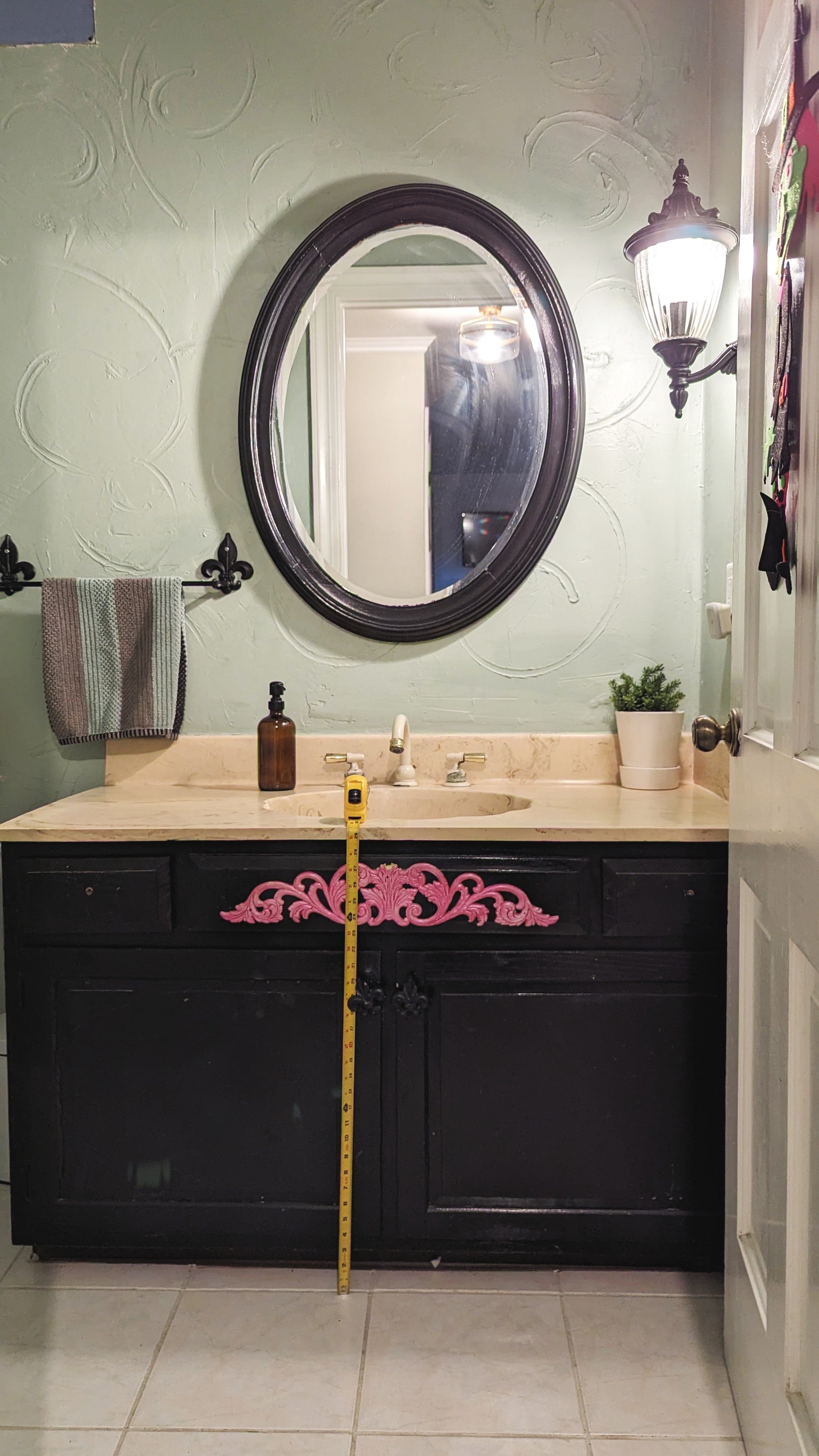
For starters, let’s chat about the vanity. Or, as we (JOKINGLY) call it, the urinal because it’s so ridiculously short men could pee in it.
Sure, it’s great for the kids to easily reach, but it’s constantly an awkward point of discussion among our taller guests.
And let’s not forget about the outdated seashell sink and the bright pink detail on the front!
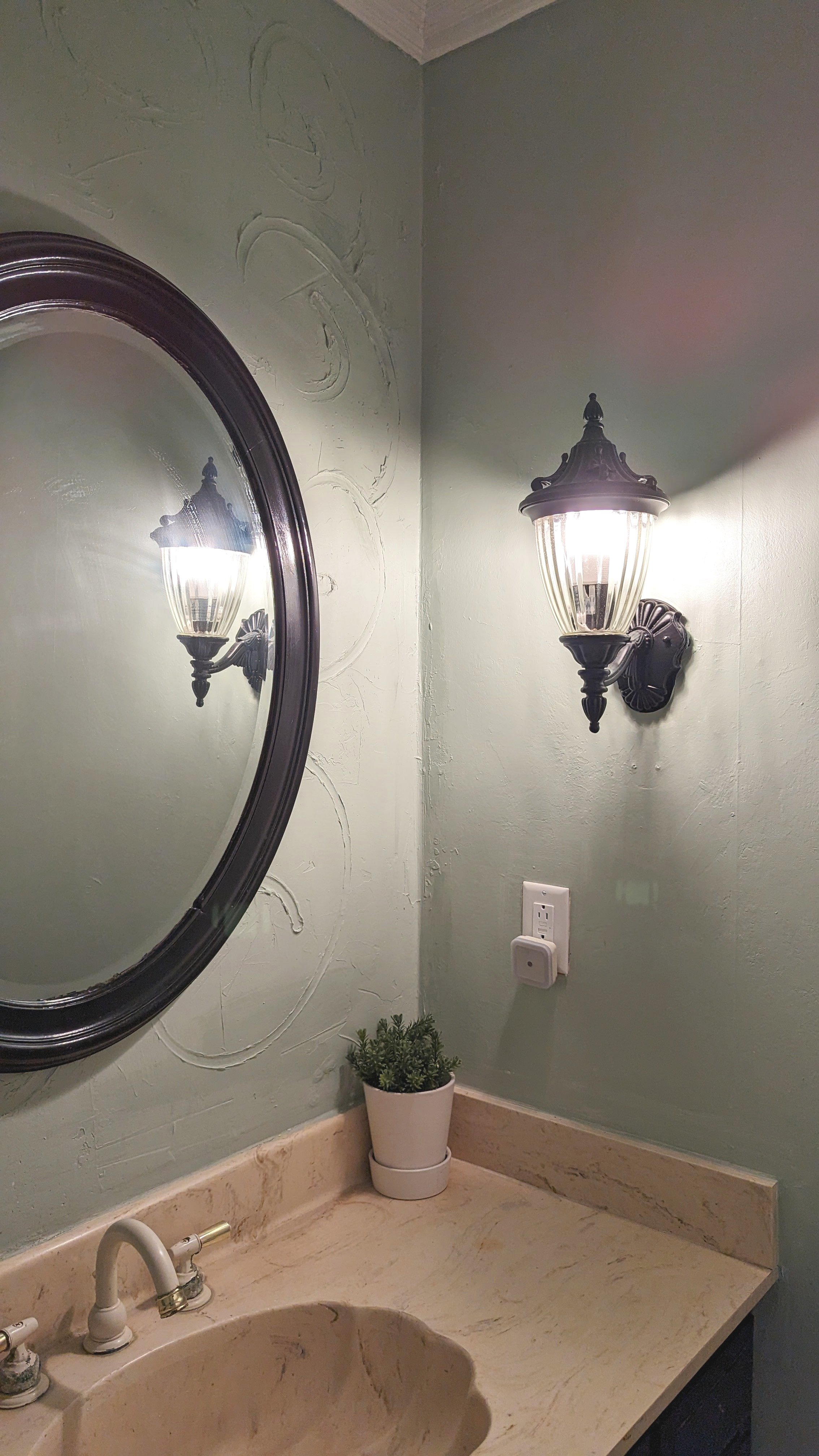
Next, we have the textured walls.
Having textured walls is one thing… but these were pretty obviously made by someone swirling a finger in joint compound. On top of wallpaper, no less!
My last major point of confusion is the outdoor lantern that’s being used as a sconce… on a dimmer!
I assume it’s in case you want to use the facilities with some ambiance? But in the time we’ve lived here, it’s never been utilized for that, so I think it’s safe to remove.
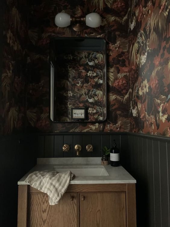
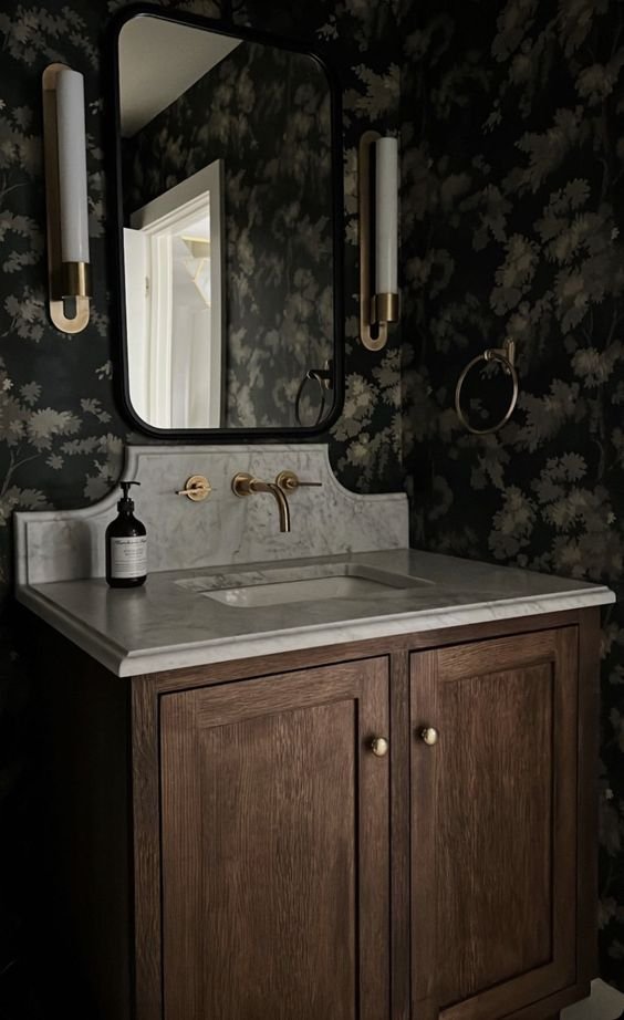
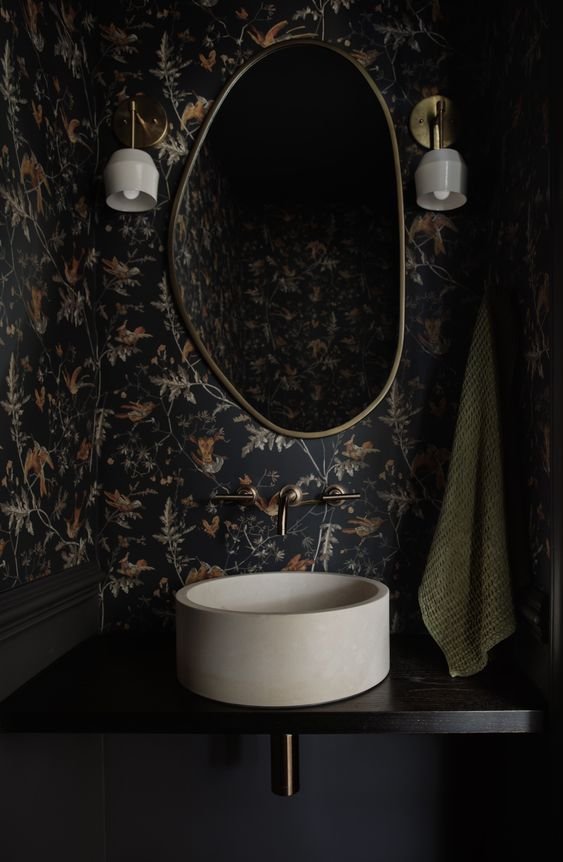
While those are just a few examples of items I’d like to change, I actually plan on gutting the entire thing and starting from scratch. In fact, I first started designing this room TWO YEARS ago. Here are some rooms that really got my wheels turning.
Half Bathroom Inspiration
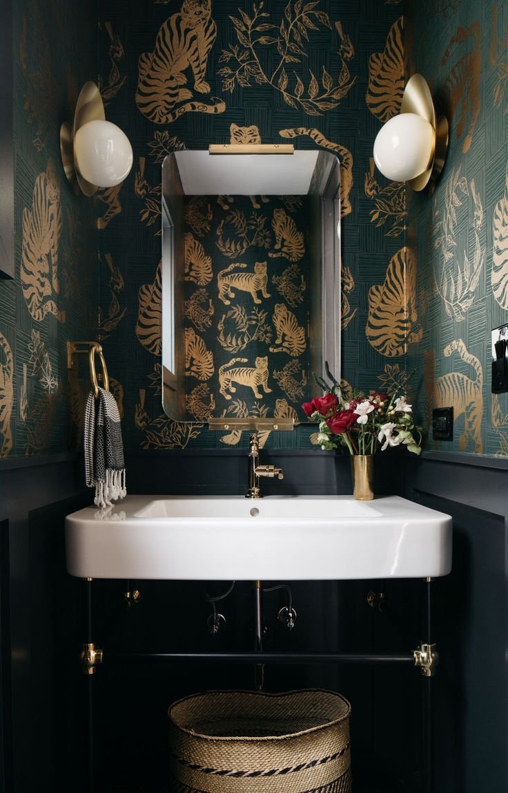
Are you sensing a theme here!?
I first fell in love with the funky, modern wallpaper mixed with some more classic elements in the picture on the top left. From there, I went down a dark and moody bathroom rabbit hole that I don’t regret one bit.
A Case for Dramatic Bathrooms
People tend to think small spaces are the last place you want to use dark colors or busy patterns, but it’s actually the complete opposite! Here’s why you should go dramatic with your next bathroom renovation:
Encompassing an entire room (especially a small one) in dark tones actually makes the room look bigger by tricking your eye into eliminating boundaries.
The smaller scale of bathrooms allows space to splurge a little, play with different design elements, and try things you may not have had the budget for otherwise.
Creating a dramatic feel in a small space is an opportunity to surprise people with a tiny room that packs a punch.
Half Bathroom Design Plans
Now that you know where my thoughts are headed, let’s dive into my bathroom design.
The Walls
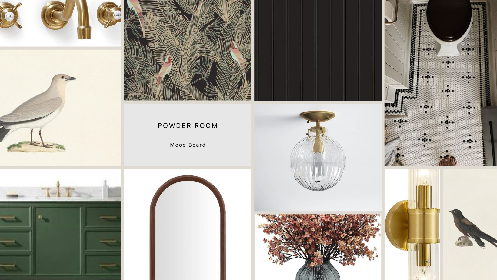
If you didn’t pick it up from my inspo photos, I want to go dark with this room. I spent countless hours scouring sites for the perfect wallpaper. There were SO MANY that I considered using, but ultimately, I chose this one from Lionheart Wallpaper.
I love the organic feel of the design and the tones in this wallpaper. Of course, I like that the primary tone is black, but the ferns are actually a subtle dark green, and the birds have some interesting, yet subtle, colors going on, too.
On the bottom half of the wall, I’ll be installing either beadboard or tongue-in-groove paneling for two reasons: 1) to break up the wallpaper and add some visual interest and 2) to save money. Wallpaper is expensive, ya’ll!
The bottom half of the walls, trim, and ceiling will all be painted a soft black or charcoal gray to coordinate with the wallpaper.
The Floor
I’m so excited to try my hand at installing black and white penny tile in this bathroom - and adding a fun border and pattern!
I have yet to decide on the exact pattern I’ll be doing, but I’ve definitely been inspired by the picture above. I look forward to experimenting and trying a few designs to see what works in my space.
The Vanity
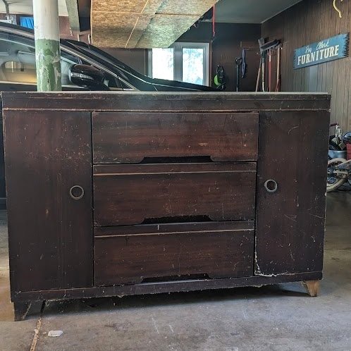
When I originally started designing this space, I jumped on Facebook Marketplace and began searching for something I could retrofit to use as a new vanity (a project I’ve always wanted to tackle)… and I found something almost immediately!
Unfortunately, plans shifted (over and over again), and this renovation was put on the backburner. Now with this project back at the forefront, I recently unburied my future vanity from under its mound of random tools and spare wood in the garage and fell back in love with it all over again!
It might not look like much in its current state, but this baby has potential! Trust me.
My mock-up shows the vanity painted green, which I chose based on my memory of the vanity being in worse shape than it is. We’ll see how she fares during the refinishing process, but there’s a possibility I’ll be able to salvage the wood.
The Faucet
Paired with the vanity, I purchased this gorgeous hardware that was just delivered, and I’m super impressed by the quality so far.
I can’t wait to see it in action!
The Mirror
Of course, every vanity needs a mirror. I immediately spotted this mirror the first time I walked into Charlie Foursquare and was drawn to it the minute I laid eyes on it.
I love everything about it - the details on the wood, the shape, the slight bevel in the glass, even the subtle aging of the glass! (This gal is OLD.)
I didn’t consider using it anywhere in my house until recently when I got curious and brought it home to try on for size in the bathroom. It fits the space PERFECTLY! I can’t wait to add a little bit of antique flair to this room.
The Lighting
To really add dramatic flair to the bathroom, I knew I needed dramatic lighting. Enter: these Art Deco-esque sconces on either side of the mirror.
And fot the ceiling, I love the look of this light fixture (and the beautiful patterns the glass makes on the walls!)
Final Thoughts
I’m so excited to get started on this project and to see the ideas that I’ve come up with come to life. But first, I have to do the dirty work: gutting the entire room. Be sure to follow along here for weekly updates and on Instagram and Facebook to watch the project come to life in real time!

