How to Assemble a Gallery Wall in 4 Steps
/Tips and Tricks for Curating a Gallery Wall
Want to add more art to your home but don’t know where to start? I feel you - I was you. I recently decided to revamp a gallery wall in my home and quickly realized how overwhelmed I was with art options. But now that my gallery wall is finished, I put together this post to share the tips for curating art for your home I learned along the way.
A couple of years ago, I hung a symmetrical gallery wall in our living room. It was filled with little studies in calligraphy I created using different funny quotes I found online. But as time has passed, my style has evolved and my original gallery wall has felt less and less like it fit into the overall aesthetic in our home. I knew I wanted a change - something more eclectic/moody/collected/quirky - but I didn't exactly know what I was looking for.
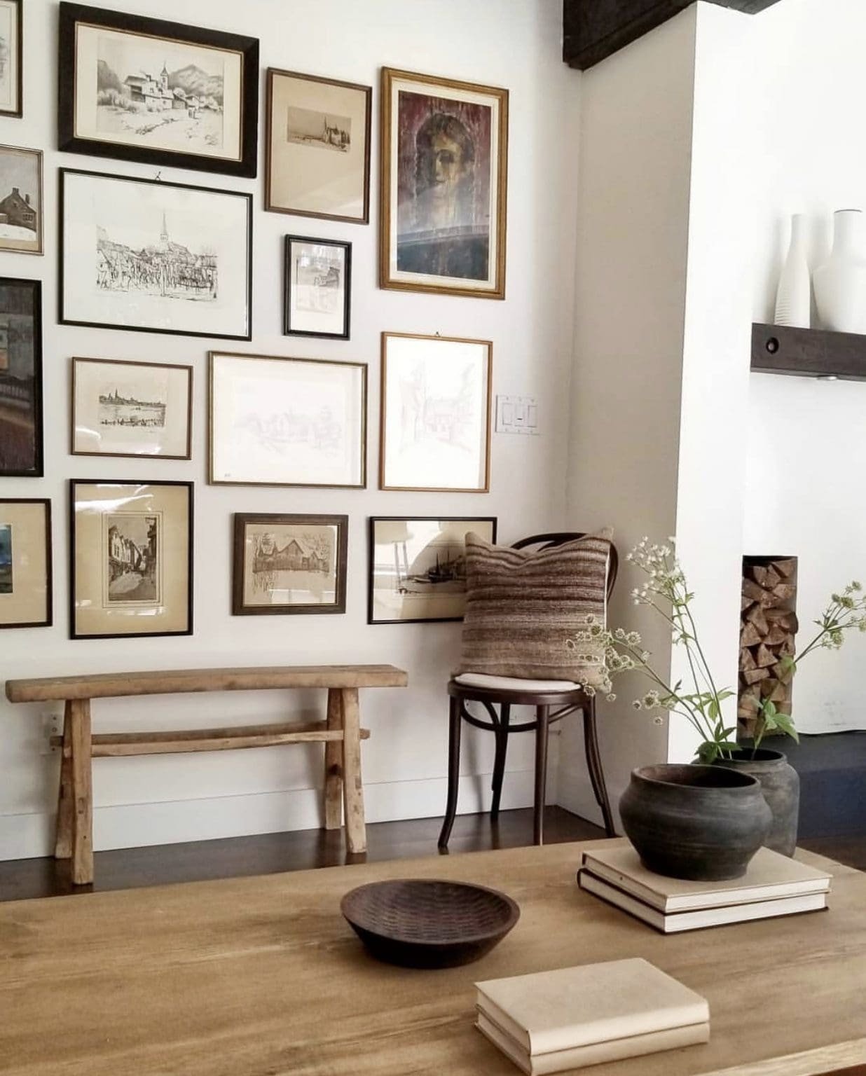
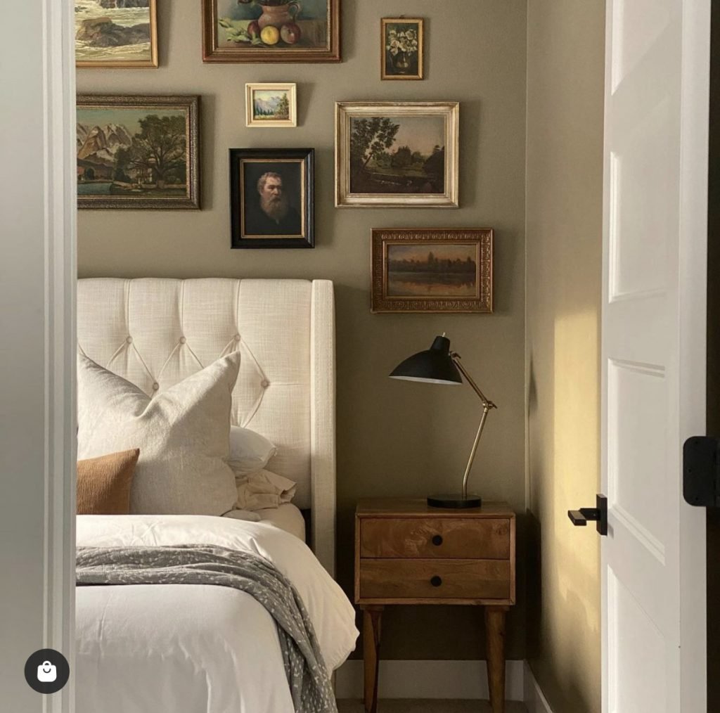
I found myself inspired by the overall look of images like these:
So, naturally, I started searching for artwork similar to the styles I saw in my inspo pics. My first instinct, as is typical with most of my design ventures, was to start pinning ideas… which brings me to my first tip!
Gather Inspiration
I love to use Pinterest when brainstorming new ideas. It’s great because it’s completely noncommital. I see something and I pin it, but that doesn’t mean I’m on the hook to use that specific image in my overall design.
Before I know it, I’ve pinned a whole slew of pictures and ideas. At that point, I can begin identifying common themes, get a clearer vision for what design aspects I’m leaning towards, and hone in on what I’m really looking for. Just take a look at this snippet of my board for our mudroom:
Based on the images above, you can clearly see that I’m leaning towards a moody blue tone and open hooks, rather than lockers, with shoe storage underneath.
My problem when I started searching for art for my gallery wall revamp was that I was looking for art similar to what I saw in my initial inspo pics, but nothing was standing out to me enough to pin.
There was nothing wrong with the art itself. I could have bought any combination of pieces I saw, and it would have turned out beautifully. But none of it felt like a true representation of me. And that brings me to my next tip…
Generic Isn’t Interesting
I quickly realized that what I was drawn to in my inspiration pictures was the overall aesthetic - not necessarily the artwork itself. The typical vintage-looking pictures of still lifes, landscapes, and painterly portraiture weren’t exactly what I was looking for. They all felt, well, generic.
I wanted a collection that spoke to me and made my heart sing a little every time I walked by. So how did I move on from the not-right-for-me pictures I was previously scanning?
As an Amazon Associate, I earn from qualifying purchases. This post may contain affiliate links, meaning I receive commissions for purchases made through those links at no cost to you.
Use What You Have
Before diving in and ordering a bunch of art I wasn’t sure I loved, I took a look around at what I already had in my house and used that as my jumping-off point. I gathered some previously thrifted art, wallpaper samples, fabric swatches, sketches I painted, interesting photos, pictures from magazines I’d been saving just because, and I even cut pictures out of some of my favorite art books.
That last one was tricky to talk myself into, but I bought these books 15+ years ago because I loved the art in them - yet I never look at them. So why not use them in a way that I’ll see all the time?
My point is - you don’t have to go out and buy a bunch of new artwork. You may already have tons of images you love around your home.
Variety, but with a Theme
Once I was able to look at everything I already owned together, I noticed some recurring themes. My aesthetic isn’t landscapes! Apparently, I’m way more into figurative artwork, animals, and foliage. Who knew!?
While not everything I gathered made the final cut, much of it did! But I knew I wanted to supplement my collection with a few more pieces. Luckily, now I felt much more confident resuming my search for additional artwork and narrowing down what types of pieces would round out my overall design.
Repetition is your friend here. If you look at your collection and realize you have, for example, a bunch of portraits but only one landscape, you should search for another landscape or two to add to that theme. Or if you have a lot of colorful pictures but only one black and white sketch - maybe search for a second black and white sketch for balance.
In my case, I noticed I had one picture with animals in it, so I searched for a few more - and ended up with three! As another example, I had one sketchy watercolor figure, so I searched for another sketchy figure and found one that caught my eye.
On that note - while repetition among your art is a good idea, don’t feel like you need to be too matchy-matchy with the sizing. Sizing will come into play more in part 2 of this post, where I’ll be talking about getting frames for your gallery wall. Don’t stress yourself out about this part. Just know the more variety, the better!
The End Result
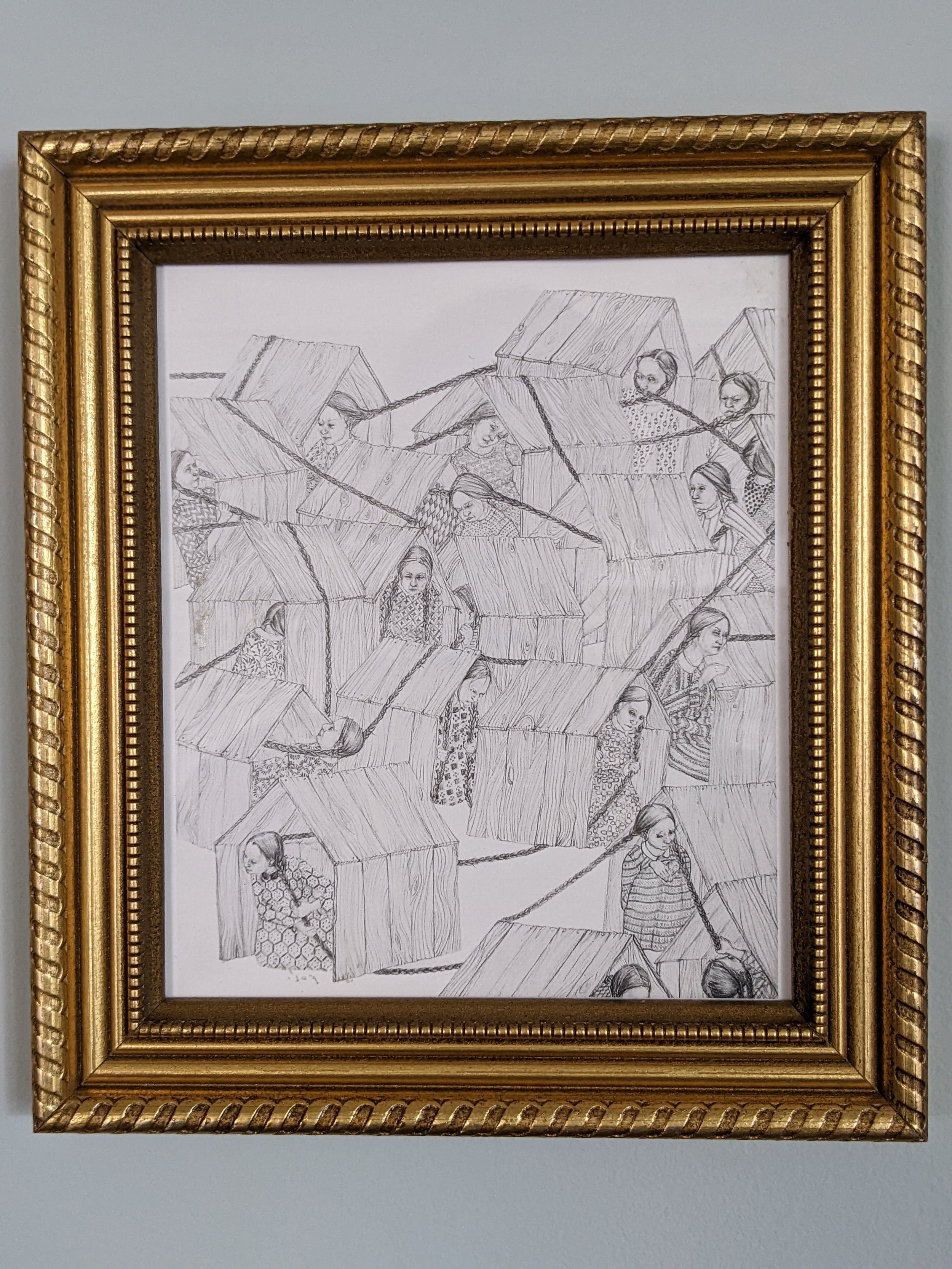
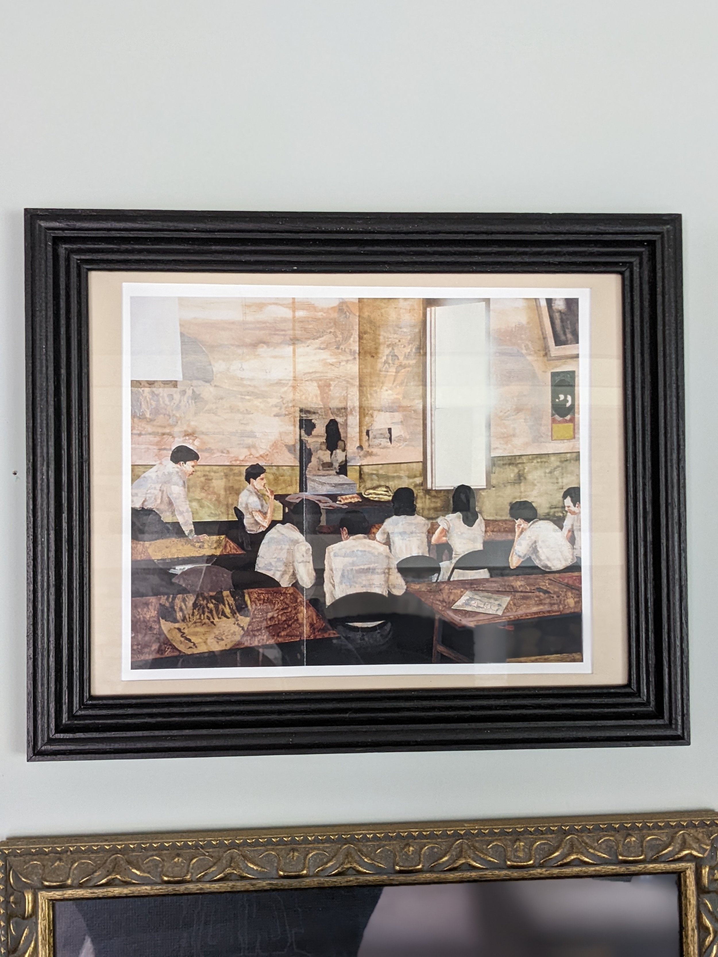
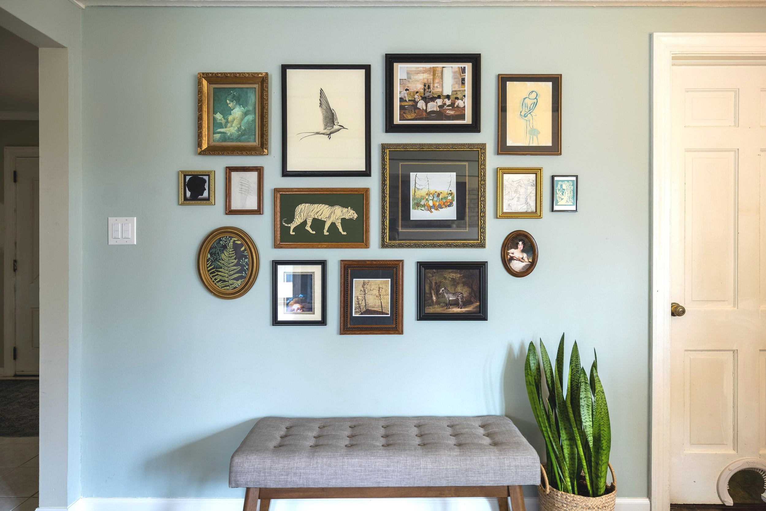
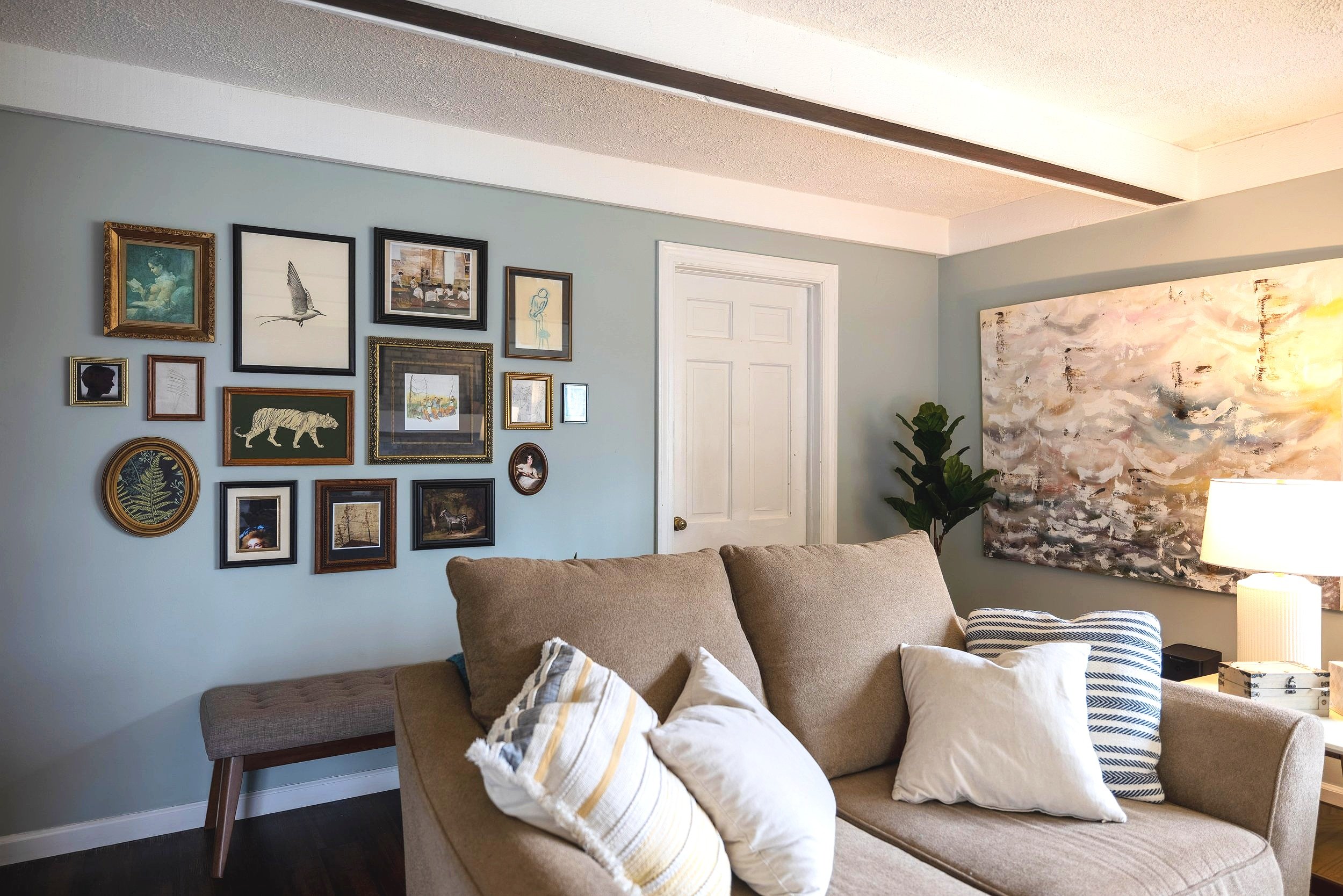
In the end, I bought 6 new digital prints from Juniper Print Shop, BFF Print Shop, and Etsy, all linked below, and paired them with 9 pictures I already owned.
Admittedly, curating my gallery wall was a slow process - slower than I anticipated. And in true Erika fashion, I overthought it more than the average person probably would. BUT, I can honestly say I’m in love with each and every piece and the time I spent putting it all together was definitely worth it.
However, this gallery wall wouldn’t have nearly the same appeal if it wasn’t for the frames. Stay tuned for my next post, where I’ll share how I went about gathering and, in some cases, modifying the frames - without blowing my budget!
In the meantime, here are links to the prints I purchased:
And here are some of the prints I seriously considered adding to my gallery wall - with links, in case any of them strike your fancy.
Final Thoughts
For those of you who skipped to the end (you naughty minx, you), here’s the TL;DR version:
Gather inspiration: Use Pinterest to pin anything and everything that catches your eye. From there, you’ll begin to see common themes appear.
Generic isn’t interesting: Don’t fall back on what everyone else is doing. Make your gallery wall a reflection of you.
Use what you have: You don’t have to spend a fortune buying all new art. You’ve likely already gathered art around your house that you were obviously drawn to - add it to your gallery wall!
Variety, but with a theme: An interesting gallery wall will have a variety of images - both in subject matter and material - just don’t throw in everything but the kitchen sink. Find a few themes and build on those.
So, I have to ask - which is your favorite picture on the gallery wall?


